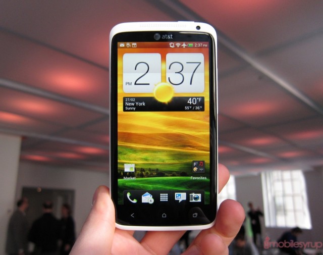
We had the chance to take a first-hand look at the HTC One series, including the flagship 4.7-inch One X, ridiculously-thin One S, and the Legend 2 aka One V.
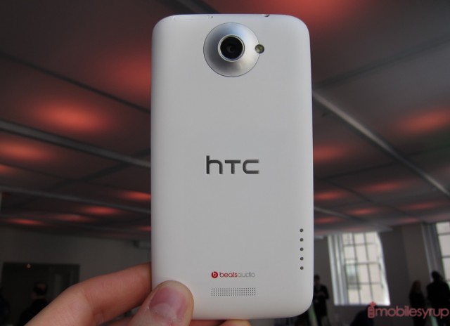
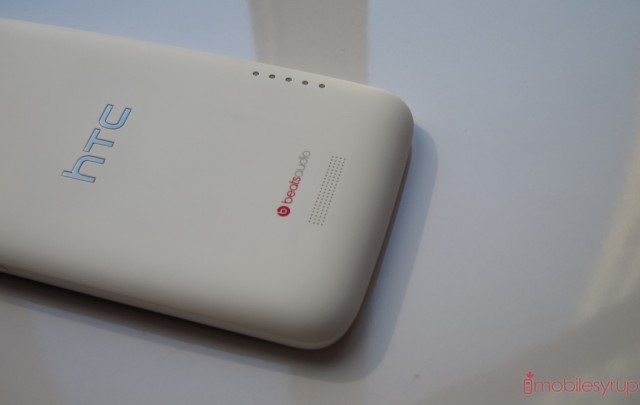
At first glance, the One X is wholly unlike anything HTC has made. It’s feather-light, and large, but eschews metal for a bezelled polycarbonate shell. Speaker holes are drilled using a new manufacturing method, and the 4.7-inch screen is covered with a curved “2.5D” Gorilla Glass that prevents reflections in direct sunlight. And the LCD behind the glass? It’s stunning. I would take this over the Galaxy Nexus in a heartbeat. It’s non-PenTile, vivid to a fault, with infinite viewing angles and not a perceptible pixel to be found.
Sense 4 looks great and runs smoothly. This is not the bloated, garish Sense 3.0 you’re used to; HTC cleaned up the UI, simplified many of the features and added a ton of optimizations for Ice Cream Sandwich. I was able to perform tasks, such as quickly opening the browser and opening a web page without so much as a stutter.
There are some design choices, such as the etched speaker holes and ceramic-feeling polycarbonate, that demonstrate how HTC has left its comfort zone and is focusing on a unified experience across all devices. While the One X is the flagship, it’s by no means the only desirable product of the three. As you’ll see later, the One S is a beast in its own right.
Internally, we’re looking at a 1.5Ghz dual-core Snapdragon MSM8960 processor, 1GB RAM, 16GB internal storage and an 8MP camera with 5-stage flash. On paper they may not look that impressive but it’s the package that screams quality here. HTC has done its homework, and they’re ready to take on Sony, Samsung and LG.
The camera, which HTC is marketing as the series’ killer feature, is astoundingly quick. It opens almost instantly — under one second — and focuses in 0.2 seconds. The 8MP lens can snap photos at 10FPS, and the built-in Image Processor detects the best of the bunch and removes all the rest. If you want to pick your favourite, you can do so as well.
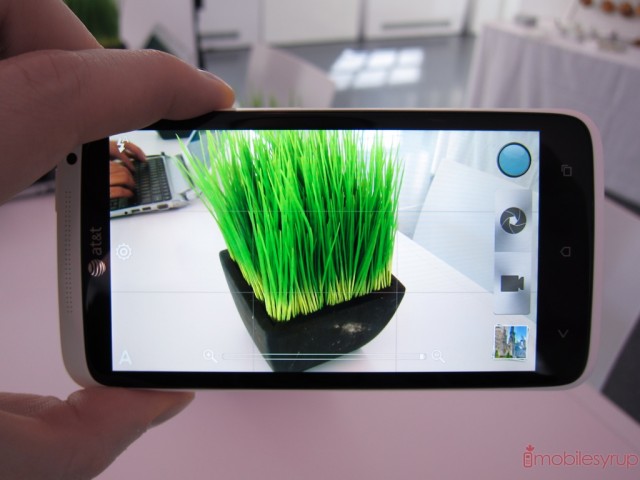
The fundamental difference between HTC One and previous iterations is the simplicity of the various first-party applications. Nowhere is this more obvious than in the camera UI. Gone are separate photo/video modes; instead you can do both, side by side. You can even take 5MP shots while shooting 1080p video. The experience is absolutely seamless. We’ll have more of the camera software during our dedicated camera demonstration post.
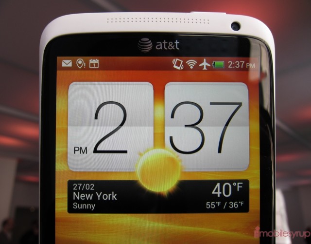
The Super LCD2 screen is really, really good. Though slightly lower density than the equivalent Galaxy Nexus or LG Optimus 4X HD, the picture looks like a static demo. It’s that clear. The Gorilla Glass also tapers on either side, enhancing scrolling and swiping. This is by far one of the nicest screens I’ve seen on a mobile device.
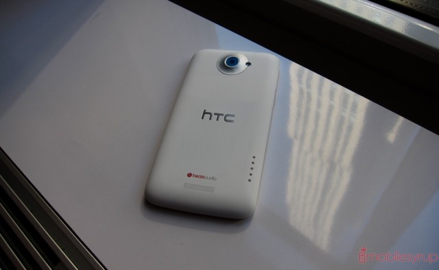
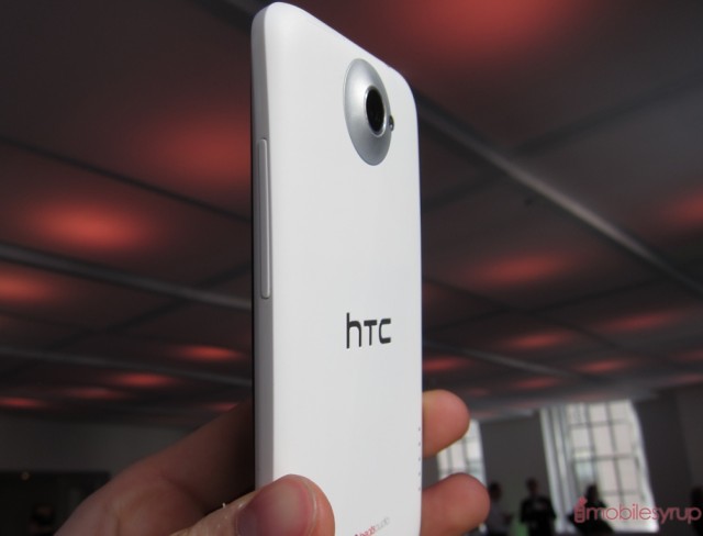
The device is very nice to hold; it does not feel like a 4.7-inch device, even with capacitive touch buttons below the screen. It’s thin, but not overly so; it’s matte, but not slick.
All the design choices are tasteful, and yet we’re hoping that the final version will come together as well as it does in the demo. We can’t wait for retail units, sans AT&T branding, that we can try for ourselves. That being said, the One X makes a fantastic first impression.
MobileSyrup may earn a commission from purchases made via our links, which helps fund the journalism we provide free on our website. These links do not influence our editorial content. Support us here.


