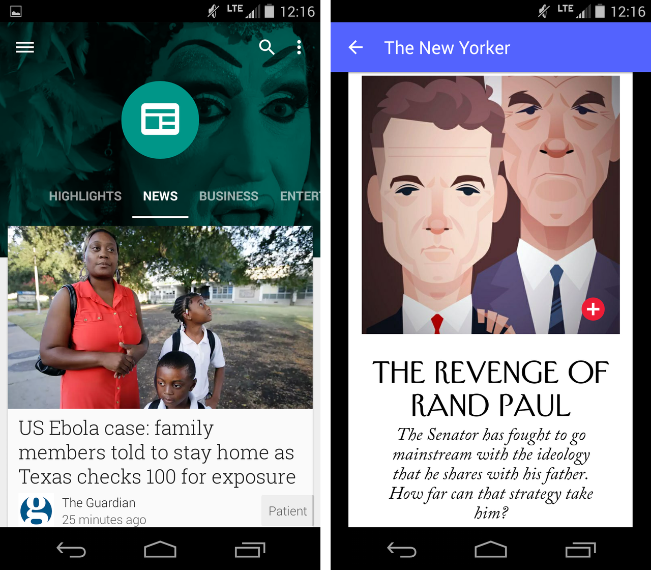
With the rumoured launch of Android L drawing ever closer, Google is continuing its roll out of Material Design across its mobile services. Most recent to get the Material Design treatment is the company’s news reader application, Newsstand.
In terms of functionality, Google has added deeper topic cards to the Explore menu, allowing more granular control over the topics you follow, and swiping around through different categories or within specific categories is smoother than ever.
Of course, the major difference is the overall look and feel of the application, which is much more media-rich than the version launched a year ago. It brings Newsstand’s aesthetic more in line with Maps, Chrome, News & Weather, Hangouts, and the Play Store itself, which have all been updated to Material Design already.
[source]Google[/source]
MobileSyrup may earn a commission from purchases made via our links, which helps fund the journalism we provide free on our website. These links do not influence our editorial content. Support us here.


