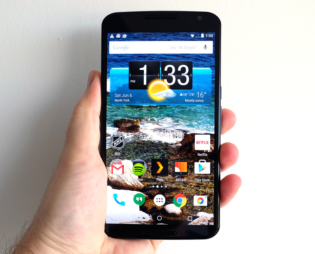
Is it an adage or a cliché to suggest bigger is always better? For Google’s Nexus 6, it’s a worthy question to ask for a number of reasons. This was a smartphone that deviated considerably from the premise many consumers expected from the Nexus line — nimble, reliable and affordable.
The size of the Nexus 6 is understandably what stands out most, but initially it was the price that cast the device in a different spotlight. By venturing deeper into flagship territory, its merits had to be juxtaposed next to the very types of handsets it had previously been undercutting.
This wasn’t so much a “go big or go home” scenario, but rather an attempt to cater to users clamouring for larger screen sizes. A 6-inch display (5.96-inches if we’re not rounding off) is pushing the envelope, even if the bezels and body are fairly thin enough to make it look more wieldy than it turns out to be.
Now, over six months after it launched to market in Canada, the Nexus 6 has recently been given the discount treatment from Google, suggesting that inventory will need to clear up in anticipation of a new duet of Nexus smartphones. With newer devices in the works, how does this one stand up right now?

The Device
Nexus devices have always required trade-offs for those using them. There’s no expandable memory, but you can bet on running the latest version of Android. You will get a nice display to look at, but not a camera you can rely on for every shooting scenario. And while the phone will run smoothly, battery life isn’t going to win any accolades.
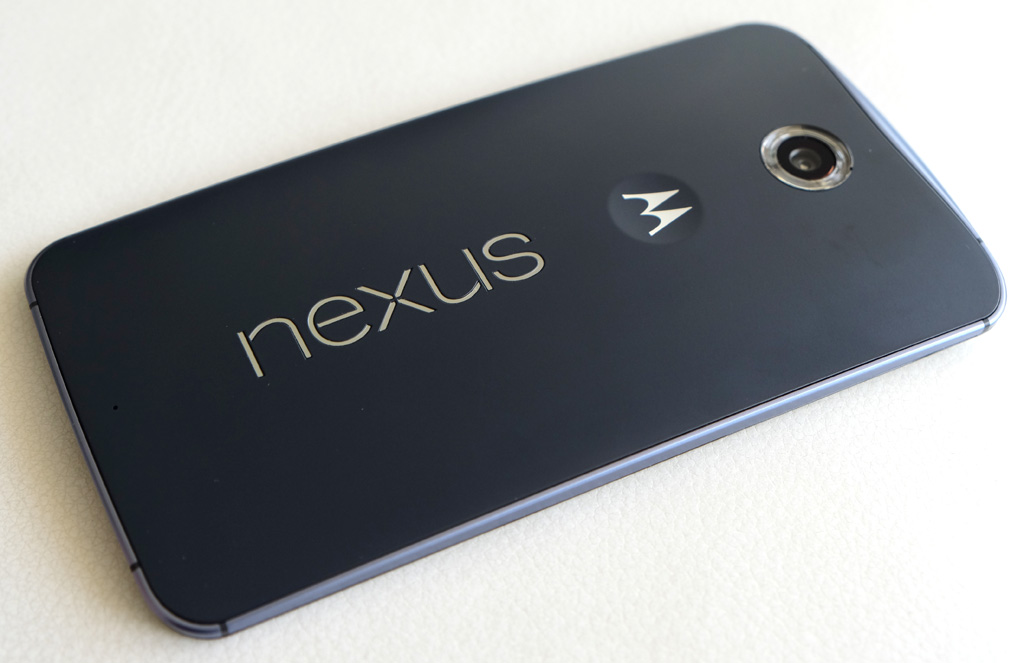
The Nexus 6 is no different. Where LG made the Nexus 4 and 5, Motorola was given the opportunity to build this one, clearly imprinting its own design philosophy into the device’s craftsmanship. It’s not so much the Motorola logo in the back that seals the deal, it’s the curved back, Quad HD AMOLED display and premium build. When I first saw it, I got the impression I was holding a slightly mutated Moto X, only with even better materials.
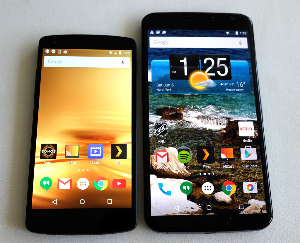
The device radiated quality, and still does. Putting it next to a Nexus 5, it’s patently obvious the two are in different classes — not because of their respective sizes, but because of how they look and feel. Except there is a usability disadvantage in that the Nexus 6 is a difficult one to master in one-handed situations. This isn’t something that happens intermittently, either, considering how pervasive it truly is. It’s a consequence of using a device with a 6-inch display. Yet in a growing field of handsets floating around the 5.5-inch size, it begs the question of whether Google and Motorola’s design was destined to be more niche than they would have preferred.
It said something to me that a few people I came across initially thought I was holding a Galaxy Note, at least until they saw the back. Then they assumed I was using some sort of “Motorola Nexus” device. It wasn’t until I explained that it was a Motorola build with Google branding that they clued in. But even then, the size became a divisive issue, and two things seemed to illustrate that. First, it was trying to perform tasks while holding it in one hand, and then it was putting it in a pocket or purse. I found this perspective interesting, considering the iPhone 6 Plus is not much smaller and offers the same usability challenges. None of them were using the 6 Plus, preferring handsets that were easier to handle.
Granted, these are anecdotal examples, but they didn’t really surprise me. Larger smartphones appeal to those who want the extra screen real estate, which clearly isn’t everyone. Sure, the screen is very pleasant to look at and the phone hums along nicely, not to mention having stock Android, but the trade-offs involved in using this phone are omnipresent.

The Software
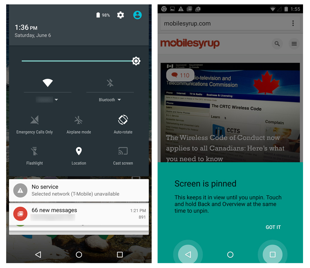
The Nexus 6 also introduced Lollipop to the masses, which is now on a number of different Android smartphones. Scale was hardly an issue here as far as stretching out Lollipop to work seamlessly with a monstrous display, but Google seemingly never considered that one-handed use was so commonplace. Out of the box, there was no way to tailor the software to lend a helping hand.
Still, Lollipop did add some elements that could benefit larger screens, like actionable notifications on the lock screen and setting up multiple profiles. Anyone with a Nexus 6 in one hand, and a child’s hand in the other, knows that kids would love to play games on a display like that.
With respect to its size, neither Google nor Motorola were venturing into unknown territory for Android. Other manufacturers had already been stretching out the OS anyway, so acclimating to a 6-inch display was less about the technical side of things, and more to do with how it would impact or improve usage.

As it stands…
The Nexus 6 was outfitted with optical image stabilization and HDR+, but not a particularly great image sensor. The two essentially fight each other to capture good photos, forcing users to improvise and make the most of what’s there. It’s almost as if it was designed to be a puzzle more tech-savvy or photography users were meant to solve, simply because the Auto mode is so unreliable. In any situation with a lot of contrast or dimming light, HDR+ mode is the only way to go, even though processing takes longer than it does on other handsets. The LED flash is awful, and should be used very sparingly. Tap to focus with a measure of manual exposure control is fine, but comes off as far too confusing for an average user to grasp.
Snapping a lot of photos and video also demands an exit strategy for all the content. Whether it’s copying all of it over to a computer or uploading it to a cloud provider, the lack of memory expansion does mean the Nexus 6 can fill up quickly (though the base model does come with 32GB of storage). Never mind the litany of apps I have on it, the larger screen compelled me to add movies I could download from my Plex server for offline viewing. Add a large music library and all the photos and video, and the internal storage eventually felt stifling.
Equally so is general usability. Two hands are still required to do much of anything on the Nexus 6. Swiping through a newsfeed with one hand is perfectly doable, but once interaction is required, especially if a menu button is on the top row, either a really long thumb or sequence of contortions is necessary to get the job done.
Ambient Display, a variation of Motorola’s Moto Display, is a nice way to peek at notifications or the time without having to unlock the screen, except it hasn’t really improved since it made its debut in Lollipop 5.0. The Nexus 6 arguably relies on features like this even more, not only because it has an AMOLED screen, but also because its very size should offer those types of conveniences. As is, detecting a wave of the hand over it is hit or miss, so I end up just double-tapping the display with some force to pry it awake.
I’m talking about basic tasks here. Texting or emailing someone on the Nexus 6 is always a two-handed affair. Browsing through Netflix or Rdio is the same. Virtually any app I use on the phone can’t be done with one hand, and if I can manage with one paw, there’s always a balancing or juggling act involved because of how the screen stretches out menus vertically.
Lollipop 5.1 hasn’t really addressed these points, and I’m not sure how well it could anyway. Samsung has long included a one-handed feature into its Note lineup, which is a bit pedestrian, but does the trick, nonetheless. This isn’t to say that a 5.5-inch device isn’t unwieldy, but it sometimes amazes me just how much of a difference half an inch can make.
I even tried pairing the phone with a couple different Android Wear smartwatches to see if some of the load could be handed off. This was a fool’s errand, in many ways, and more because Wear’s current level of maturity precludes it from taking the reigns the way it should. I didn’t mind not having to pull out the Nexus 6 to look at an incoming email, see who was calling or skip a song, but when I truly needed to do something, I had no choice but to reach for the phone.
Much of what I’ve focused on here is negative, but it’s not intended as a broad swipe of the phone’s shortcomings. It’s merely acknowledging the see-saw nature of the device’s design and functionality. I’ve had very little to complain about when it comes to performance when the Nexus 6 handles whatever app or content I throw at it. Battery life isn’t exceptional, but it’s a long way from being terrible, and continues to hold up surprisingly well. The camera may have some issues, but it can take solid images in good lighting. And games look great on the larger display. It’s just that I can get that and more from other Android handsets that aren’t as big and make fewer sacrifices.
It’s expected Google will release two new Nexus handsets this fall, a 5.7-inch built by Huawei and 5.2-inch by LG. The 6-inch Nexus 6 will likely still be available alongside the newcomers, but in going with two smaller models, it seems that some lessons were learned since its release.
MobileSyrup may earn a commission from purchases made via our links, which helps fund the journalism we provide free on our website. These links do not influence our editorial content. Support us here.


