It’s almost a year to the date since Google’s introduced Material Design to the world. Since then, we’ve seen a flood of apps adopt the design guideline to great effect. Still, even a year later there are a surprising number of popular Android apps that have yet to take to it. Just take a look at Dropbox and Todoist. They’re leaders in their respective verticals and yet it took until this week for them to release Material Design updates. In many ways, however, they were worth the wait.
Dropbox has been sporting its Matias Duarte-inspired digs on Android for a couple of weeks, though checking out the overhaul required downloading a beta version of the app. Starting this week, anyone can download the update.
The file sharing app’s Material Design overhaul features the usual flourishes associated with Google’s design guideline. There’s a new floating action button, a coloured status bar and a new hamburger menu that allows users to access the app’s other features.
Aside from that, it’s almost the same file sharing app that Android users have been using for the past several years; with the exception of searching being faster and photos uploading quicker, there’s not a whole lot of new features included with this update.
On the other hand, Todoist used the occasion of its Material Design refresh to introduce add several new features.
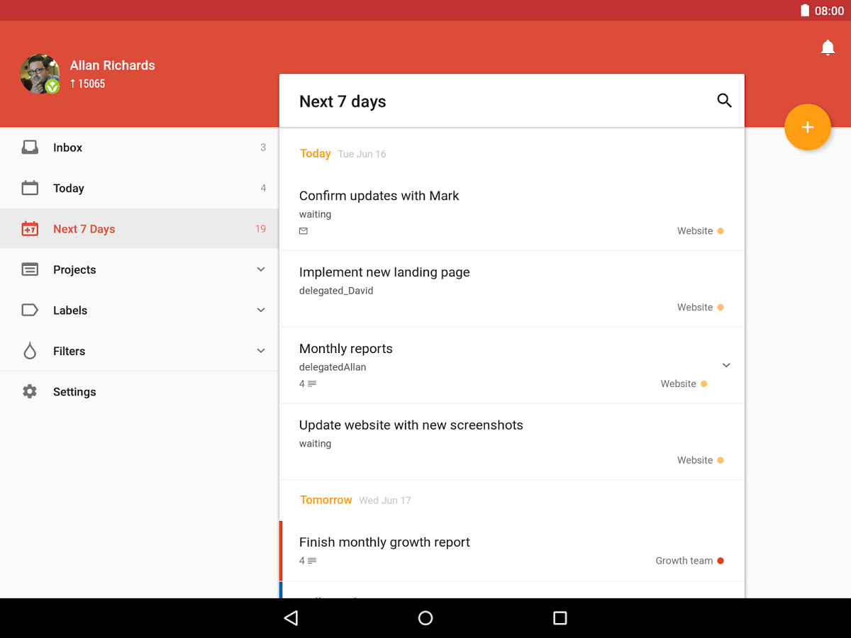
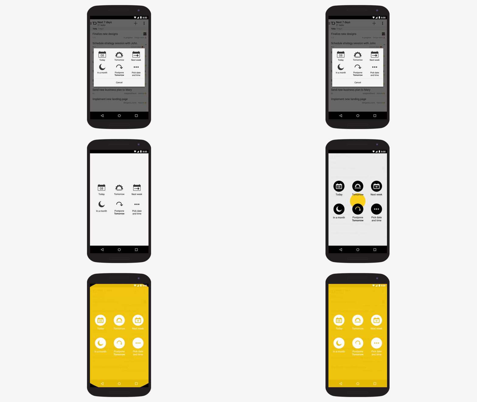
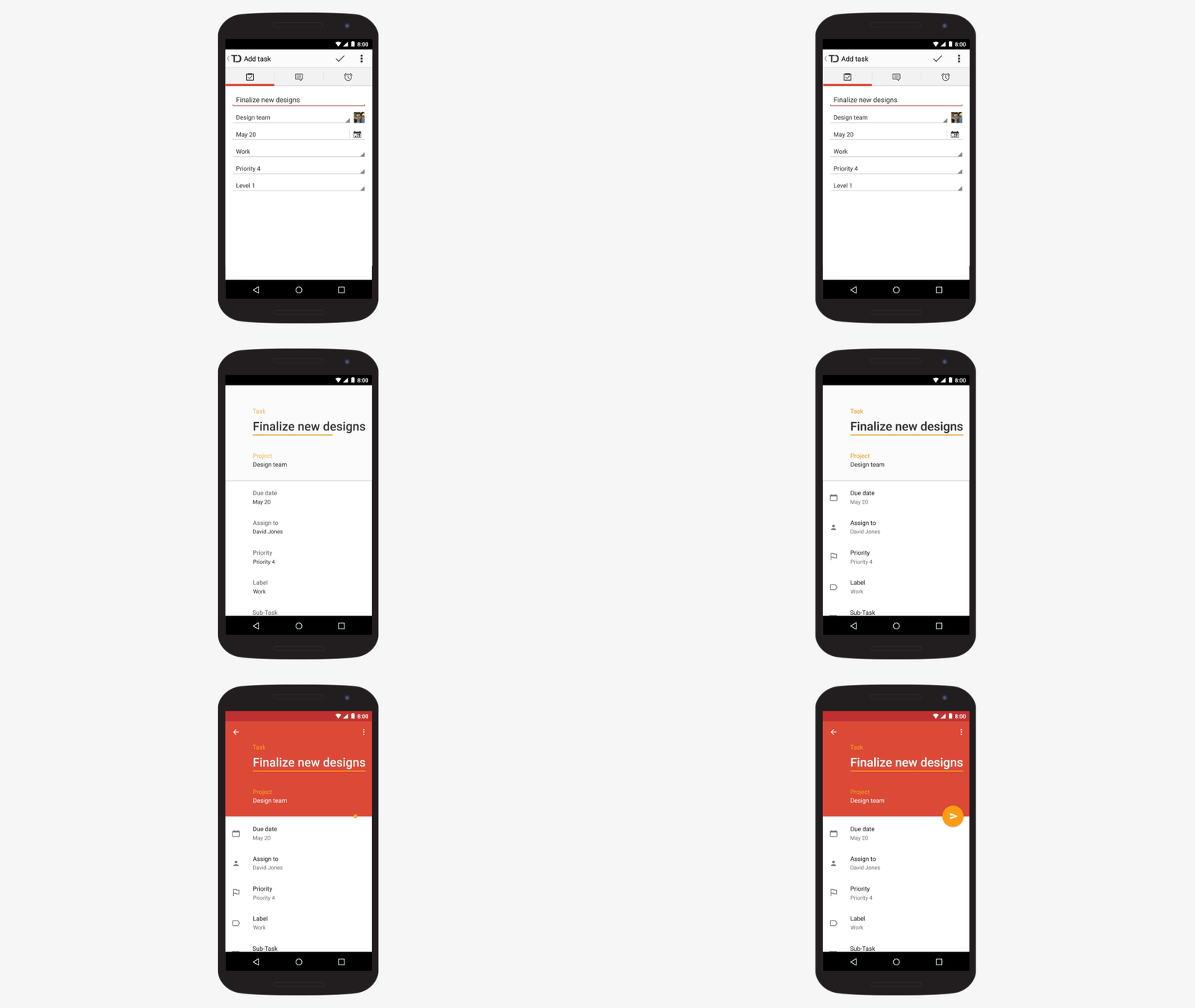
The first major feature is obviously the visual overhaul itself. Not to overstate things, but this is a significant departure for the app in terms of its look and feel, so much so that it’s best to let images do the talking. Check out the GIFs below to get a handle of how much the app has changed. The company says it took Material Design’s mantra of “focus on the user and all else will follow” to heart and it shows.
 Functionally speaking, there are several helpful new enhancements. First and foremost, there are new gestures to help with navigation. Swiping a task to the right will mark a task as done. Whereas swiping one to the left lets the user schedule it for later. In the completed tasks view the same swiping interaction will unmark a task as done or delete it.
The app also features a much improved data parsing algorithm. It’s able to work complex through inputs like “do yoga every day at 7am starting today and going until November 23.”
 Finally, in a feature squarely targeted at people like me that colour code their Gmail labels to help with organization, it’s possible to use a coloured theme to differentiate between different to-do lists. There are several more features, so make sure to check out the app to see all that’s new.
Both Dropbox and Todoist can be download from the Play store.
MobileSyrup may earn a commission from purchases made via our links, which helps fund the journalism we provide free on our website. These links do not influence our editorial content. Support us here.


