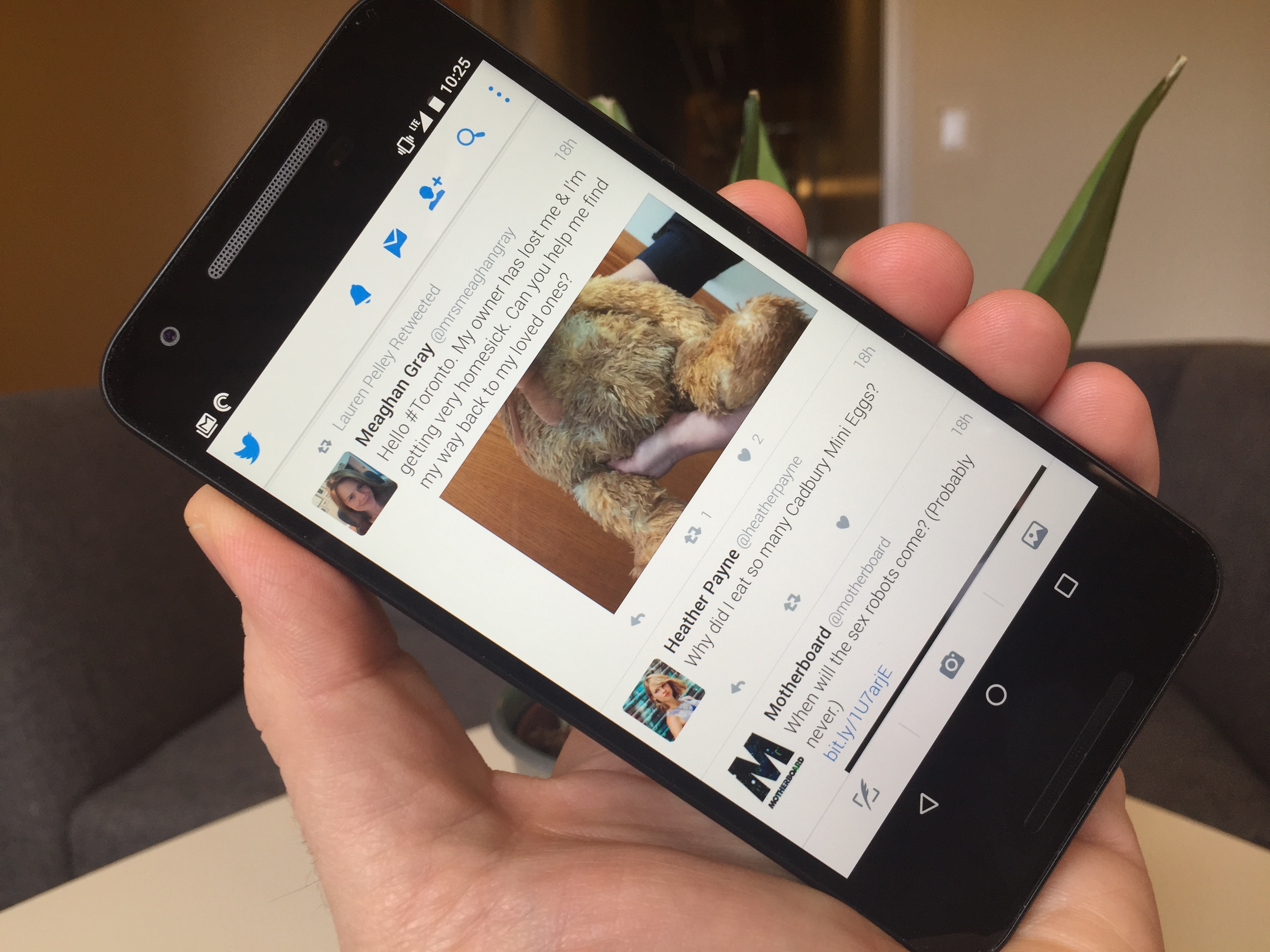
Some Twitter users have started sharing pictures of a new app design the company is currently testing on Android smartphones.
https://twitter.com/HeyMarkL/status/720609922942169090
The new design is simplified with four main columns at the top of the page to choose from: home, moments (the area where users can see what is currently trending), notifications and direct messages. Above those columns is a circular thumbnail with the user’s profile picture. When clicked, it opens a side menu on the left with links to their profile, lists, accounts, settings, highlights and a find people option.
As it stands now, the Twitter app has three columns at the base for writing tweets, taking pictures and opening up your photo gallery. At the band at the top of the app, there are buttons for moments, notifications, direct messages and search.
Twitter has not yet revealed whether or not it will roll this new design out to the public.
Related reading: Twitter Moments is now live in Canada
MobileSyrup may earn a commission from purchases made via our links, which helps fund the journalism we provide free on our website. These links do not influence our editorial content. Support us here.


