The Galaxy Note 4 is perfect.
It’s not a perfect smartphone, nor a perfect phablet, but a perfect distillation of what Samsung has been working on creating for the past three years. The Galaxy Note 4 is a perfect Galaxy Note.
But as other manufacturers clamber to catch up to Samsung in both device size and market share, does a perfect Galaxy Note do enough to differentiate itself from last year’s still-excellent offering, or those of its competitors? Let’s find out.
Specs
- Android 4.4.4 KitKat w/ TouchWIZ Flat
- 5.7-inch 2560 x 1440 pixel QHD Super AMOLED display (515ppi)
- 2.7Ghz quad-core Qualcomm Snapdragon 805 SoC / Adreno 420 GPU
- 3GB RAM / 32GB internal storage
- 16MP rear camera w/ optical image stabilization (OIS), 1/2.6″ sensor, 1.12 µm pixel size, F2.2 lens
- 3.7MP front-facing camera, F1.9 lens
- WiFi (a/b/g/n/ac) MIMO, Bluetooth 4.1 LE, GPS {A-GPS, GLONASS, Compass}, NFC, USB 2.0, MHL 3.0, IR Sensor
- Fingerprint sensor, heart rate monitor, Oxygen saturation sensor (SpO2)
- 3,220mAh removable battery (Adaptive Fast Charging & QC2.0)
- 153.5 x 78.6 x 8.5mm
- 176g
- 3G: 850, AWS, 1900, 2100 MHz
- LTE: Band 1, 2, 3, 4, 5, 7, 8, 12, 17, Cat 4 150/50 Mbps
Design & Display
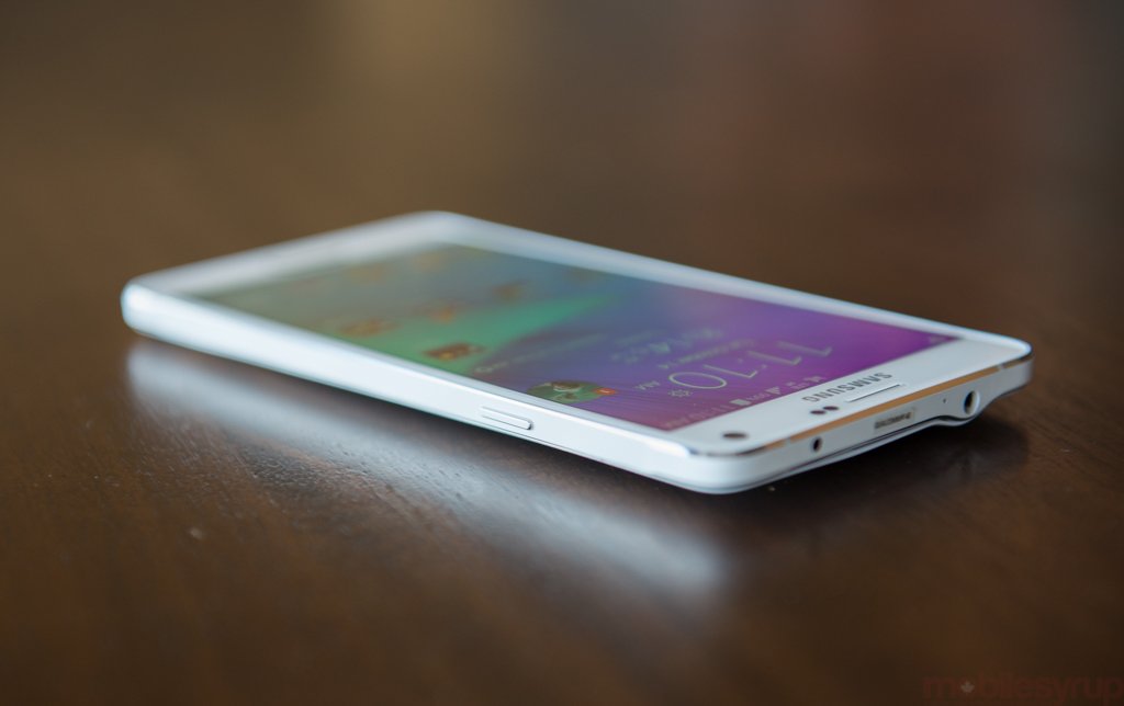
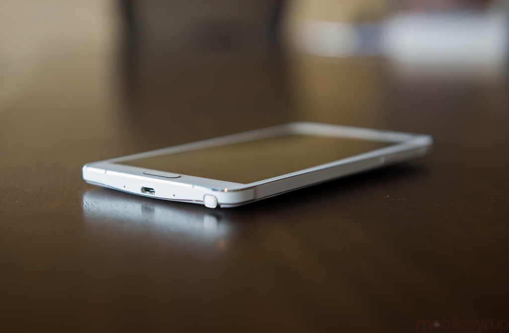
We’ve already looked at the metal-framed Galaxy Alpha, but this year’s Note is the first mainstream flagship device from Samsung with a hunk of aluminum.
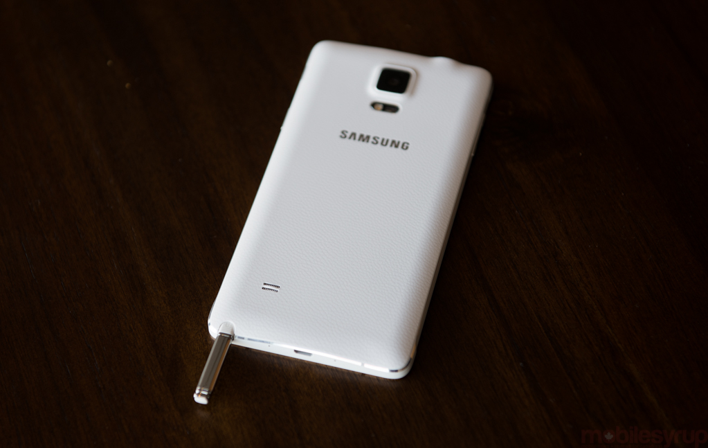
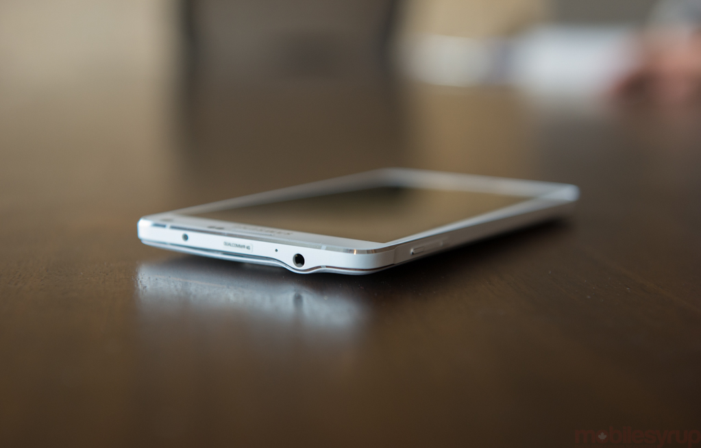
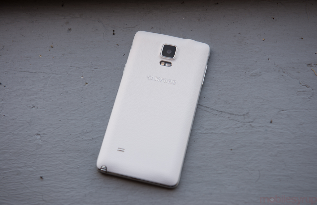
Both devices share a similar focus on clean lines and chamfered edges, a design element that gained acclaim in 2012 on the iPhone 5. But the Note 4 does not maintain a clean profile, preferring to roll with the hills and valleys of its various ports. Samsung still employs plastic on the rear, but the faux leather exterior not only feels less artificial but lacks the egregious fake stitching found on the Note 3.
In fact, everything I disliked about the Note 3’s design has been updated here. The chrome plastic bezels are now solid white or black metal; the power and volume buttons crafted alloys; the camera bump more gradual. The Note 4 looks awfully similar to its predecessor, but it’s immediate upon picking it up that this is a new generation — a new era — of Samsung smartphones.
The Note 4, while taller than the Note 3, is nearly 2mm narrower, making it easier to grip in one hand. This is still not a one-handed device, though as we’ll see in the next section Samsung continues to maneuver around this issue with mixed results. It’s also slightly heavier, but the heft is necessary — the Note 3 felt awkwardly light for such a large product.
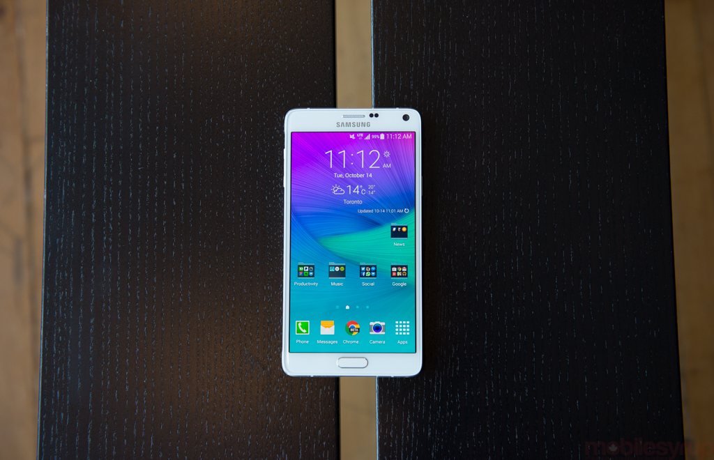
I had no complaints about Note 3’s screen, either — it was, and still is, one of the best AMOLED displays — but the Note 4 ratchets up the resolution at the expense of very little.
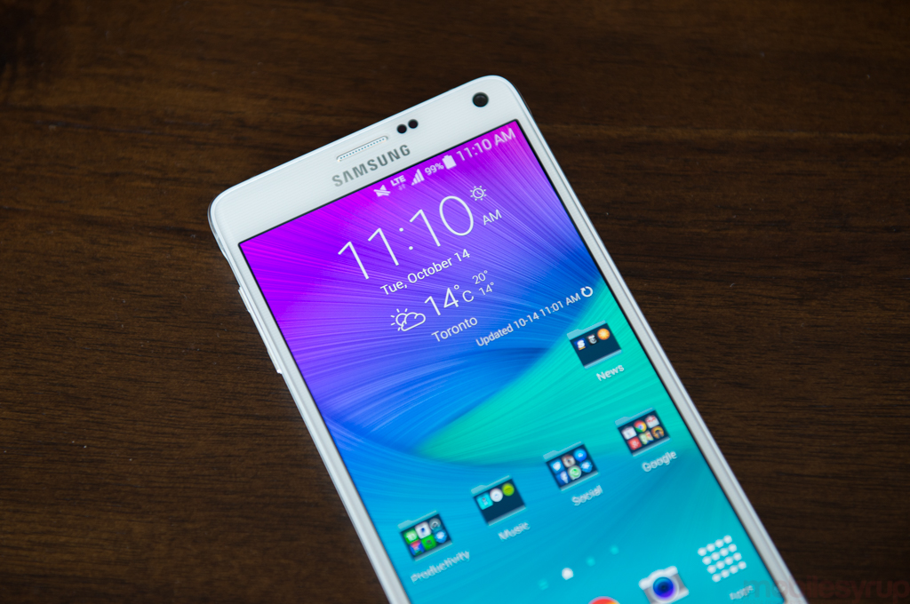
I had qualms about LG’s choice to use a 2560×1440 pixel LCD panel on its G3, but there are no similar reservations here. Samsung not only managed to achieve nearly perfect calibration, within the confines of AMOLED’s over-saturated nature of course, but max brightness is comparable to the Full HD display on the Note 3. It’s not quite iPhone 6-levels of brightness — still one of AMOLED’s weaknesses — but in all other ways the Note 4’s screen is incredible.
Samsung admitted to us that the Galaxy S5 was a misstep in design, water ingress protection and all — a misstep that, in many ways, prompted the worldwide release of the Galaxy Alpha. Not only did Samsung do away with the under-utilized USB 3.0 port of the Note 3 and GS5 but the company saw an opportunity to refine nearly every facet of the Note’s design in moving from plastic to metal. What we have is, as I said in the introduction, a perfect distillation of the Note series’ ideology.
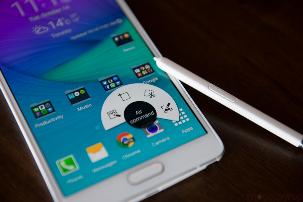
The S Pen, which is physically identical to the Note 3’s, communicates with the Wacom Digitizer’s 2048 pressure points, double that of the previous two generations (and ten times that of the original), making note-taking and sketching about as close to natural as you’re going to find on a digital canvas.
Performance & Battery Life
The Note 4 is one of the first devices on the market, and the first to launch in Canada, with Qualcomm’s new Snapdragon 805 SoC. While the four CPU cores are still based on the same Krait architecture (manufactured on a 28nm process) that debuted in 2012, some improvements have been made, and maximum clock speed has been boosted to 2.7Ghz.
Using AnTuTu benchmark as a base, the Snapdragon 805 offers around a 10% boost in performance over the Galaxy S5’s S801, affected by higher clock speeds in the CPU and a new GPU.
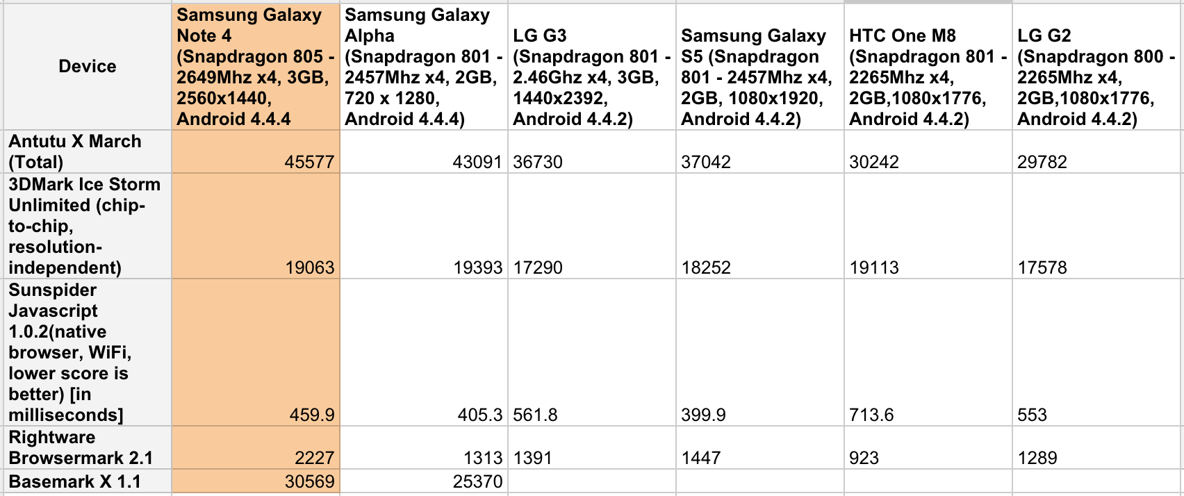
Delving into the specifics, we find that the Adreno 420 GPU performance is roughly 15-30% better in certain benchmarks over Snapdragon 801’s Adreno 330, thanks to a wider memory bus and faster clock speeds. These performance improvements are not noticeable in everyday use — the Note 3’s Snapdragon 800 is still plenty fast — but through our fortnight of use we found the Note 4 generally more responsive.
We’ve clearly reached the end of a very mature chipset design lifecycle; Krait has been good to us, but we’ll have to wait until next year’s 64-bit Snapdragon 810 before we see hearty CPU speed improvements and accompanying power savings.
I was also concerned that due to separation of the Snapdragon 805’s CPU/GPU/memory from its modem chip — we haven’t seen such a design since the Snapdragon S4 Pro — power consumption would be higher than last year’s model, but thankfully I was wrong. Well, partly wrong.
There is a nominal increase in idle power consumption over an SoC with an integrated baseband, but it is largely offset by the inherent efficiencies of the Krait 450 CPUs themselves, which benefited from serious battery improvements from the second-revision Krait 400 chips found in the Snapdragon 801. Confused? Don’t be: the Snapdragon 805 is, despite consuming a larger surface area, still relatively power efficient.
All this plus-minus has an neutralizing affect on the battery. In fact, battery life is around 30% better than the Note 3, despite having a battery that is practically identical in size. In our video looping test, which normalizes the brightness to 200 nits and loops a video while the device is connected to WiFi, the Note 4 ran just over 11 hours, compared to the Note 3’s 8.5 hours.
In our subjective usage tests, where I used the Note 4 to perform daily tasks, from checking email to refreshing feeds to playing some Threes, the device lasted well over 24 hours. I never quite managed the “two days-plus” some others have claimed, but that’s why battery stats continue to be the most difficult of all smartphone benchmarks to pin down — there are just too many variables. Suffice it to say, the Note 4 will last a whole lot longer than the other QHD device on the market, the LG G3, and should thoroughly beat any other Android device short of the Huawei Ascend Mate 2. The only other phone that beat the Note 4 in our mixed use battery tests is the iPhone 6 Plus, which lasted well over 40 hours.
The victory doesn’t pack the wallop the Note 2 or Note 3 had over its competitors, but that’s due to the general trend of shipping higher-capacity batteries inside larger flagships running more efficient chips. Or, in short, every high-end smartphone has a huge battery and a Snapdragon.
The takeaway here is this: if you’re a power user who doesn’t want to worry about charging your phone even once throughout the day, the Note 4 is a good candidate, alongside the HTC One M8, Sony Xperia Z3 and iPhone 6 Plus.
Software
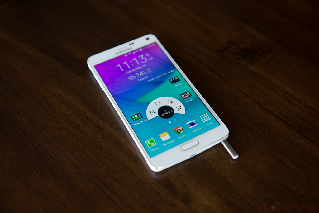
TouchWIZ still has those awful, awful bubble touch sounds enabled by default. You’ve definitely heard them, likely in the background while sitting on a bus or enjoying a coffee at the local Tim Horton’s. Samsung still thinks people want to hear whistles for notifications or bubbles for screen taps. Well, they don’t.
I’m grateful, though, that the touch sounds are the most egregious of Samsung’s missteps in the software department. In fact, once known for piling on feature after godforsaken feature, the OEM has shown a modicum of restraint with the Note 4. Continuing a trend we saw on the Galaxy S5, this year’s TouchWIZ is flat and, dare I say it, attractive. Screen animations are gloriously smooth, and aside from the multitudinous superfluous menu items, the Note 4 is relatively easy for a newcomer to use.
During our briefing, Samsung told us something that made us exceedingly happy: it is discontinuing its attempts to recreate features Google already offers, such as a separate app store and media hub. While Galaxy Apps will continue to be bundled on Samsung’s devices, it will focus on offering software that has been specifically modified for the Samsung experience, such as Autodesk’s Sketchbook for GALAXY. And you’ll be happy to know that ChatON, Samsung’s failed messaging experiment, is no longer bundled with its devices.
Galaxy Apps houses Gifts and Essentials, two portals Samsung hopes will continue to separate it from other OEMs by offering value on top of just the basic Android experience. Users get three months of free Evernote Premium, for instance, and six months of Wall Street Journal. While these things are not new to the Galaxy experience — they arrived alongside the Galaxy S3 — Samsung is putting more emphasis on them by removing the cruft in the periphery.
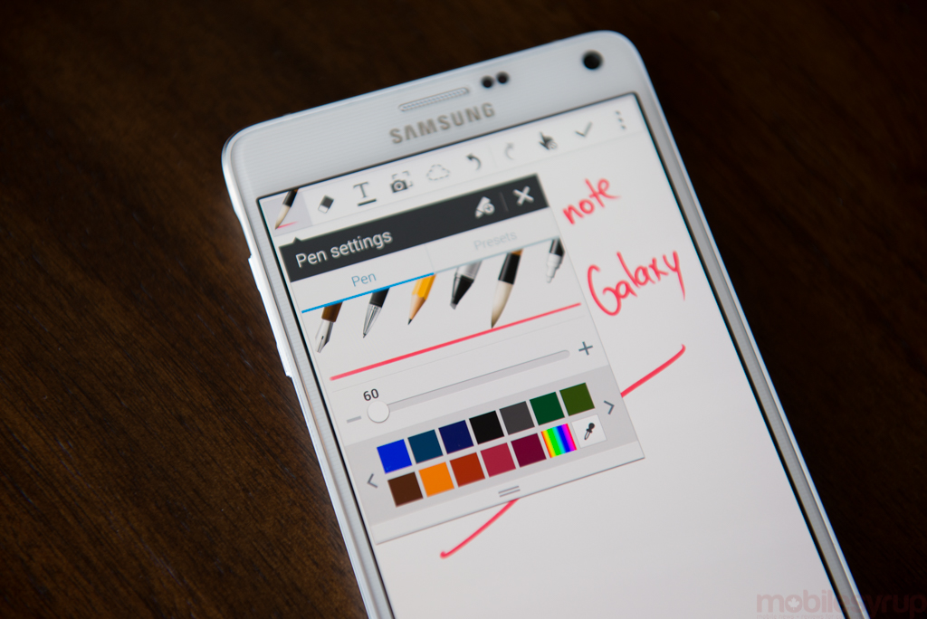
A good example of this new-found focus is the S Pen, Samsung’s ubiquitous stylus that now comes with 2048 points of pressure sensitivity. Samsung has simplified the number of features that stare back when the pen is taken out of its holster, consolidating some and revising others. Action Memo is still a clear focus here, allowing users to take a quick note from anywhere and either save it to Evernote or paste it, like a sticky, to one’s homescreen.
In the original two Galaxy Notes, I was ambivalent about the S Pen: while a curious addition, it just wasn’t very accurate, and therefore wasn’t very useful. It was on the Note 3 that I finally began to take advantage of its input precision: taking notes in a meeting, for example, appears far less rude than tapping away, which can be misconstrued for zoning out.
For note-taking, sketches and annotations, the S Pen is extremely useful; those creatively inclined may find it more valuable still. See, fingers are fat blobs of skin, and humans have habituated themselves to rely on prediction and autocorrect rather than enter something right the first time. The S Pen allows me that precision when I want it — on a less fragile, cloud-enabled digital canvas — and the Note 4 allows me the ability to resort to fat thumb typing when I don’t.

Now let’s talk about the Note 4 as a one-handed device. Samsung wisely decided not to increase the size of the Note 4’s screen, figuring that anything over 5.5-inches or so is a two-handed proposition.
But the company has been working to make its larger devices more accessible for some time, and with the Note 4 there are numerous ways to achieve that. Not only can the entire OS be shrunk down, with disastrous aesthetic effect, but individual windows can be, too, merely by swiping diagonally from the top left of the screen.
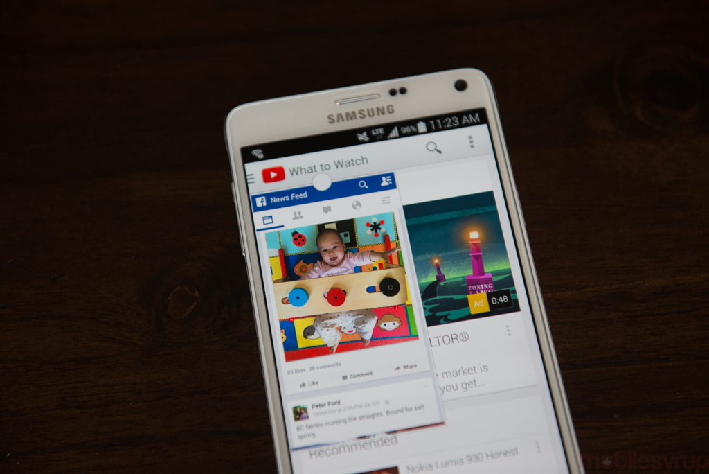
The scene above is an example of how Multi Window has evolved to fit the needs of Samsung’s user base. Want to scroll through Facebook while watching a YouTube video in portrait mode? You got it. Browse the web fullscreen while keeping an eye on a Hangouts window? No problem.
Traditional bifurcated Multi Window is still alive and well, accessed by holding down the capacitive back button, but it’s no longer the only way to do it.
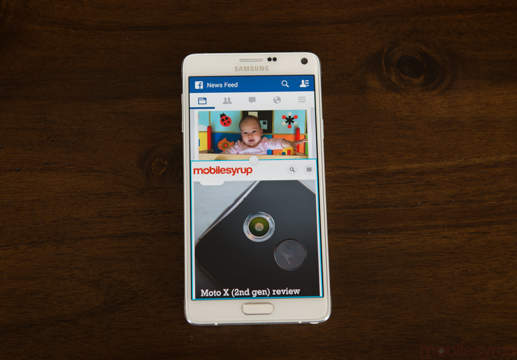
Further, individual apps can be minimized, Chat Heads style, to sit on top of any window, making it particularly easy to keep track of important conversations. The problem is that these disparate multitasking methods sit in contrast to Android’s perfectly capable bidirectional system of notifications and app switcher. Samsung’s multitasking and one-handed solutions are certainly admirable, but none are particularly innovative, and all potentially foster confusion and frustration, especially when one can easily go from split screen to resizable window to Chat Head and back very easily.
In some ways, this is Samsung at its best, and what made it so popular: give users every choice by showing no restraint at all. And, of course, none of these multitasking or one-handed modes are mandatory, and are easily ignored, but I wish Samsung would pick something and stick with it, rather than maintaining one method and building two more on top.
Contrast this with Apple’s anemic Reachability solution, though, and you have yourselves two sides of a wide usability chasm. Apple’s iPhone 6 and 6 Plus have a feature that, with a double-touch on the home button, drops the top half of the screen so higher content can be more easily reached. On the iPhone 6 Plus, where it’s needed the most, Reachability doesn’t solve the problem of horizontal content being too far away, and adds two taps to a workflow that many took for granted, by being easily able to reach the top of the display, on the iPhone 4 and 5 series.
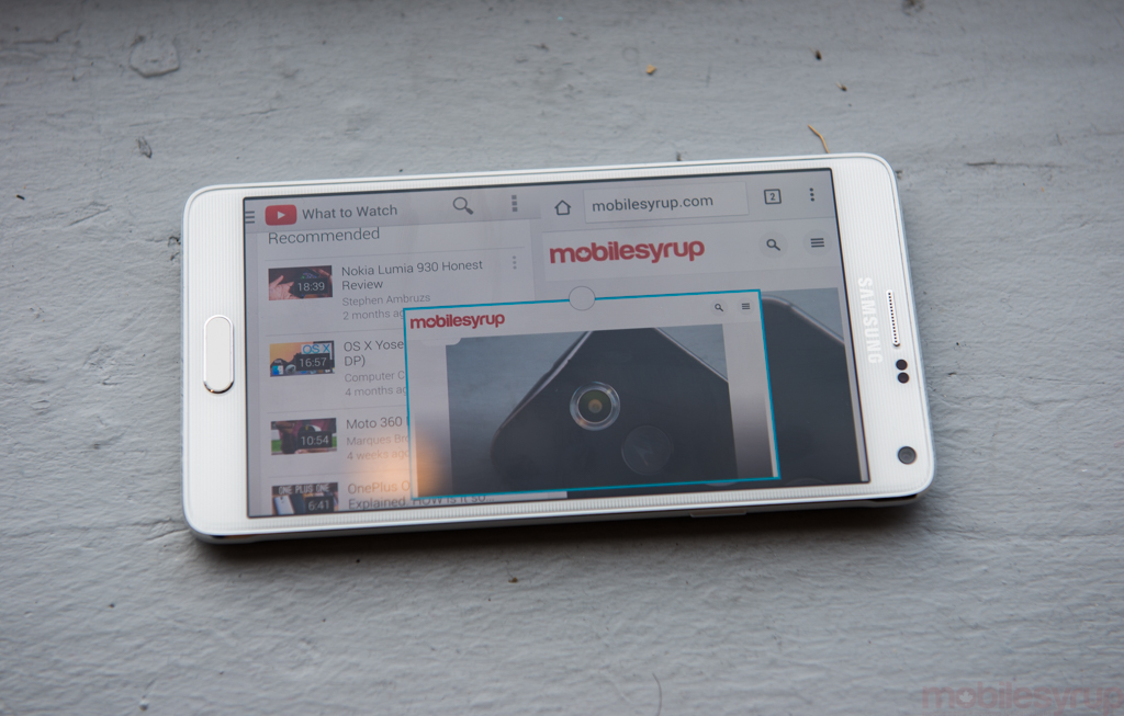
Samsung, on the other hand, sees its hack-and-slash engineering decisions pay off with its one-handed mode. Being able to granularly resize both the entire screen and individual apps makes the Note 4 a much more one hand-friendly device.
The difference is that Samsung tries so hard to convince you the Note 4 is versatile that it loses the aesthetic entirely. With Apple, it’s form over function, and with Samsung it’s the other way around. Neither makes the phone any physically smaller, and both methods frustrate more than they solve, but the Korean company fares better.
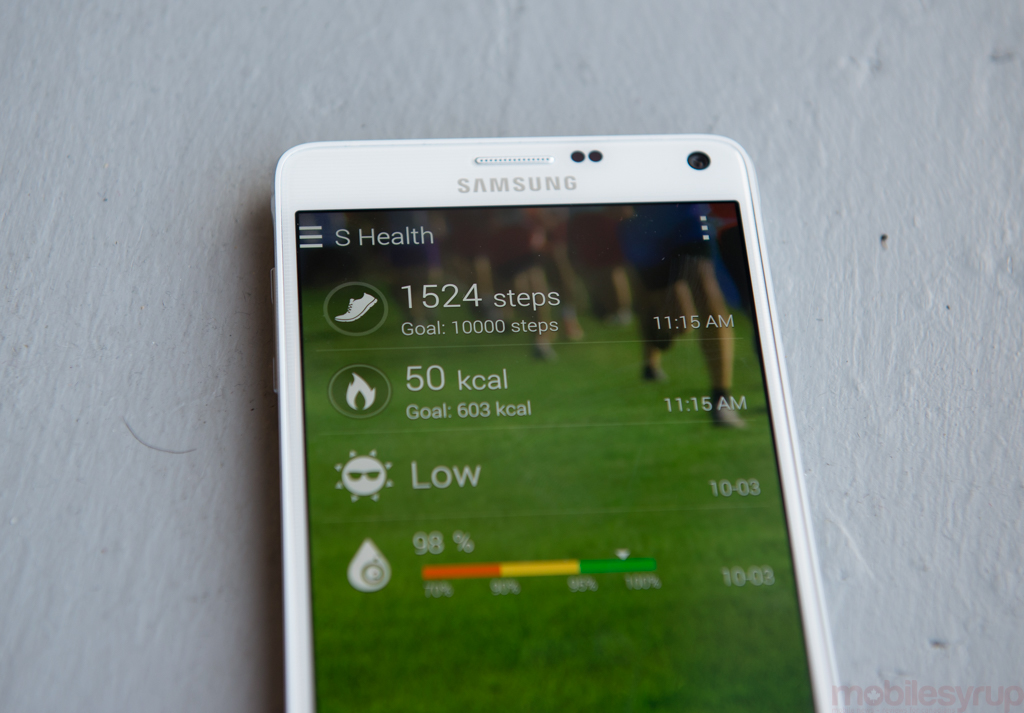
Samsung’s health push continues by adding oxygen saturation and UV sensors to the existing heart rate monitor underneath the camera. It’s admirable that the company is trying to make more useful a feature that, on the Galaxy S5, I found redundant and frustrating, but the Note 4 is not a medical device, and the inclusion of the SpO2 sensor baffles me.
A healthy, active person’s oxygen saturation level should never drop below 98%; an ill person whose SpO2 levels are below that is certainly not going to be using a rudimentary component in a smartphone over a medical-grade device to measure his or her blood oxygen levels.
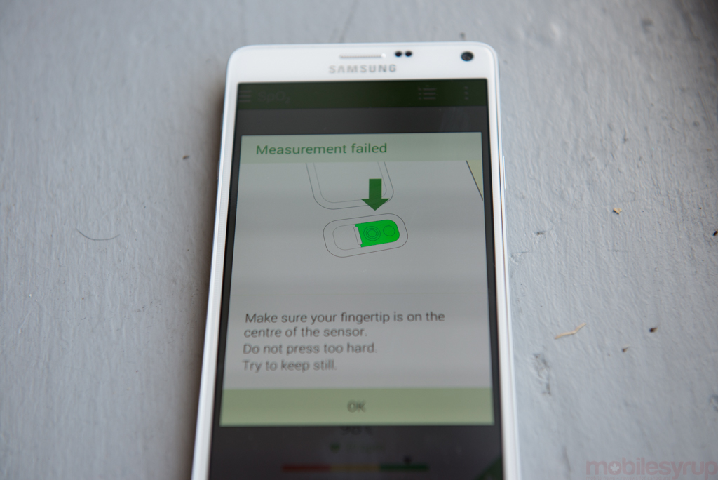
If, for some reason, one uses it for fitness, he or she is met with the same usability issues as before: it doesn’t work while moving, or with sweaty digits, or in any situation outside the ideal. More times than I could count the measurement failed and, as seen above, my fingerprint was on the centre of the sensor, I didn’t press too hard and I kept perfectly still.
The UV sensor is slightly more interesting, but the average person doesn’t care if the UV index is five, eight or 10. If they care about protecting their skin against harmful UV rays, they’re likely going to apply sunscreen regardless (at least I hope they will).
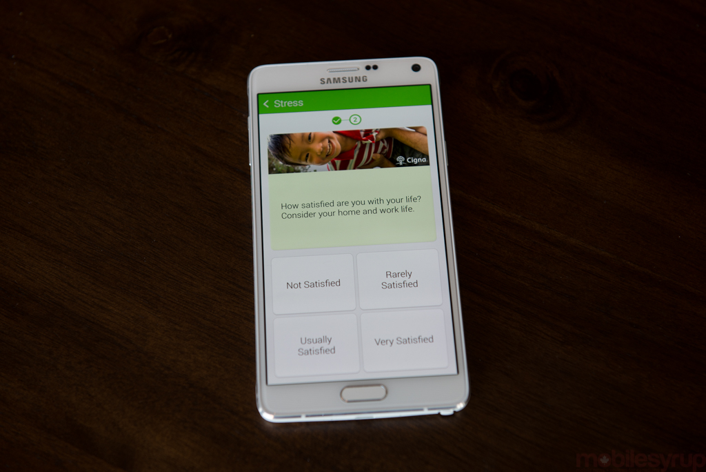
To further muddle the message on fitness, Samsung has teamed up with Cigna, a US-based health insurance company (?) to launch Cigna Coach.
After asking a bunch of questions about sleep and daily exercise and stress (and the above one, my favourite, vaguely patronizing query) Cigna determines your Personal Lifestyle Score in a number of categories, after which it lightly impugns you for not walking, failing to stretch or eating that plate of fries.
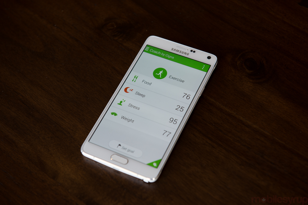
Unlike Apple’s purely quantitative approach to health and fitness (though the Note 4 still counts your steps), Cigna Coach paints a more naturalistic picture of one’s overall health, but speaks in generalities as a result. It’s less useful than nothing at all, but other ecosystems, from Jawbone to Fitbit, do it better and more consistently. This one feels like a half measure.
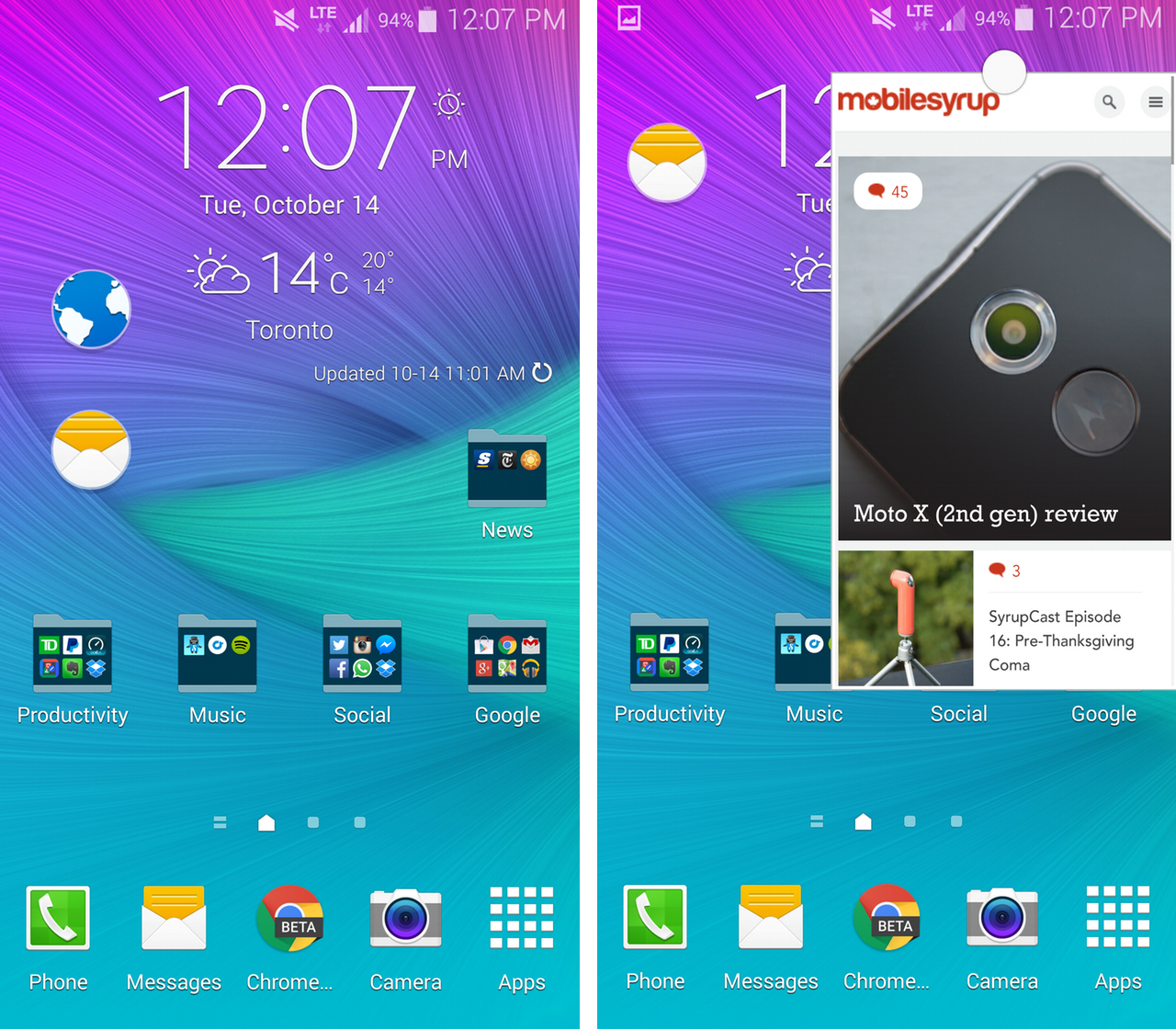
Samsung’s software is still mired by strange decisions (why is it so complicated to create a homescreen folder?) and an abundance of choice. By now, though, you’ll know whether that choice is a blessing or a curse.
Features like the Flipboard Briefing, found on the leftmost pane of the launcher, have been improved over previous versions, but lack the granularity of a native app experience. Others, like the ability to hover over a photo to extract a preview, are so much a part of the Samsung software story that neither the company nor its user base likely notices them anymore. Smart Stay, Air View, Phone Call (OK, the last one is a joke) are flashy monikers for features few people use, but remain in the OS because Samsung wants to please everyone.
If you’re willing to ignore everything superfluous and just use Android as it comes, the Note 4 offers a pretty great software experience. Delve deeper and muddy the waters a little and you’ll either be immensely frustrated or immensely satisfied with all that choice.
Camera
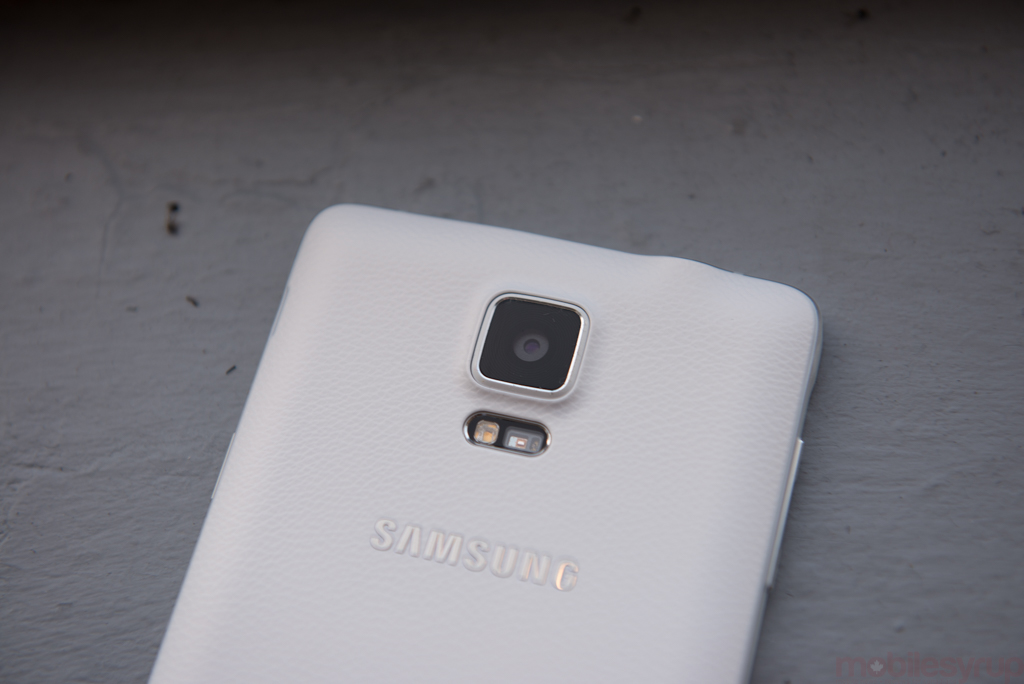
With the same sensor, optics and lens as the Galaxy S5, I wasn’t expecting much change on the Note 4. The 1/2.6″ 16MP sensor proved itself in daylight shots, coming in ahead of most Android devices, and the Note 4 shares, and modestly improves upon, those positive qualities.
As with Samsung’s AMOLED screen, the company has properly calibrated colours captured through the Note 4’s sensor, similar to Apple’s changes on the iPhone 6 and 6 Plus. This means more neutral but accurate colours, which translates into some fantastic photos that can be shared as-is from the phone, but benefit from some post-production in Samsung’s competent editing studio.
With double the number of pixels compared to Apple’s 8MP iSight sensor, the Note 4 captures an incredible amount of detail. It’s clear to see that spacial resolution advantage when comparing the street sign captured at 100% in the gallery below. Samsung also does a great job exposing most outdoor scenes correctly, though it does have a tendency to choose a higher shutter speed than the iPhone and slightly underexpose the scene as a result.
In our low-light tests, the Note 4 performed better than the Galaxy S5 thanks to its optical image stabilization, but the extra pixel count is a disadvantage here: the iPhone 6 Plus lets in considerably more light, and its OIS module appears to keep motion blur in check slightly more effectively than the Note 4. As a result, Apple achieves better results by keeping shutter speed and ISO (light sensitivity) lower, avoiding the graininess that creeps into the Note 4’s low-light photos.
The two phones are evenly matched on indoor photos, with colours coming across a little more vividly on the iPhone 6 Plus, but Note 4 users should be very happy with most captures.
Indeed, the Note 4 is probably the best all-round shooter on Android at the moment. The LG G3 shoots better in low light, and the Xperia X3 captures more detail, but the Note 4 finds the right set of compromises.
Samsung also uses the Snapdragon 805 to great advantage, improving autofocus time and discretely adjusting exposure to shoot photos with better dynamic range than its S801 competitors.
Like most Samsung flagships, there is a bevy of potential photo modes, from HDR to panorama to split-screen shooting (which uses the front and back at the same time), and all sorts of excess, like taking a selfie with the rear-facing camera (HTC has that problem solved).
The HDR mode is particularly good, turning a gloomy, underexposed shot of a building into something more usable.
Speaking of selfies, the Note 4 doesn’t quite go all-out, but it still improves things for the front facing-conscious. The 3.7MP sensor is paired with an F1.9 lens, and the quality is vastly superior to anything we’ve seen from Samsung before. While regular selfies generally turn out just fine, the company has also added something called “Wide-angle Selfie” that acts sort of like a panorama for people. It’s weird, but it works. The only downside is that you’ll probably end up annoying people in the process.
On the motion side, the Note 4 captures excellent 1080p video and beautiful 4K video that, for space considerations, is still limited to five minutes per clip.
We took our trusty iPhone 6 Plus to the streets of downtown Toronto for a little OIS tête-à-tête and came away a little disappointed with Samsung’s stabilization. The iPhone simply captures smoother, better video. Each ‘clomp’ of my boot resonated through the Note 4, disrupting the video; with the iPhone you only see unperturbed movement.
Still, the Note 4 takes wonderful video at both 1080p and 4K, and I was impressed with the camera’s overall performance in most scenarios.
Connectivity
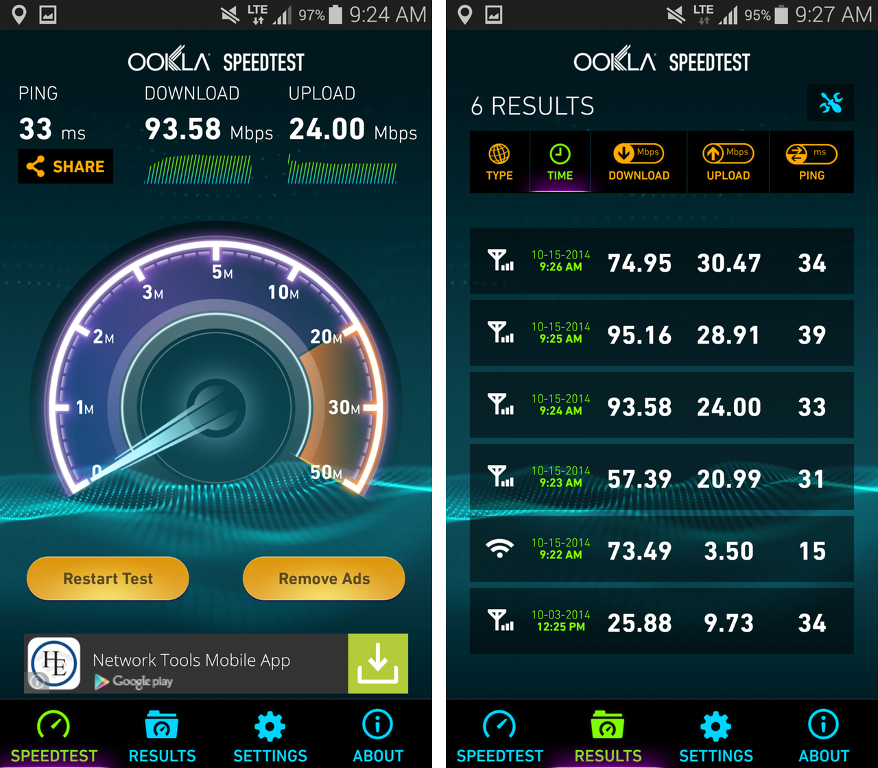
Like the Galaxy S5, the Note 4 doesn’t skimp on LTE bands: the device supports 150Mbps in the downlink on Band 7, which is great news for Rogers and Bell customers, and I was able to reach nearly 100Mbps on some lesser-used nodes.
Generally, the Note 4 was a competent phone — you know, to make calls — but its heft and size, along with the sharp chamfered edges, made it uncomfortable to hold for too long. Sound quality from the headpiece was good, but not great, and the anemic speaker in the back continues to be a sore spot for Samsung, especially since smartphone sound is a focal point for competitors like Sony, HTC and Apple.
Competition
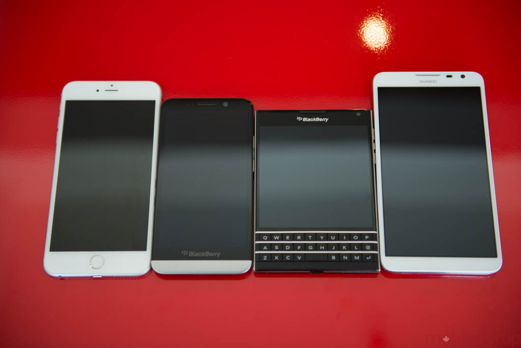
The Galaxy Note hasn’t encountered much competition in the phablet space until recently, but the slow encroachment of larger flagships has forced Samsung to change its strategy.
The Note is no longer a phone for power users or business professionals, but a mainstream product with a slightly larger-than-average form factor. The introduction of the iPhone 6 Plus will inevitably have a halo effect on the 5.5-inch-and-larger smartphone market in general, and customers will no longer scoff at the Note for its stature, since the iPhone is actually larger.
The Note 4 does a great job showcasing not only the strengths of Samsung’s vertical integration — its screen quality and battery technology in particular — but Android, too. As Apple struggles to adapt iOS 8 to suit a larger form factor, the Note 4 reinforces Google’s open Android strategy, with its apps-on-apps extensibility. iOS still has an edge in app quality, and perhaps it always will, but the Note 4 is nothing short of the poster child for the high-end Android market.
Of course, the Nexus 6 muddies the waters somewhat, as the device marks Google’s entry into the phablet space. Many were expecting a price more akin to last year’s Nexus 5, so the $749 entry point will force customers back to the carrier store, where the Note 4 can be compared side by side with similarly subsidized pricing.
And with Sony about to launch its latest smartphone salvo with the Xperia Z3, and HTC, LG and others pushing their interpretation of flagship, there’s no wrong answer in the smartphone space today. The Note 4 is the best of the big phones, though — Samsung made sure of that.
The major issue is price: at $300 subsidized and $800 outright, the Galaxy Note 4 is expensive, both on contract and without. It’s therefore an investment, which is aligned with Samsung’s strategy of offering decent products in every market segment.
But this is the new reality in Canada: want the best? Pay for it.
MobileSyrup may earn a commission from purchases made via our links, which helps fund the journalism we provide free on our website. These links do not influence our editorial content. Support us here.

