
Google+ for iPhone has always been the also-ran of the company’s mobile apps: Android seemed to get new features first, and had design priority. The tides have turned, at least in the short term, as Google has released a significant update to the social media app on iPhone first. To be fair, the equivalent Android update is coming “in a few weeks, with a few extra surprises,” but that doesn’t lower the significance of today’s update.
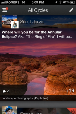
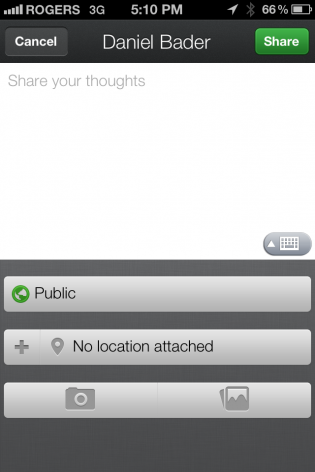
So, what do we get? Besides a darker overall milieu, the app has prioritized image quality, upped the crispness of text and profile photos and has a pleasantly beautiful interface. The app looks nothing like its forebear — this could be a completely different social network but for the pre-populated Circles and inconsistently-aggregated Twitter content — and that’s a good thing. The app takes advantage of the iPhone’s high-density Retina display, and care has been taken to ensure that the user experience is optimized for iOS.
Posts within a particular circle fade into existence from the bottom of the screen, and text is now overlaid on top of much-larger images. If this is the direction Google is taking Google+ — more Tumblr, less Facebook — I think it’s the right move.
Check out the updated Tumblr Google+ for iPhone in the App Store.
Via: Google Official Blog
MobileSyrup may earn a commission from purchases made via our links, which helps fund the journalism we provide free on our website. These links do not influence our editorial content. Support us here.


