Electronics retailer Best Buy announced today that it’s changing its iconic price tag logo design into something more modern.
The new logo changes the font colour from black to white and moves the letters out of the yellow price tag. The yellow tag is still part of the logo, but it’s now hanging off the edge of the words instead of housing them.
The updated logo is part of a new marketing strategy on Best Buy’s part, one that company hopes will be “conversational” and “inspiring.”
While I’m not sure that many people are looking to Best Buy for inspiration, the new logo does look a little more modern, which is probably a step in the right direction for the company.
So far, Best Buy Canada hasn’t updated its Canadian online store with the new branding. MobileSyrup has reached out to Best Buy Canada for comment.
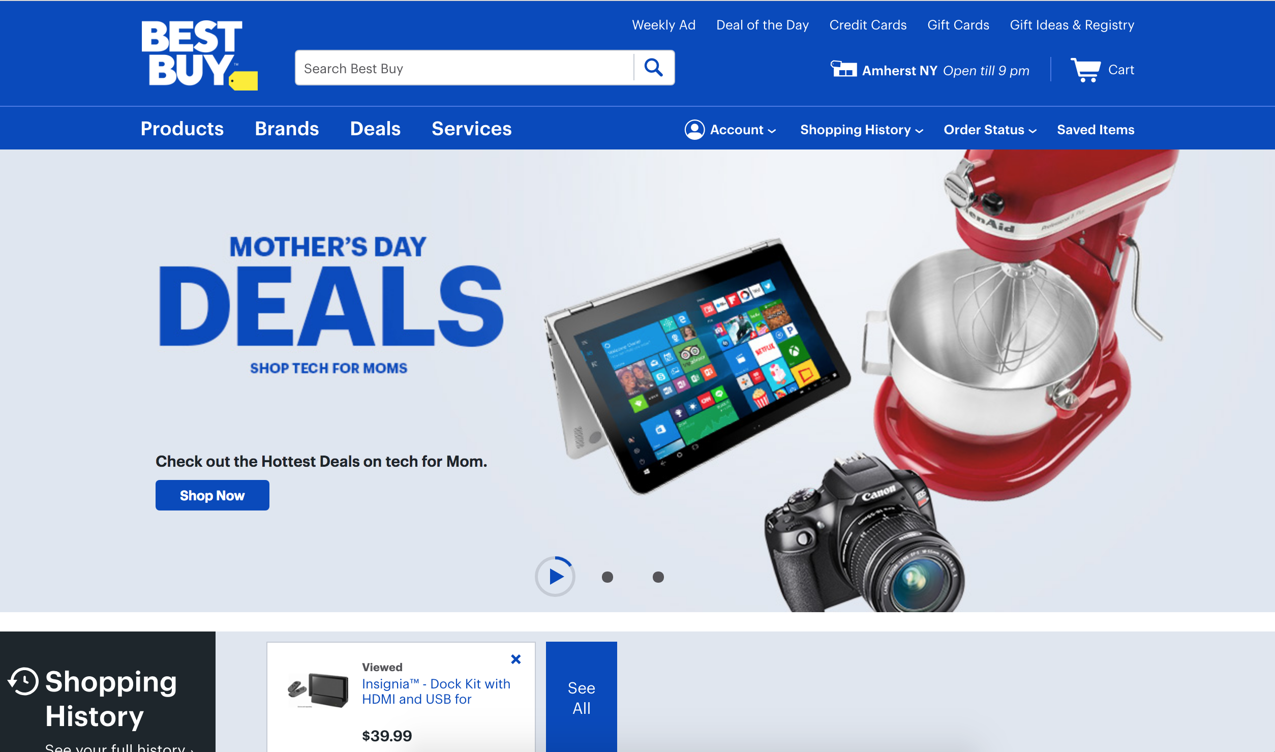
The updated BestBuy.com website.
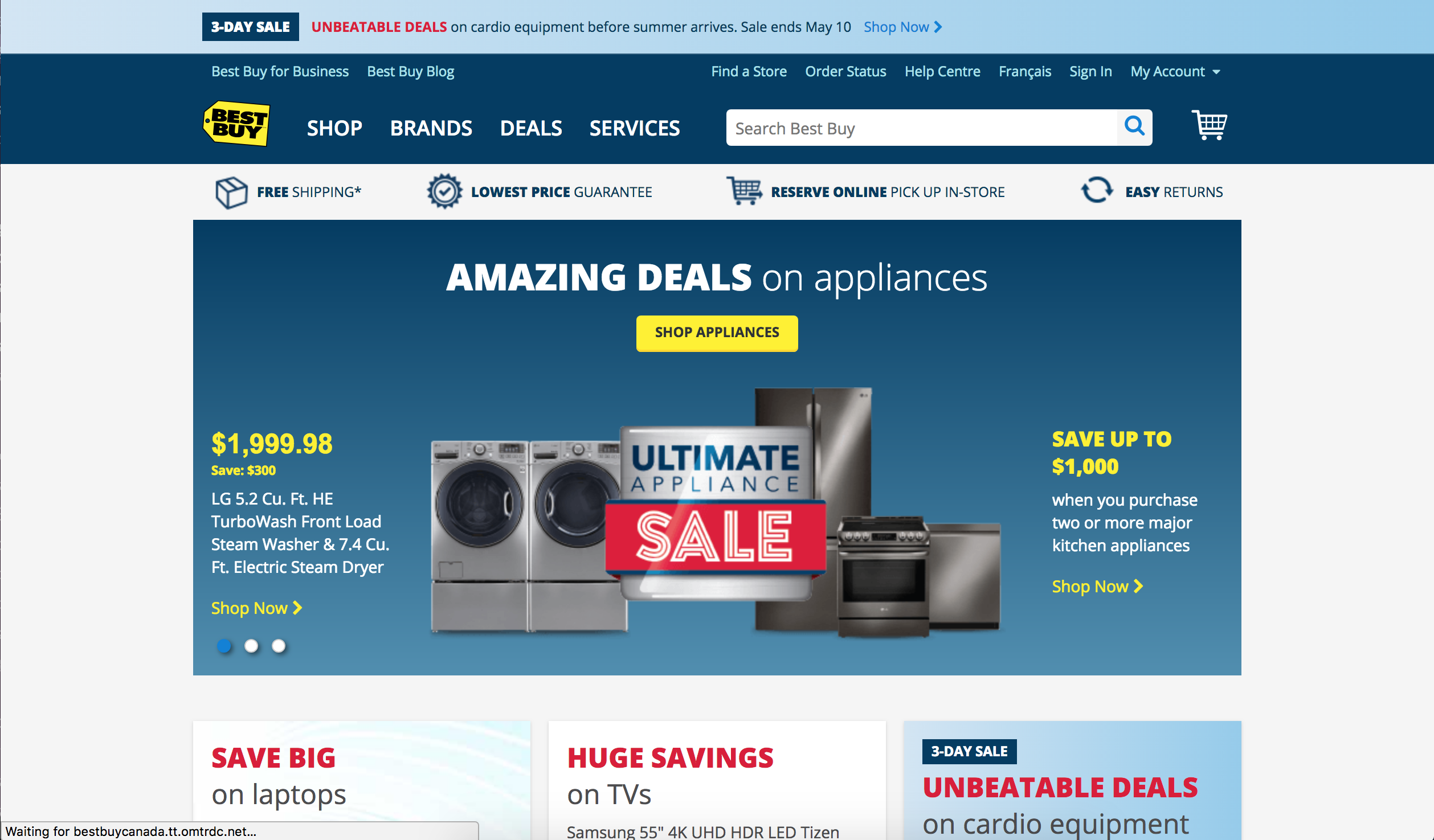
The old Best Buy.ca website.
Source: Best Buy
MobileSyrup may earn a commission from purchases made via our links, which helps fund the journalism we provide free on our website. These links do not influence our editorial content. Support us here.
