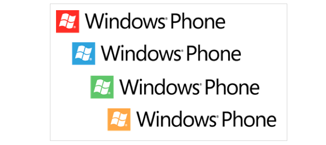
Microsoft first unveiled their new Windows Phone 7 OS back in October of last year, this brought on a complete re-vamped mobile experience along with a new circular “Windows Phone” logo. Now Microsoft has scrapped the circle and officially updated their logo with a simple square that compliments the “Metro” tile look. This new look was slightly introduced last week when Microsoft announced several new Windows Phone 7 partners, and beta users of the upcoming “Mango” OS have stated this square design is what’s on the boot up animation. All in all it’s consistent with their direction… what do you think of it?
Source: WPCentral
Via: Shinobu Takahashi’s MSDN blog
MobileSyrup may earn a commission from purchases made via our links, which helps fund the journalism we provide free on our website. These links do not influence our editorial content. Support us here.
