It’s been awhile since we looked at the “state of Android apps” and how they compare to their iOS equivalents. The situation has improved drastically in the past year or so, with most big-name companies overhauling their Android apps as the quality of development tools improved alongside the visibility of the platform.
In the first part of this series, we’re going to look at seven popular apps from major startups. These are all free apps for services that are either offered without fee, or in the case of Evernote, as a “freemium” model. The impetus for this post came from my transition to Android from iPhone, and the realization that there are fewer “core” experiences I miss going from Apple to Google. In the second part of the series, we’ll look at the areas in which Android finds itself at a disadvantage, namely “exclusives” such as Letterpress, Vine and Tweetbot, as well as some smaller brands that have yet to really take Android all that seriously.
The takeaway from this brief experiment is that, in most ways, the feature sets and performance of each Android app listed here is identical to its iPhone equivalent. If you’re trepidatious about switching from an iPhone to a Galaxy S4 or HTC One and are happy to search for a few lesser-known equivalents to some high-profile exclusives (for example, Draft for Drafts, Falcon for Tweetbot) you should find yourself without too much angst.
All screenshots below are taken with an HTC One (left) and an iPhone 5 (right).
Rdio
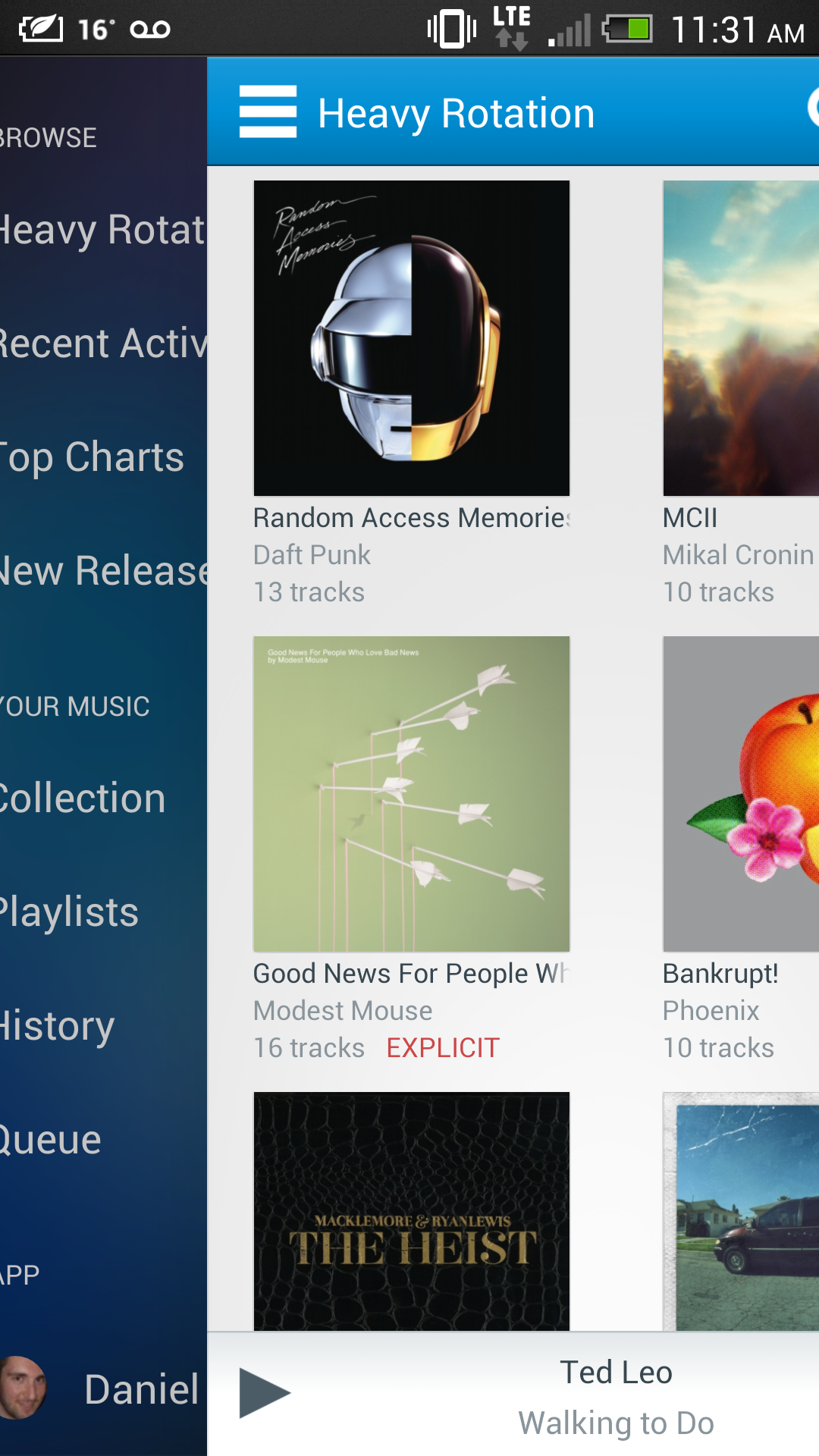
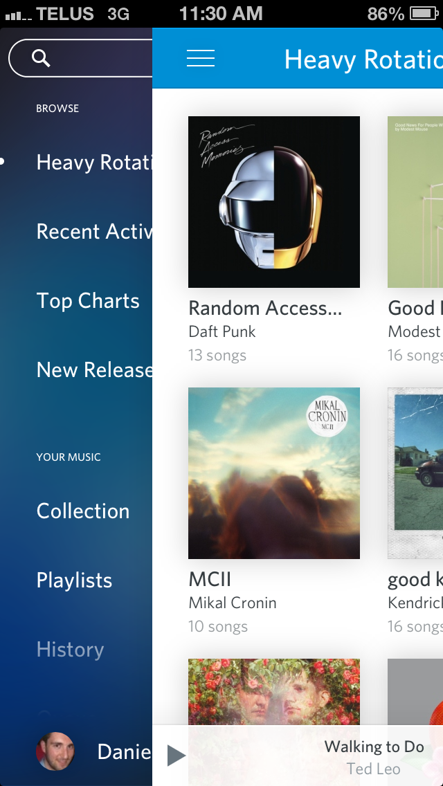
Rdio is a good example of an app that has focused on platform equality through the ages, even on less popular platforms like BlackBerry and Windows Phone.
Recently, the company released an update to both its Android and iOS apps that bring the two within pixels of one another, even using the same left-side control scheme and colour palette between them.
Functionally, the two are the same, though the Android version supports in-line controls through the notification shade. The iPhone version does have a prettier “hold for more” menu — when you hold on an album or song, it takes you to a separate page with a lovely textured background — while the Android version sticks to a simple system popup to add music to your Collection or search for more.
Curiously, the Android version sticks the Search action in the top Action Bar, along with the Refresh icon, whereas the iPhone version employs the popular pull-to-refresh and sticks the Search panel in the sliding menu.
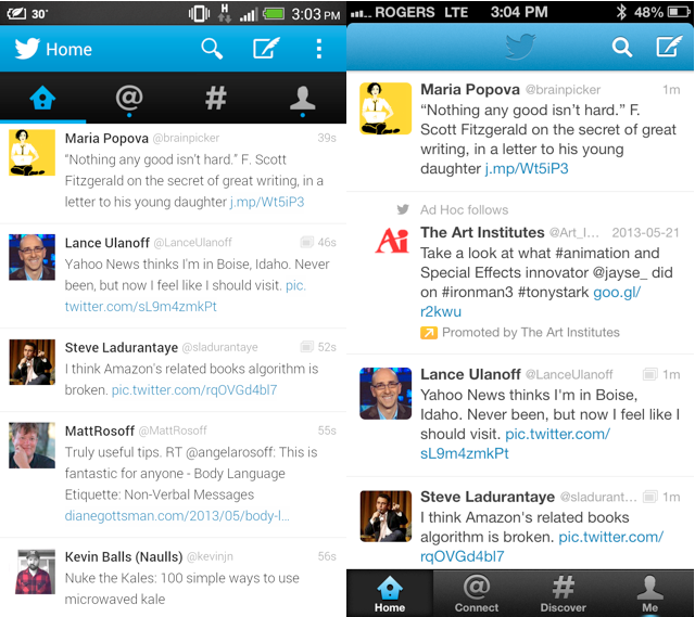
Twitter for Android recently received a pretty significant visual overhaul, bringing a more Google-approved “Holo” look along with an extended Discovery experience. Twitter for iOS remained ahead of its Android equivalent in terms of features and design for a long time, but these days, aside from the lack of an Android tablet version, the two are quite equal.
Android differs in some aesthetic ways, putting the four-button navigation row below the top action bar, where it’s on the bottom in the iPhone app. Twitter also recently added an easy way to switch between accounts on Twitter for Android when it added a three-dot menu button to the app.
Twitter for Android suffers from a few performance issues, especially when inputting text. The situation is vastly improved over a year ago, but we wish the company would put as much effort into making the app run smoothly as it did to overhaul its design.


Instagram for Android does everything its iPhone counterpart excels at, but feels clunkier all the same. It could be something to do with the different camera workflows, which is not quite as intuitive as it is on iOS, or it could be the fact that the app’s design just works better on the iPhone, but Instagram for Android, like Facebook, is in need of a visual overhaul.
That being said, Instagram has taken to updating its Android app around the same time as the iPhone version, and it contains all of the same filters and features. It performs very well on modern Android devices, and was recently updated with a new camera interface, doing away with the traditional cropping feature in favour of a simpler grid-and-snap lens.
Now all we need is Vine.
Flickr


This post was largely inspired by the new Flickr for Android, which did away with the interminable legacy app in favour of a cleaner, more image-focused alternative. Flickr for Android is probably the most unlike its iOS counterpart in terms of navigation, opting for a left-side sliding menu over a permanent five-icon bottom dock.
It takes a little more work to snap a photo in the Android version, as tapping on the camera button at the top right will ask whether you want to take a photo or choose from the Gallery. Once you’ve taken a photo or chosen one or many from the Gallery, both versions allow you to add preset filters or use the integrated Aviary plugin. The main issue with the Android version is that once you’ve selected your photos (which are very small thumbnails) you cannot delete them. You must return to the photo selection screen is choose the photos over again, omitting the one(s) you don’t want. Because the thumbnails are small and hard to differentiate from one another, especially if you’ve taken a lot of similar photos as users are wont to do, this omission is extremely frustrating. The iOS version allows you to hold down your finger on a photo and delete it from the set.
Otherwise the apps are extremely user-friendly, photo-focused (EXIF data is available on both if provided) and relatively powerful. Thankfully, Flickr for Android takes advantage of a user’s native camera app, which oftentimes is superior to the limited built-in versions.
Foursquare

Foursquare has iterated quickly on the designs of its various mobile apps, trying to work with the OS makers directly (in the case of BlackBerry and Microsoft/Nokia) to take advantage of platform-specific features.
Their Android version has gone through some significant changes in the past few months, and is now close in functionality, if not design, to its iOS counterpart. Both apps employ a sliding left menu bar, but the iPhone version’s mainstay check-in icon floats in the bottom middle of the screen, while on Android, likely due to the typically-larger display real estate, the same button is permanently affixed to the bottom left.
The ‘Explore’ sections of both apps have been upgraded together, so various features, such as ratings and filters, work identically. Foursquare even takes advantage of Google’s newest Maps SDK in the Android version, so vector-based navigation is smooth and arguably more accurate than the Apple Maps integration on iPhone


On the surface, Facebook for Android seems to be almost identical to its iOS counterpart, but there are fundamental differences in architecture that make the former a far worse experience.
Even on high-end hardware, Facebook runs poorly on Android, and newer features often roll out for iPhone first. This was true of VoIP calling and a number of other features, but at the end of the day it’s the fact that Facebook for Android still feels like it was built for Froyo-based devices that irks the most.
Whereas so many other apps take advantage of Google’s new design guidelines, and are optimized for newer devices, it seems that regardless of how many cores, how much memory and how fast a connection, Facebook for Android is slow, ugly and unwelcoming.
Perhaps it’s the fact that the company has put so much effort into its (largely-useless) Home launcher — which is surprisingly beautiful and smooth — but Facebook for Android is ripe for an overhaul.
Evernote
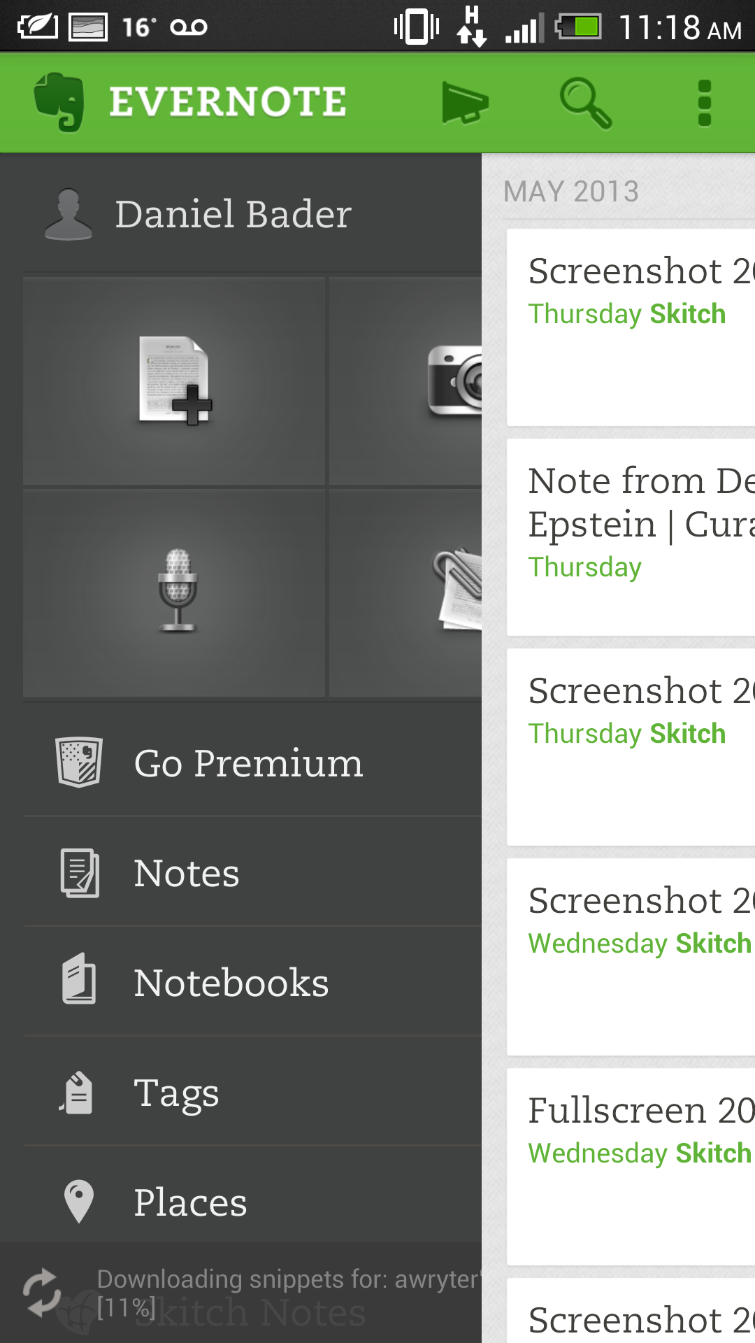
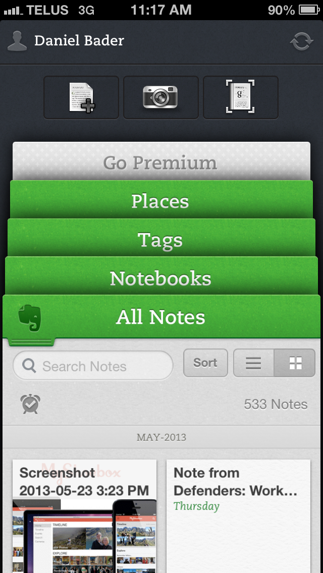
Lastly, Evernote looks drastically different on Android than on iPhone, though the company states it has optimized both versions for their respective users.
It’s hard to see how the Android version is superior in any way, and Evernote has a history of iterating its iOS versions before others — see the main branch of Evernote in addition to Hello and Food — but eventually Android sees these improvements.
But Evernote for Android has a fundamentally opposite design to iOS: it employs a left-side sliding menu as opposed to the iPhone’s layered “cards” system, which provides quick access to more features. At its core, the app is functionally similar throughout — take text-based, voice- or picture-based notes; append location data and rich text formatting — but the iPhone version generally feels smoother.
In its latest iOS update, Evernote included a reminders feature, which is sure to come to Android in the coming weeks. While the Android version feels at times a little clunky, it can still integrate with important features like Page Camera — OCR from a photo — and Dictation.
MobileSyrup may earn a commission from purchases made via our links, which helps fund the journalism we provide free on our website. These links do not influence our editorial content. Support us here.
