
Google has rolled out a new look and feel to its Glassware tab in MyGlass, the main distribution channel for Google Glass apps. The new design is much more graphical and polished, and could be seen as yet another hint that Google is getting ready for its consumer release later this year.
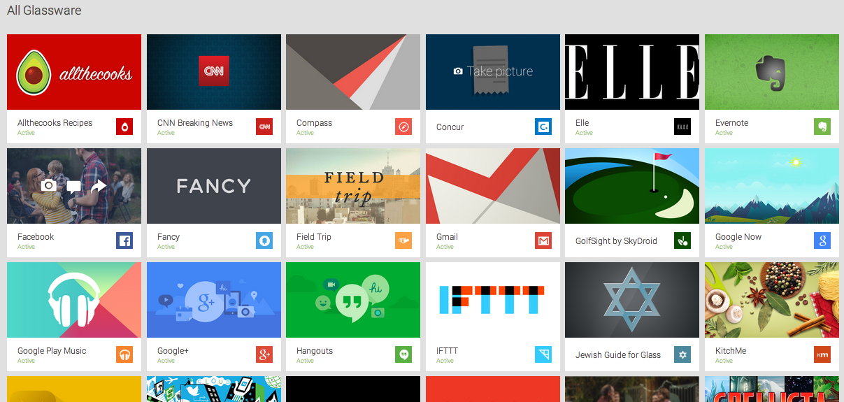
The most noticeable change is how visual the Glassware tab is now, making it look much more like an app store. Each app now features a graphic tile image which replaces the short description on white background we have seen before. The On/Off toggle has also been removed on the first layer and can now be accessed when clicking on an app.
Here is the new design:
This is the original look and feel:
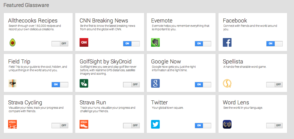
Back in October, Google opened up a submission process which gives developers a chance to get their apps in the Glassware channel. It looks as though Google is using a lot of the new assets they have ask for in the Glassware Checklist of this process including the 640×360 pixel tile image.
Google has been slowly rolling out new apps to the official catalogue. They now have forty-one apps in total. Most recently they have added fitness app LynxFit, vocab-helper “Word of the Day,” and business-oriented apps Vodo and Refresh. Vodo lets you interact with your Google Drive folders from Glass and Refresh uses your social networks to send information to the heads-up display on the people you are about to meet with in upcoming scheduled meetings.
MobileSyrup may earn a commission from purchases made via our links, which helps fund the journalism we provide free on our website. These links do not influence our editorial content. Support us here.
