
Sidewalks Labs showed off two new Toronto-based apps at the Tuesday event it co-hosted with Waterfront Toronto.
The apps are called Old Toronto and Toronto Transit Explorer. Both are developed by Sidewalk Labs and are the first of many Toronto-specific apps the company plans to make.
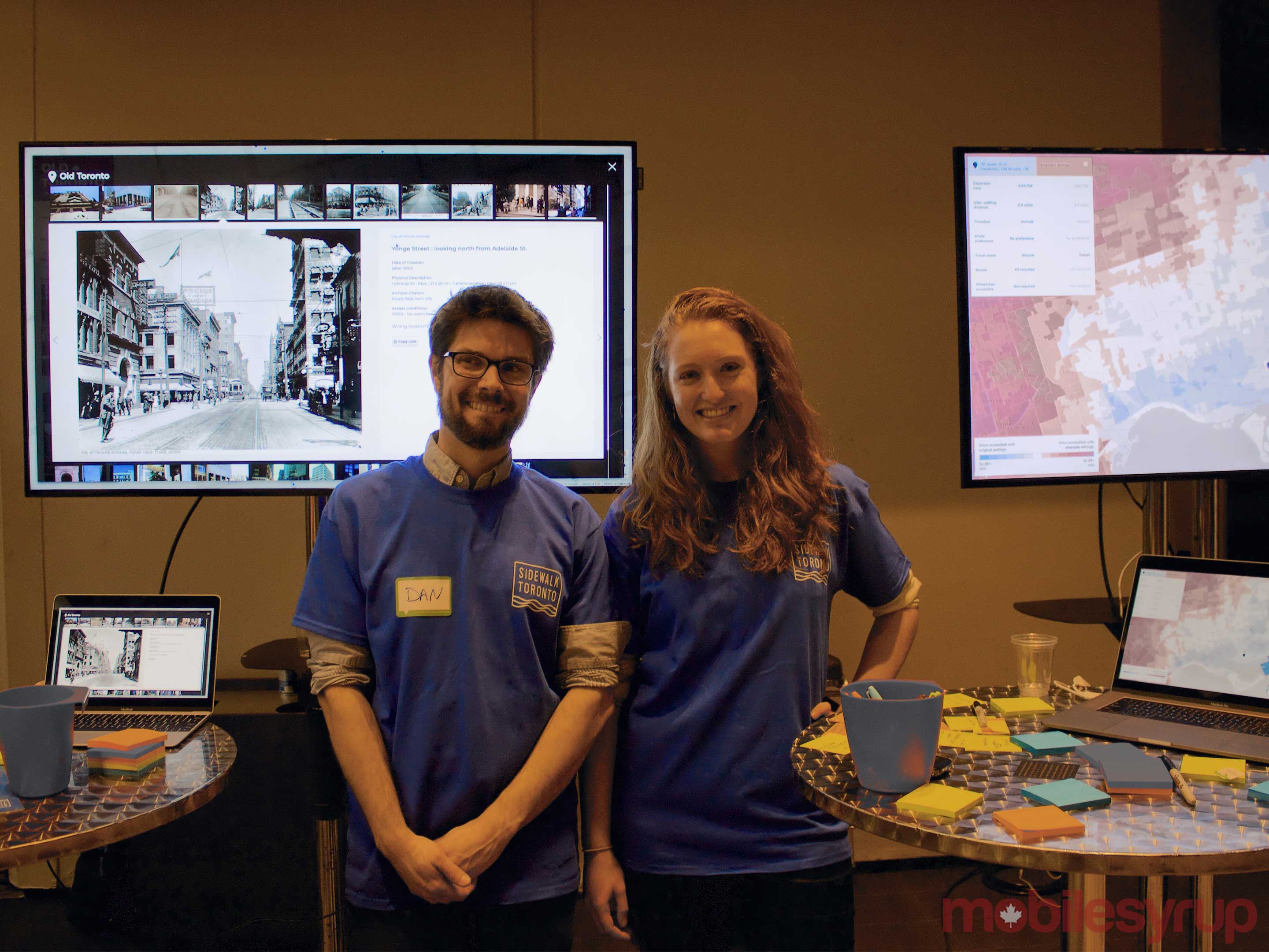
Old Toronto, a web app that lets users discover old photography of the city through an interactive map, was developed by a small team led by senior software engineer Dan Vanderkam. This isn’t his first foray into mapping historical photographs — previously he’s created two other maps that are full of historic photos for New York City and San Francisco.
To get these types of projects running Vanderkam usually works in conjunction with libraries and archives to source photos they have already digitized so that his team can code them onto an interactive map.
“When we started working with Toronto I was naturally curious if there was a collection that we could work with and I pretty quickly discovered the Toronto Archives,” said Vanderkam.
He says the archives have around 1.7 million old photos of the city but only about 100,000 of them are digitized. From that number, they’ve been able to add 30,000 of them to the online map with many more to come in the future.
Not all photos can be located — “some are just photos of the insides of an apartment so we’re never going to be able to get those,” says Vanderkam — but he thinks his team can get 50,000 to 60,000 in total.
Right now the data for the project can be downloaded from the Old Toronto website and VanderKam says it will soon be open-source.
The Toronto Transit Explorer web app was also shown off, but hasn’t launched yet. This app was developed by software engineer Samara Trilling and can be used to see if transit or biking is more efficient for the distance someone wants to travel.
The app works by selecting a position on a map and then it will show users how far they would need to travel by bike before transit becomes the faster option. The app shows different colours; anything in blue means biking in that area is the most efficient form of transportation, white means that both transit and biking take about the same amount of time and red means public transit is fastest.
![]()
This tool “can be really useful if you’re looking for the most accessible new apartment or a new school or if you want to compare if its worth it for you to buy a bike-share membership,” said Trilling.
She also mentioned how this can help cities identify transit dead zones and open up other possibilities for city planning.
In the future, Trilling plans on adding the ability to combine modes of transportation so users can see if a combination of transit and bike-sharing can change how people get around the city.
MobileSyrup may earn a commission from purchases made via our links, which helps fund the journalism we provide free on our website. These links do not influence our editorial content. Support us here.
