
Google has been redesigning many of its first-party apps with the company’s modern design, but the Play Store seems to be getting a slightly different look.
Just a few small changes are coming to the app, and most of them add white space to sections of the app that previously had a green header.
The ‘My Apps and Games’ section has dropped the green header and replaced it with an all-white screen with small green highlights.
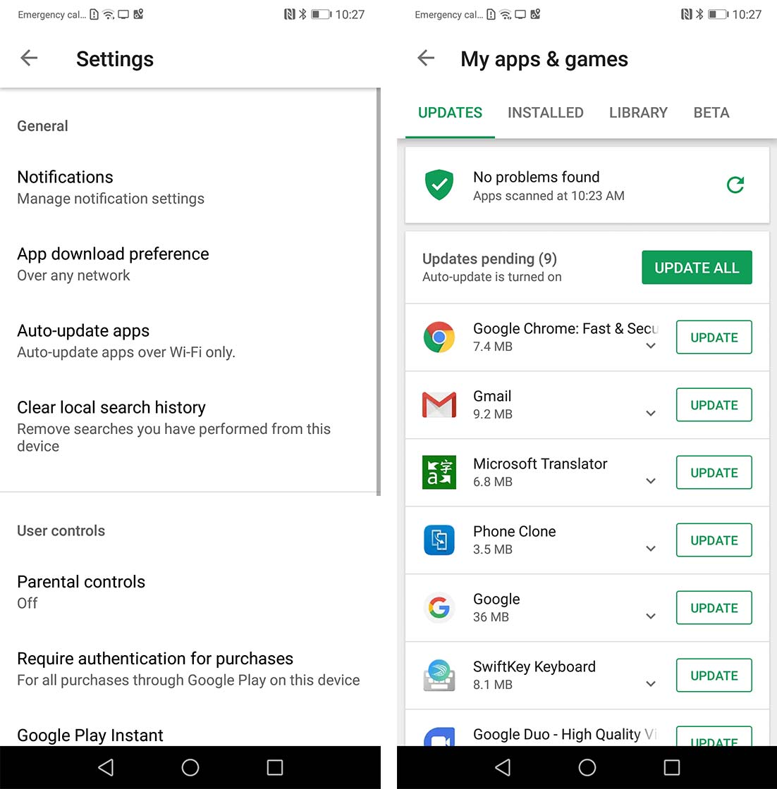
The settings page is getting the same refresh. Furthermore, the ‘Account’ section’s reorganized to mirror the design of the My apps and games page.
Google has rearranged the overflow menu on the left side of the app to raise the shortcuts to ‘Play Movies,’ ‘Books,’ ‘Games’ and ‘Music’ higher in the menu.
The new update steps in the right direction for the app, but it doesn’t look exactly the same as Google’s other modern apps since those apps use rounded corners and the content on the pages are flatter with the menus and floating action buttons raised.
The app’s update is server-side, so it’s rolling out in waves. It should be available to most users soon, according to 9to5Google. On my phone, the ‘My Games and Apps’ section is updated, but the side menu is still in the old style.
Source: 9to5Google
MobileSyrup may earn a commission from purchases made via our links, which helps fund the journalism we provide free on our website. These links do not influence our editorial content. Support us here.
