
Facebook’s significant Messenger redesign — dubbed Messenger 4 — is widely rolling out to users via a server-side update.
The new design delivers, at least partially, on some of the social network’s promises. When Facebook unveiled the design at its F8 developer conference last year, it promised a more straightforward experience, as well as a dark mode.
While dark mode is mysteriously absent (for now), Facebook did simplify the Messenger app somewhat. For example, the new design reduces the number of tabs along the bottom bar from five to three. It also does away with the four tabs along the top of the app.
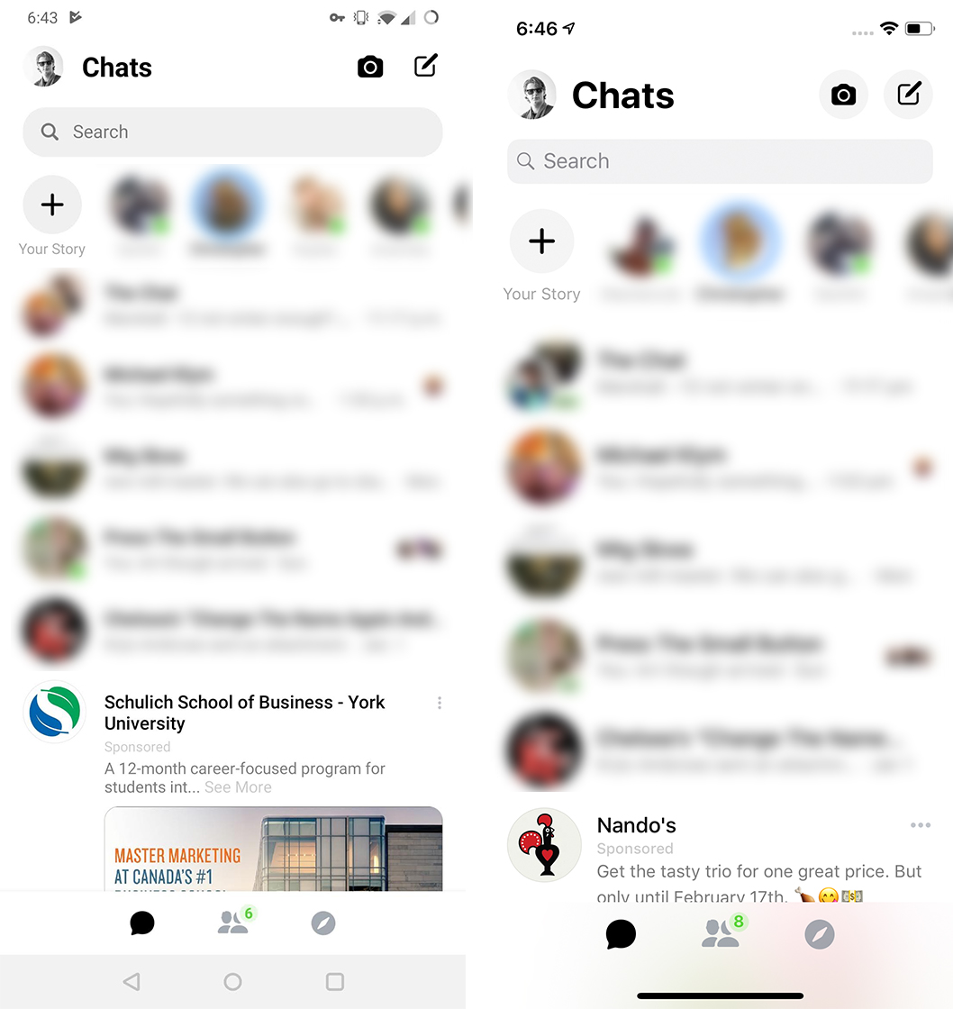
The three new tabs — ‘Chat,’ ‘People’ and ‘Discover’ — contain just about everything that was split across nine tabs before.
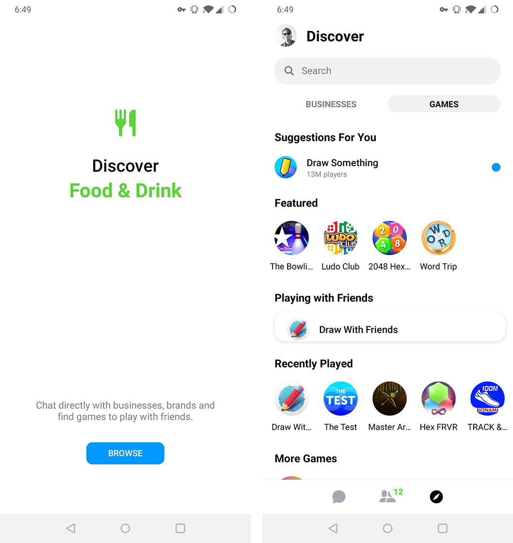
That being said, Facebook hardly trimmed excess features from Messenger. Instead, the social network moved them out of the way so users could focus on chatting. Most of those extras can now be found in the Discover tab.
Discover is split into two sections, ‘Businesses’ and ‘Games’ on Android, or ‘For You’ and ‘Businesses’ on iOS.
The For You and Games sections are practically identical, featuring several suggested games that users can play with their Messenger friends. The Businesses section is also functionally similar, offering a list of businesses users can message through the platform.
However, I can’t see people ever leaving the main Chats page. That section contains nearly everything users will actually need from the app, including current chats, a search bar to find contacts and Stories for those who use them.
New look, fresh hate
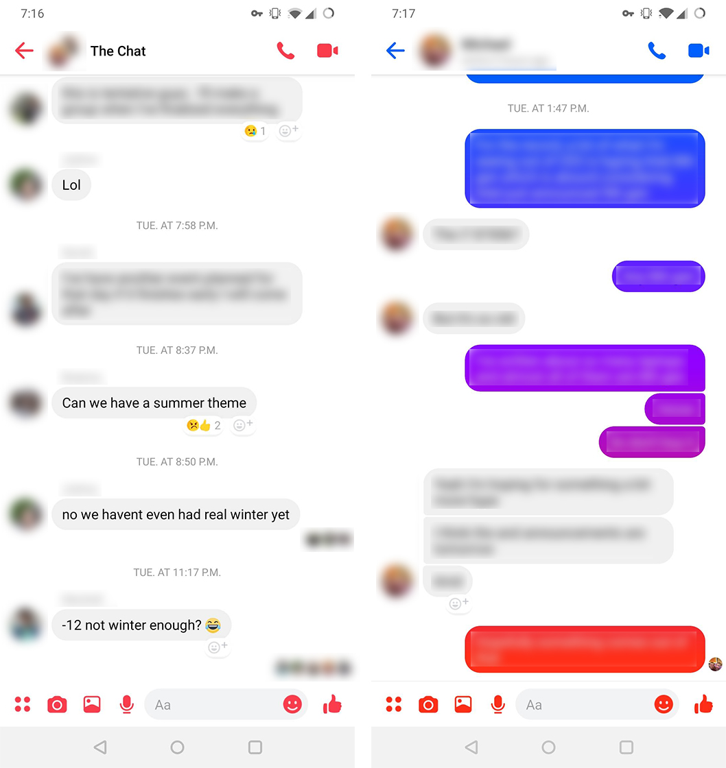
As for chats, not much has changed here either, beyond some new chat bubble colour options and the same general redesign. Like other big tech companies, Facebook opted for an all-white aesthetic. I quite like the look, and it feels like Messenger fits with the typical style of Android apps now.
opening up messenger after the new update like pic.twitter.com/vqZ7J6fT4M
— Abe (@NuanenBee) November 13, 2018
However, not everyone is of the same mind. Some users on Twitter have derided the lack of dark mode, but Facebook says that it’s coming soon.
Considering how much the company pushed dark mode as a selling point for the redesign, it amazes me the feature didn’t launch with the rest of the update. Further, I’m perplexed by the complaints of how bright the redesign is, as Messenger was always primarily white.
Other users have taken to social media to proclaim the “ugliness” of the app. While the new look might not be for everyone, I’d argue that it’s definitely an improvement over the previous look.
Ultimately, whichever side you fall on, you’ll likely see the update hit soon. After a few false starts early this morning, it appears the server-side update is making its way to almost everyone, so sooner or later your app will make the switch.
Source: Android Police
MobileSyrup may earn a commission from purchases made via our links, which helps fund the journalism we provide free on our website. These links do not influence our editorial content. Support us here.
