
Google Maps’ search interface is receiving a facelift that adds some more colour to the list of suggested locations.
Now that Google has the core look down, it’s adding some visual flourishes to its iconography that makes points of interest easier to recognize.
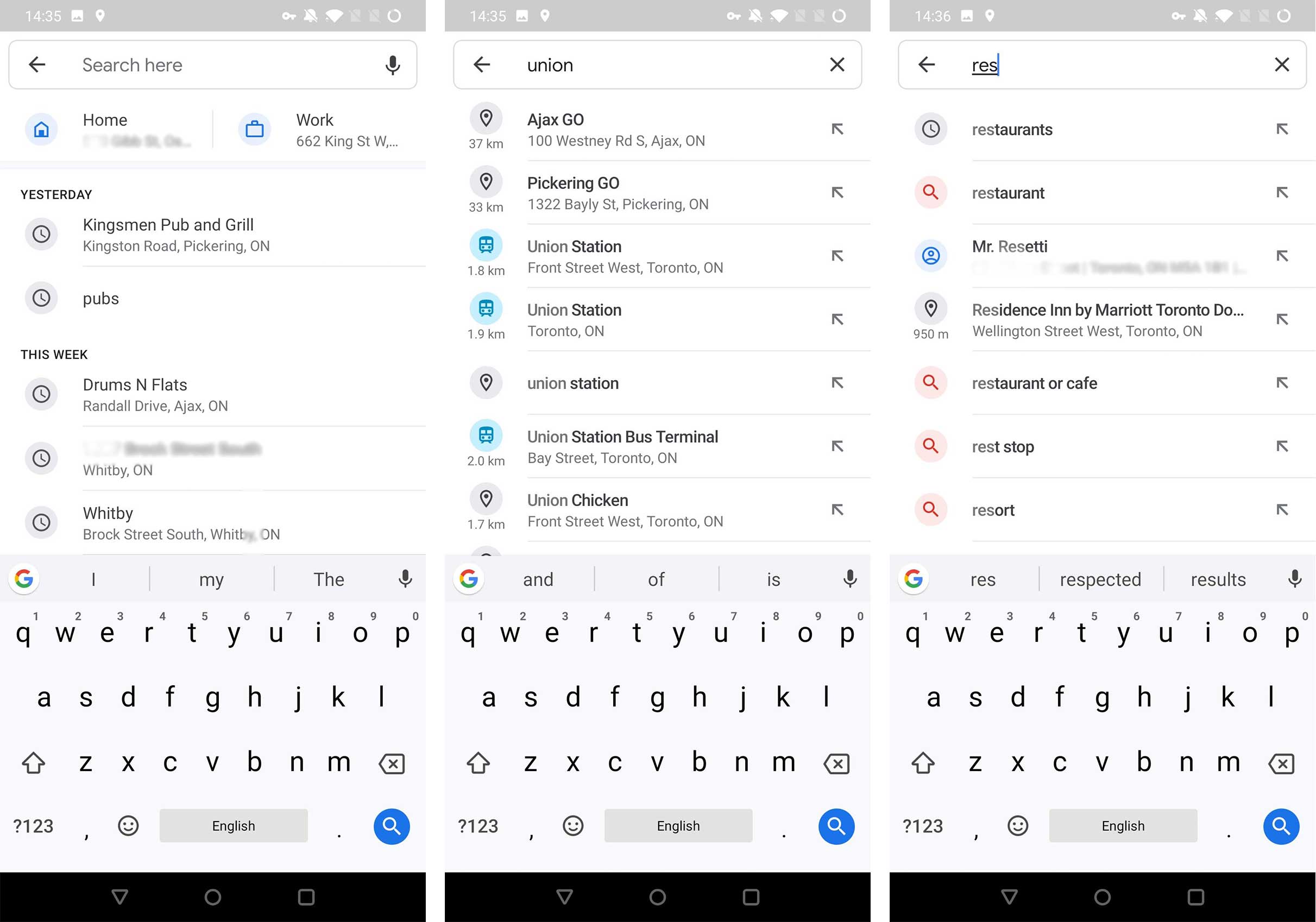
To start, Google desaturated the Home and Work icons at the top of the search list. They’re still blue, but instead of a vibrant shade, the company is using a pastel blue with updated Material Design icons. The icons are a darker shade of blue to add contrast.
The new look of search within Google Maps.
The rest of the search history still has grey and black fonts, but some icons received a splash of colour. Specifically, Saved and Labelled locations, the search icon and some places that have representative symbols, like train stations.

what Google Maps’ search interface used to look like.
Some contacts with locations attached to them use the same colour scheme as the Home and Work shortcuts and a human-shaped icon if there’s no contact image.
These new colours are in the same hue family as Google’s other apps that utilize the modern design. Specifically, the colours remind me of Messages and Contacts.
The update is server-side according to Android Police, so it should be rolling out to more users in the upcoming days.
Source: Google Maps app, Android Police
MobileSyrup may earn a commission from purchases made via our links, which helps fund the journalism we provide free on our website. These links do not influence our editorial content. Support us here.
