
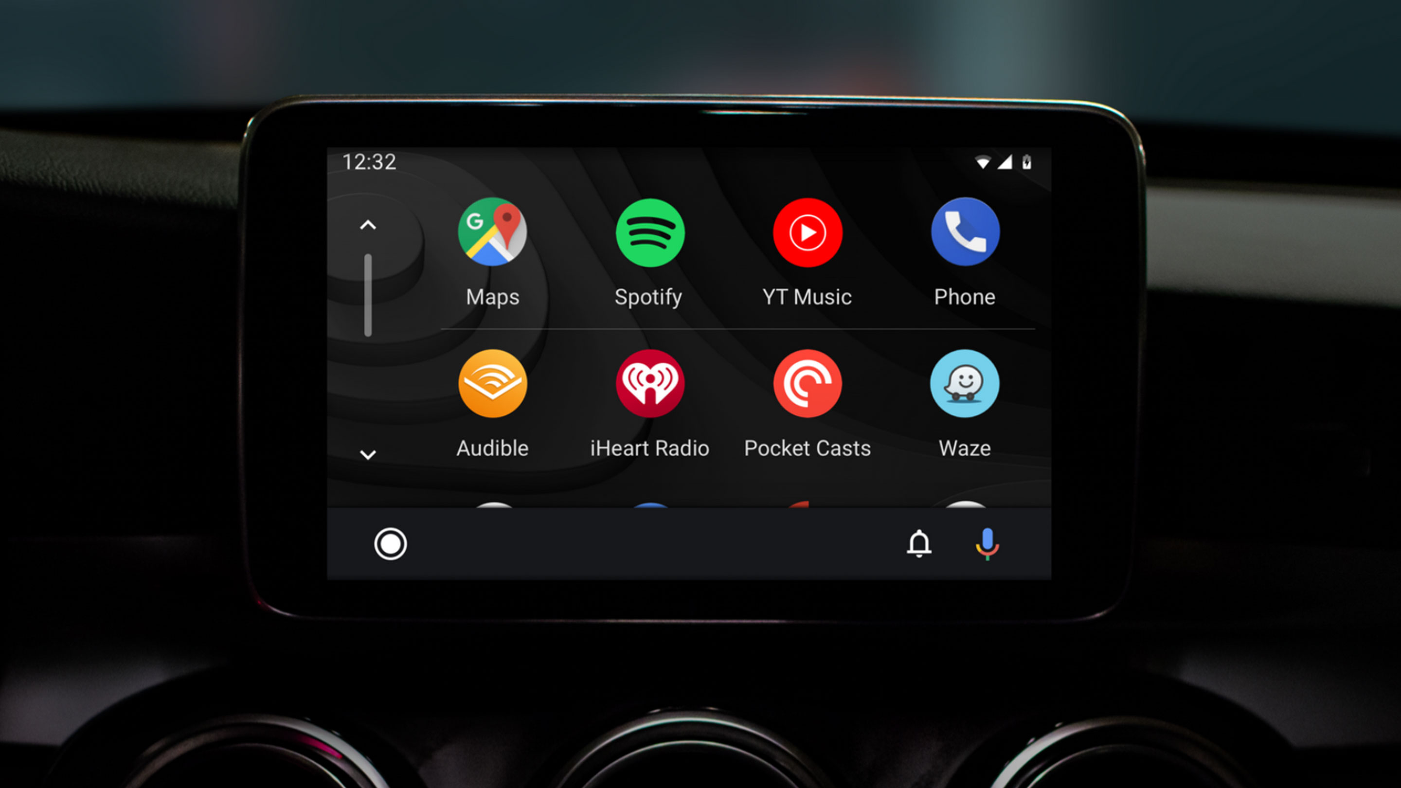
Google is finally updating the look of Android Auto with a more traditional grid-like home screen, the company’s Material Design stylings and the ability to control music and see directions while inside of other apps.
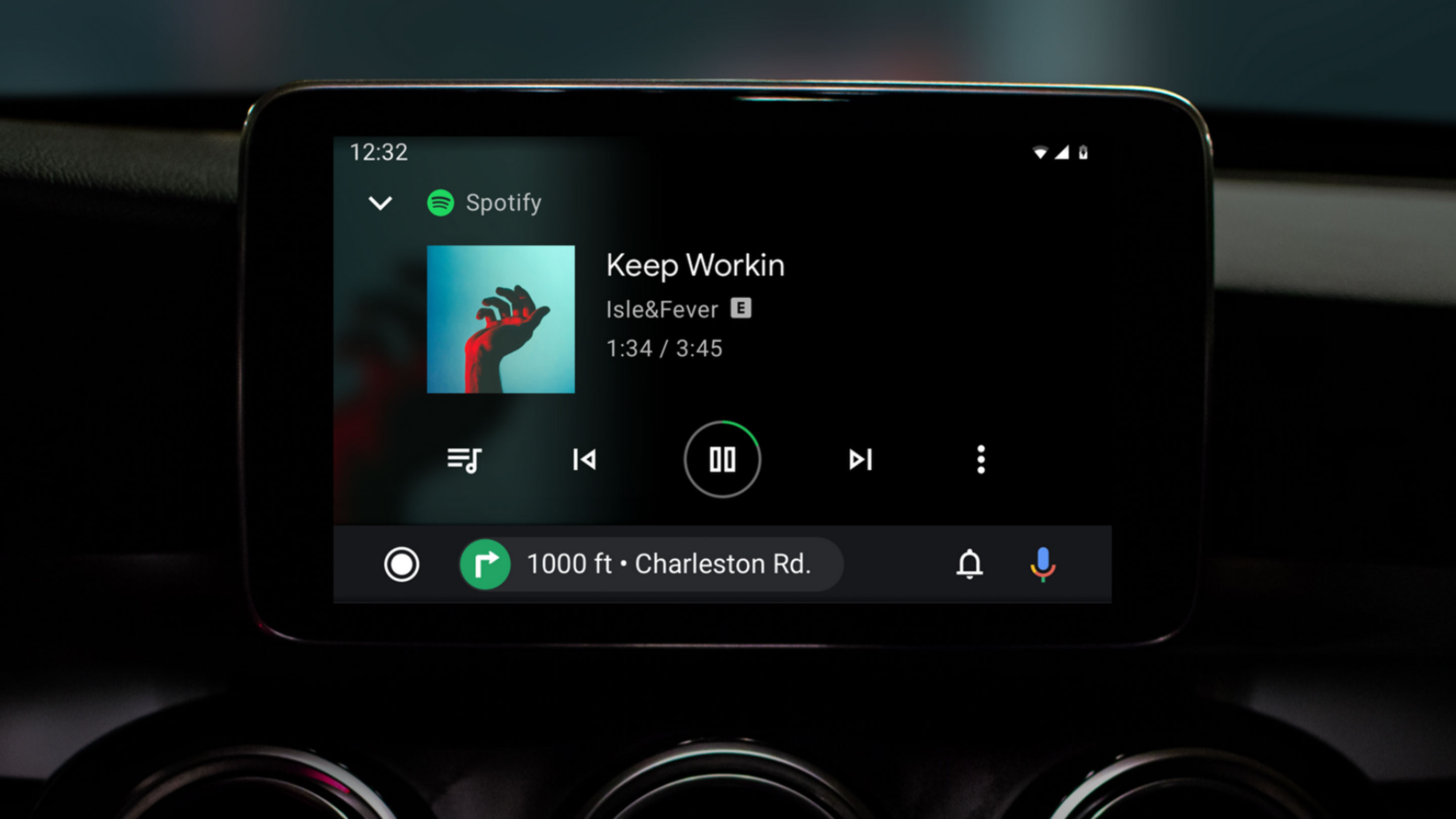
Now, if you’re playing music and you open another app, the music controls shrink into the nav bar so you can skip to the next or previous song or tap the play/pause button.
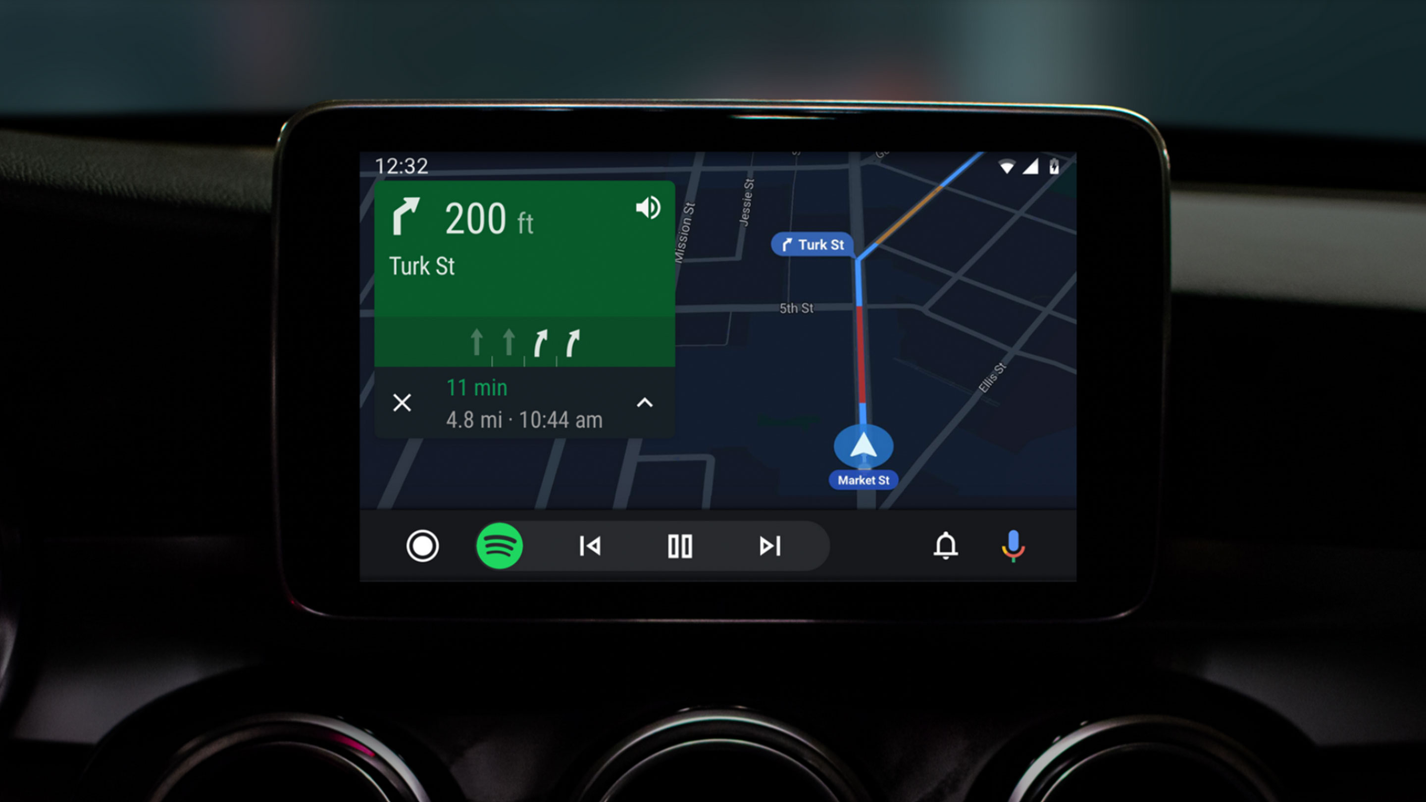
The same thing happens with Maps. If you’re navigating with Maps and you open another app, the direction panel becomes part of the nav bar and displays your next upcoming turn. The company’s blog post also says you’ll be able to hang up phone calls from the nav bar when you’re on the phone.
The interface is unique looking and makes it so users can access more features at once. You could do this in the old Android Auto with the Homescreen panel, but you were locked into using small sections of each app. Now, you’ll be able to use one full app plus a slice of another.
Instead of a row of five buttons, there are only three this time around – ‘Notification Centre,’ a ‘Home Button’ and a microphone icon that triggers Google Assistant.
The company has also done away with the gradients of colours that were on the homescreen and has instead replaced it with a dark background which the company says is to “fit in better with your car’s interior.” While the central theme is dark, there are pops of colour throughout the OS to make it easy to see things.
A nice quality of life improvement now makes sure that Android Auto expands to fit wider displays. These larger displays can show more information as well, according to Google.
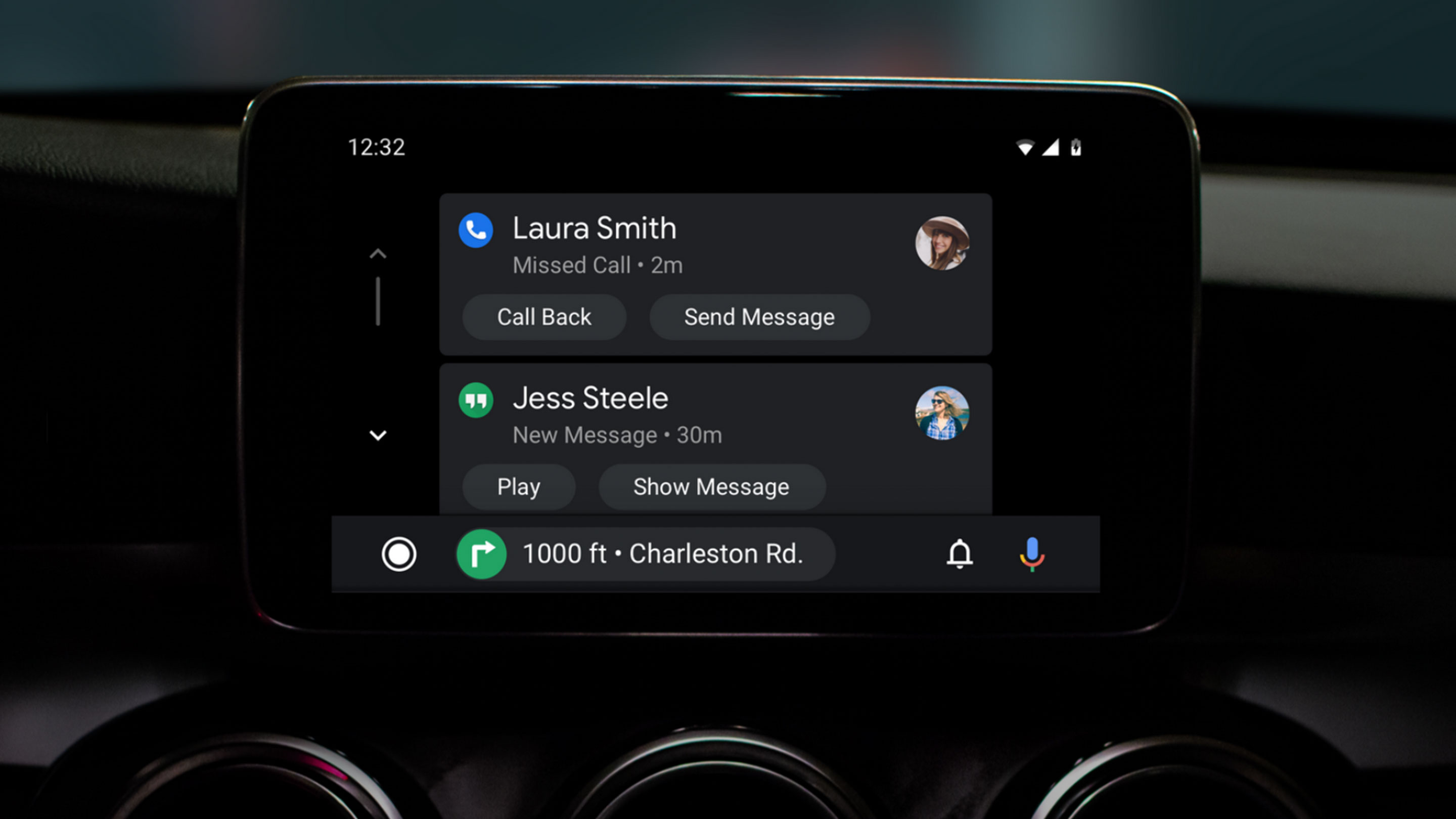
Another change seems to be with how users can interact with notifications. In the blog post, a photo makes it look like users will be able to see incoming messages instead of just hearing them. This change recently came to the older version of Android Auto, but it only works while you’re not moving. It will be interesting to see how the new design handles notification previews.
Currently in Android Auto Google locks users into only interacting with the display a handful of times while you’re moving before it stops and tells you to put your eyes back on the road. That’s one feature that Apple’s CarPlay doesn’t have so maybe with this release, Google will get rid of the restriction to make it a bit easier to find the song you’re trying to play.
At the end of the post, Google says it will share more information on May 7th at Google I/O.
If you want to find out more about the current iteration of Android Auto, check out our post that compares it to Apple’s CarPlay.
Source: Google
MobileSyrup may earn a commission from purchases made via our links, which helps fund the journalism we provide free on our website. These links do not influence our editorial content. Support us here.
