
A Brazilian YouTuber has shown off what One UI 2.0 looks like and it seems to go against the grain of the original One UI.
There isn’t a lot revealed in the video, but one of the main things is the quick settings panel. In the current iteration of One UI, one of the core design philosophies is to make interactive elements easy to reach on tall devices.
This means that when you pull down on the quick settings menu, it stretches to the bottom of the device while a clock takes up the top half of the screen. Or when you open Samsung’s default texting app, it says ‘Messages’ on the top half of the screen and then loads your conversations on the bottom half until you start to scroll up.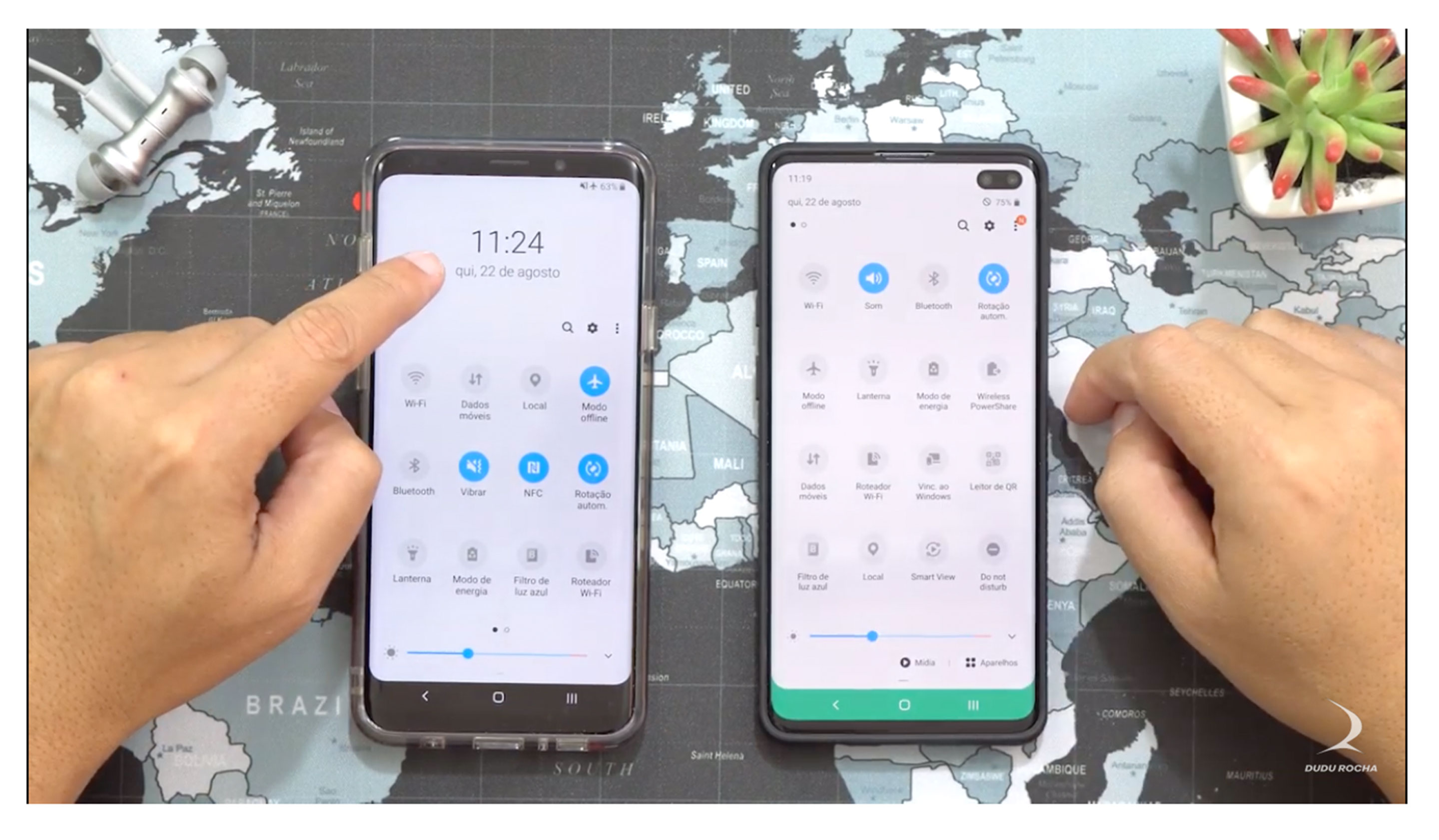 In the leaked One UI 2.0 build, it looks like easy to reach elements like those mentioned might be going away. In the update, the quick settings toggle takes up the entire screen, instead of just the bottom half. This gives the settings more space but also makes the top buttons much harder to reach.
Other changes include Android 10’s default gesture navigation. That means that you swipe up from the bottom of the phone to go home and then swipe in from either side to go back.
You can get a better glimpse of the phone in the video below, but just a note, it’s in Portuguese.
Source: Dudu Rocha
MobileSyrup may earn a commission from purchases made via our links, which helps fund the journalism we provide free on our website. These links do not influence our editorial content. Support us here.
