
Facebook is reportedly testing out a new design for its Android app, according to screenshots from a limited set of users.
Even though the social network pushed out a redesign that abandoned the top blue bar in favour of a more white, modern design, there’s more Facebook has in store for its app.
The main change concerns the navigation bar, which has moved to the bottom of the screen, similar to the iOS version of the app. However, unlike iOS, this new design only has three buttons on the bottom.
The left-most button is presumably the newsfeed button, but that’s not immediately clear. The right-most button likely opens the notifications menu as it uses a similar bell icon to the current notification tab.
However, the middle button is a significant change. It’s a large version of the Facebook icon which, according to the screenshots, opens the menu. Instead of the hamburger tab like in the current design, this new Facebook ‘F’ button contains nearly every aspect of the social network.
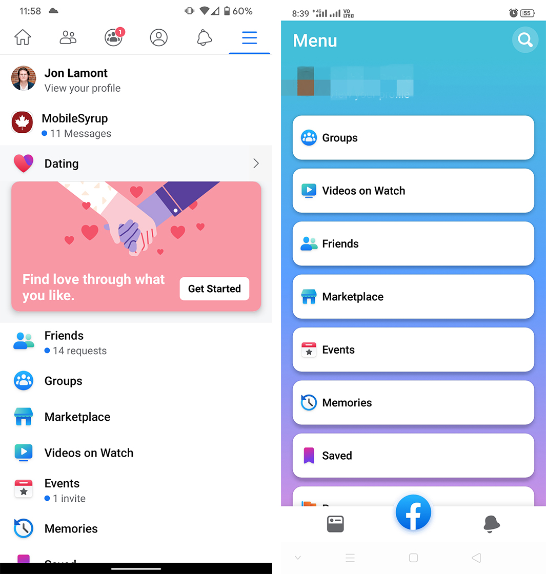
Left: Old Facebook UI. Right: New design.
This includes items like Groups, Friends, Marketplace and more.
Further, the new menu ditches the all-white look for a colourful gradient background. Each menu item resides within a white box. There’s also a link to your profile and a search button in the menu.
According to Android Police, which obtained the screenshots, the newsfeed and notifications menus have not adopted gradient backgrounds.
The changes appeared in the Facebook app version 246.0.0.49.121. However, it seems to be a server-side change, as none of my devices running that version show the changes.
It’s not clear if or when the update will roll out on a broader scale.
Source: Android Police
MobileSyrup may earn a commission from purchases made via our links, which helps fund the journalism we provide free on our website. These links do not influence our editorial content. Support us here.
