
The third Android 11 OnePlus beta released earlier this week, and now people can experience the company’s brand new interface design.
OnePlus has taken a step away from the so-called stock Android experience, though I feel the new design actually exceeds Google’s in some ways while still fitting within modern software trends with a clean and responsive look.
For some, OxygenOS 11 might not be the look they were hoping for, but it’s a massive step forward for the company given its previous design didn’t stand out at all.
Stock vs skinned Android
Before I begin, I want to address the stock android vs skinned Android argument. I believe the stock vs skin argument began years ago when stock Android was straightforward and clean looking, while skins from the likes of Samsung and LG were very flashy and bombastic.
Over the last few years, all the major Android companies have revamped the style of their UXs to be cleaner and simpler, while also providing an easy-to-use experience. Though some, like Samsung’s One UI, might look very different from Google’s Material Design, both are structured similarly with bright colours, rounded edges and clean menus.
In 2020, the whole stock vs skin argument holds little ground since even Google’s Pixel phones — which have beautiful software — are not stock Android anymore. Therefore, it was time for OnePlus to move away from the stock-like experience and forge something of its own.
What are the major changes?
OnePlus has been slowly revamping its brand-image this year. We got our first hint of the shift when the company revealed its new logo and colour scheme in March, but it’s taken until OxygenOS 11 for the brand to show off what it has in store for its mobile OS design.
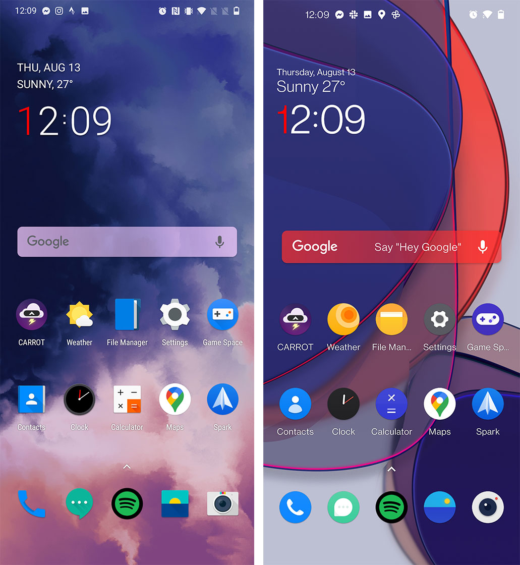
Fonts

The first significant change is the new font. While it may seem like a small change, it permeates every level of the phone from the keyboard, to the clock, to all the words you read on screen. The new font is called ‘OnePlus Sans,’ and it takes over from ‘OnePlus Slate.’
The character and word spacing has been improved this time around as well, making the new font much easier on the eyes.
Quick toggles and Notifications
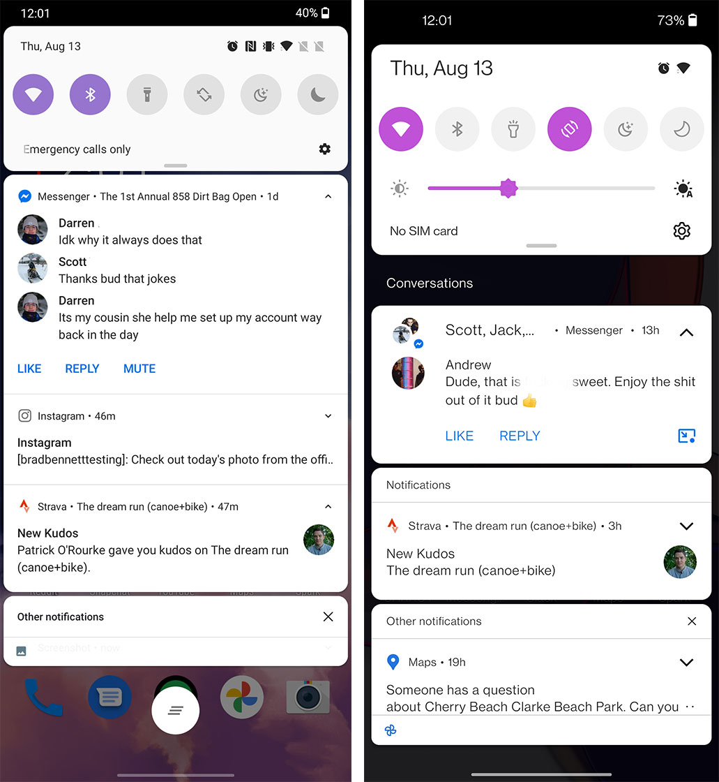
The notification shade has been updated for OxygenOS 11, so it now includes subcategories for ‘Conversations,’ ‘Notifications’ and ‘Other notifications,’ which come in silently.
Overall, this area is a little larger, resulting in it showing less info at once, but that helps it feel less cluttered and easier to read.
The new rounded design is also a lot nicer and looks more modern compared to the compact version that was here before.
Pulling down further to open the quick toggle shows off some new iconography and an easier to understand layout. In the old layout, not everyone knew that tapping on the clock allows you to the set the alarm. Now, in OxygenOS 11, these buttons are defined in a way that suggests touching them.
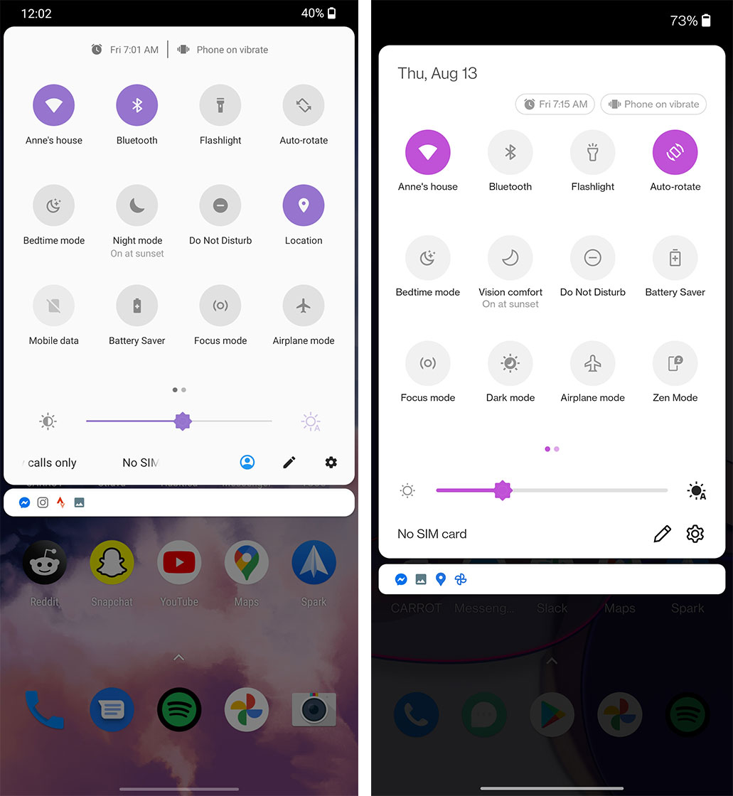
While the shade may be larger, this is a good thing because it makes touching the bottom row of toggles, the brightness slider and the Settings shortcut a lot easier to reach with one hand.
This ease of reach design is something that Samsung started with One UI to make it easier for people to use large phones with one hand, and OnePlus has implemented a similar approach here and in many of its other apps.
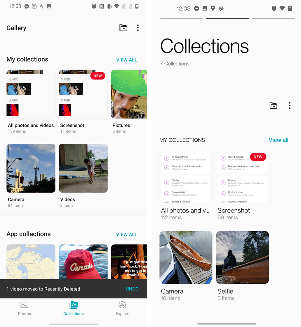
Gallery App
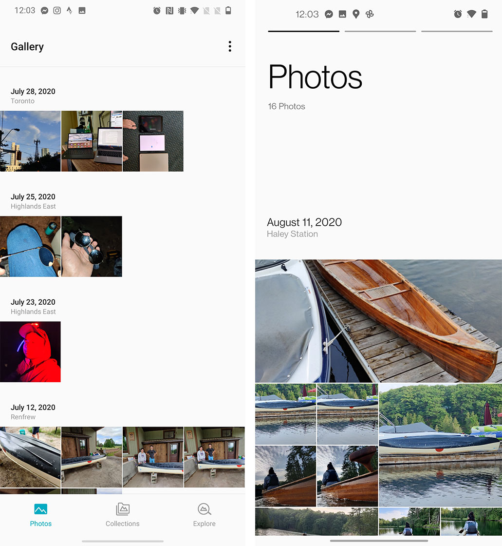
If I’m being honest, before this update I used to banish all the OnePlus apps to the hidden folder so I could use Google’s software. Starting with the Gallery app, I began to pull the old apps back to my home screen because they all look great.
The Gallery app now has three sections: ‘Photos,’ ‘Collections’ and ‘Explore.’
Photos is straightforward and displays all your pictures in a chronological list with breaks for each day.
However, OnePlus has opted to ditch the boring old grid of photos, and instead displays your pictures in varying sizes, which makes the lists that much more interesting to look at.
It also cleans up a lot of the excess white space that plagued the older version of the app.
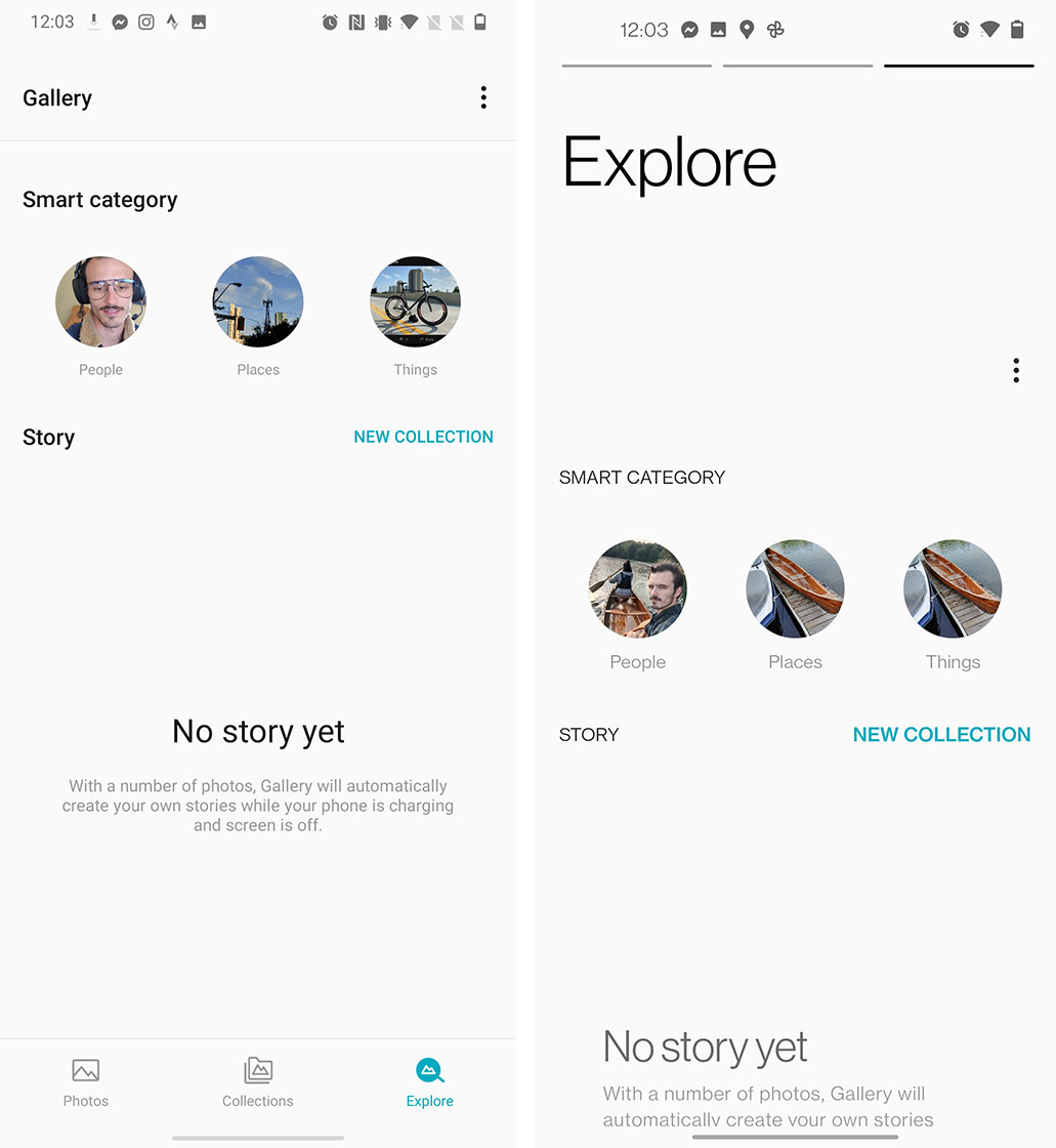
The Collections tab is where you house all of your photo albums, and it also looks cleaner but doesn’t bring any significant new features beyond a modern look.
The Explore tab is the same way. It features a new look, but no new features.
Weather app
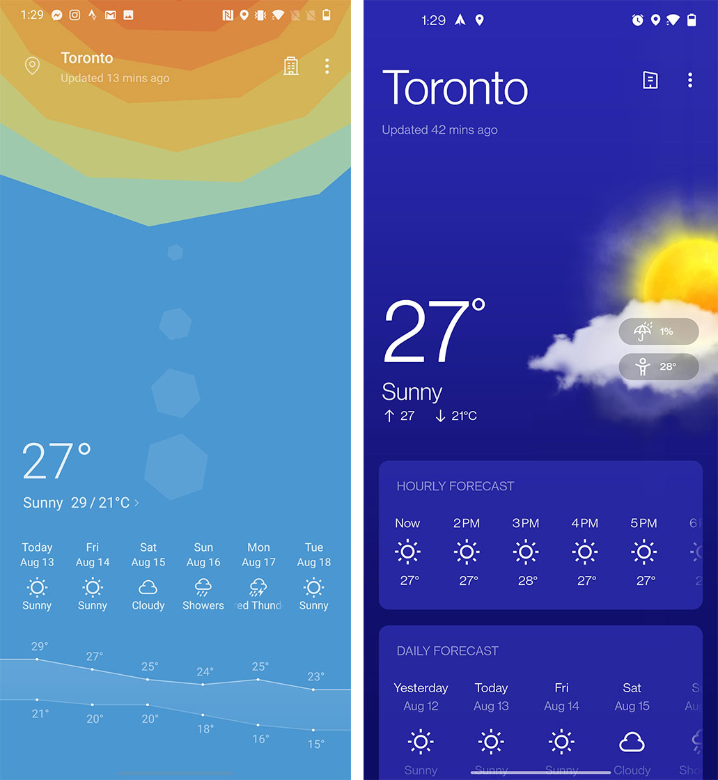
Another app that might finally get me to stop using Carrot Weather is the new OnePlus Weather app.
I actually liked the old OnePlus weather app, but the new one is still so much better. It matches the rest of the ecosystem design perfectly and the colours used are quite nice. It takes you to the Chinese version of The Weather Channel when you click on the 15-day forecast button, but I’d imagine that it will be sorted out by the final release in the fall.
Always-on Display
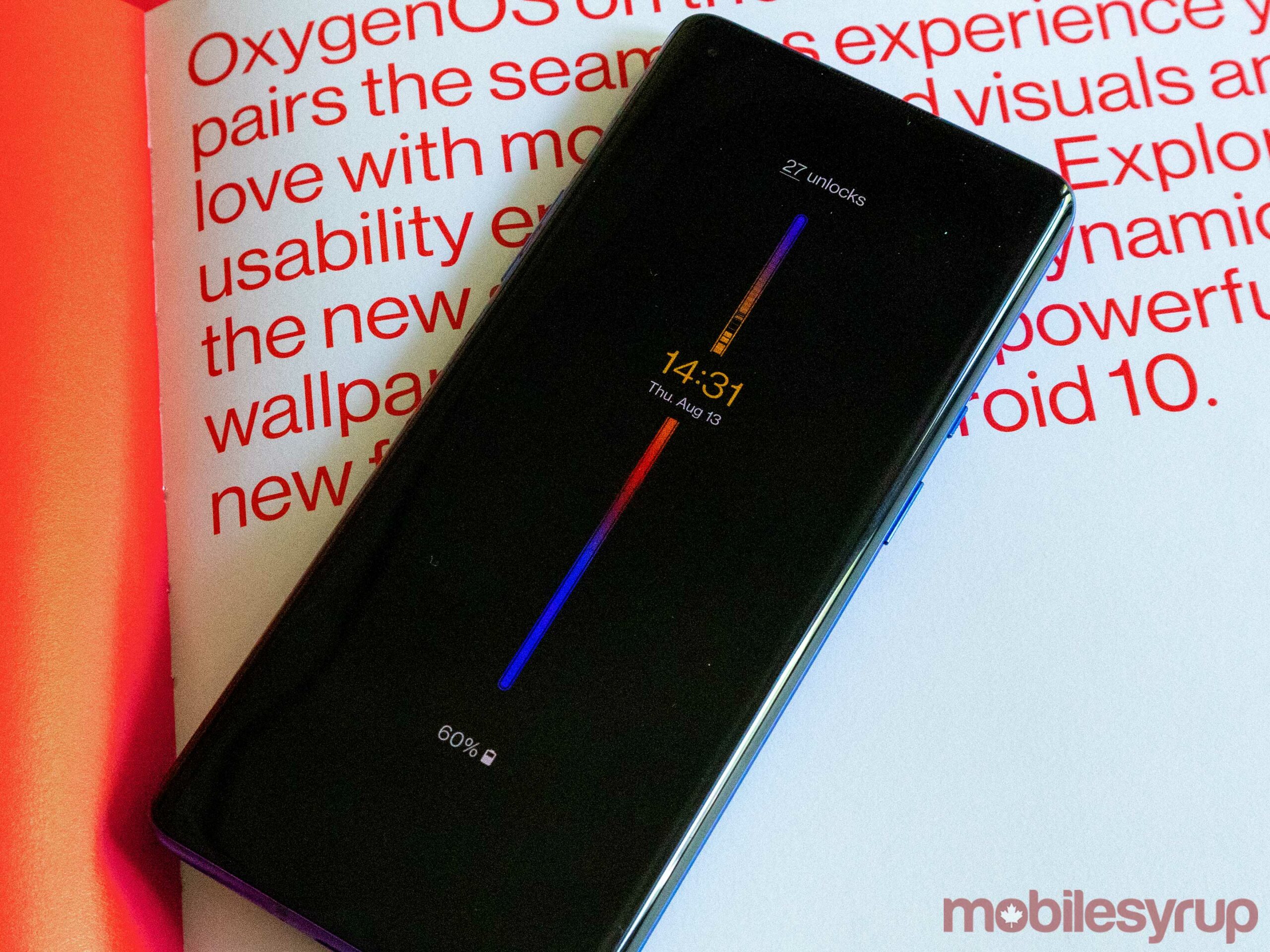
OnePlus has finally added an ‘Always-on Display’ (AOD) function to its handsets and it’s great. In the beta, there are 12 clock styles to choose from, but one called ‘Insight’ really breaks the mould.
I’ve written about it before if you want the full breakdown, but its very informative and simple features are so good, I hope other companies implement similar AODs.
The other apps and features
Beyond the things, I’ve highlighted OnePlus also redesigned many of its first-party apps slightly, and others have only received a new icon so far.
The files app, for example, is still the same on the inside, minus the new font. Yet, it’s gotten a new app icon that uses a more realistic folder colour. I’d anticipate this app will get updated in the future to implement the one-handed focused design that’s so prevalent in all the other apps.
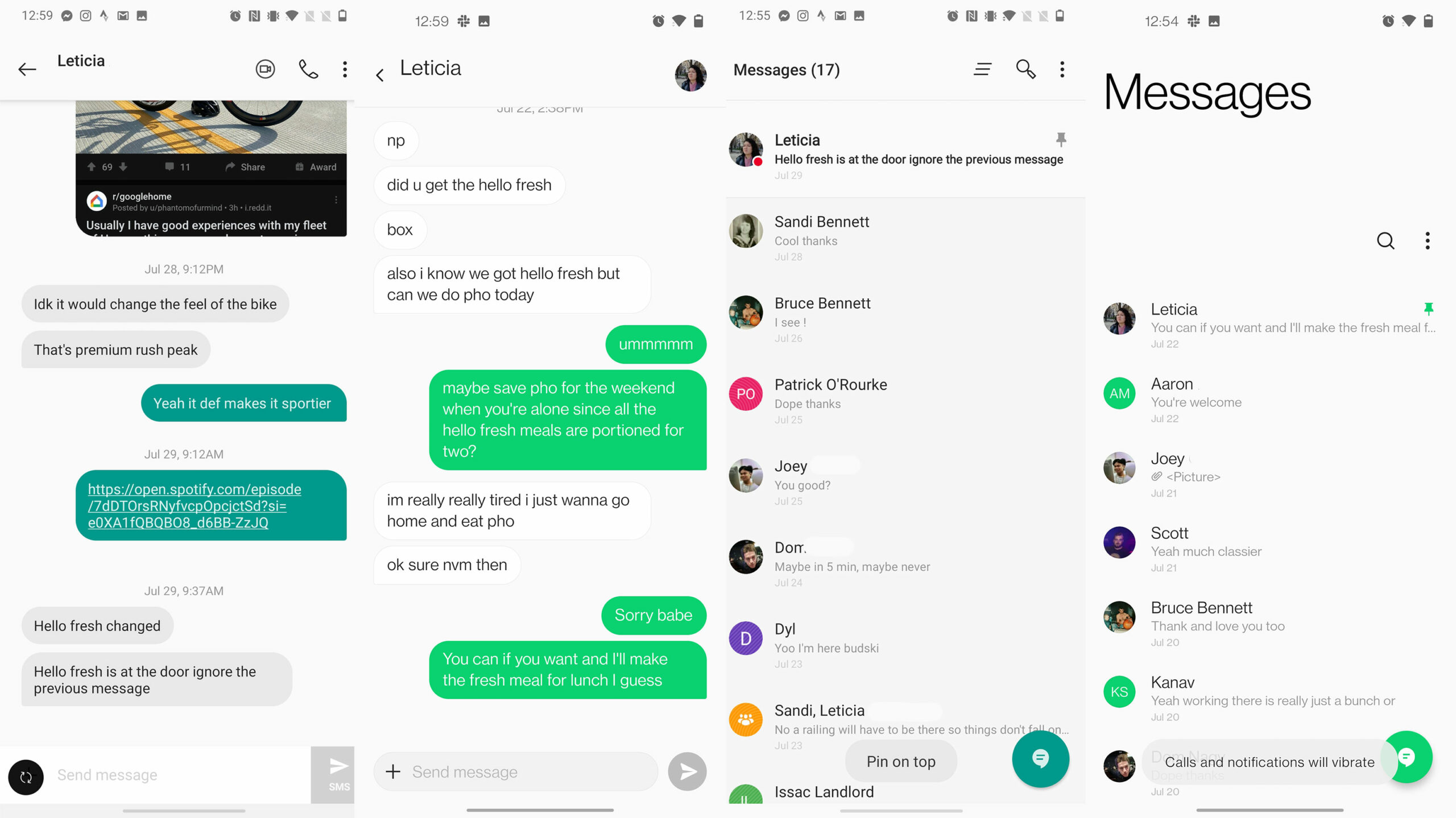
The messages app doesn’t look like it’s stuck in Android 6 any more with an updated colour palette and the new cleaner/more comfortable page design.
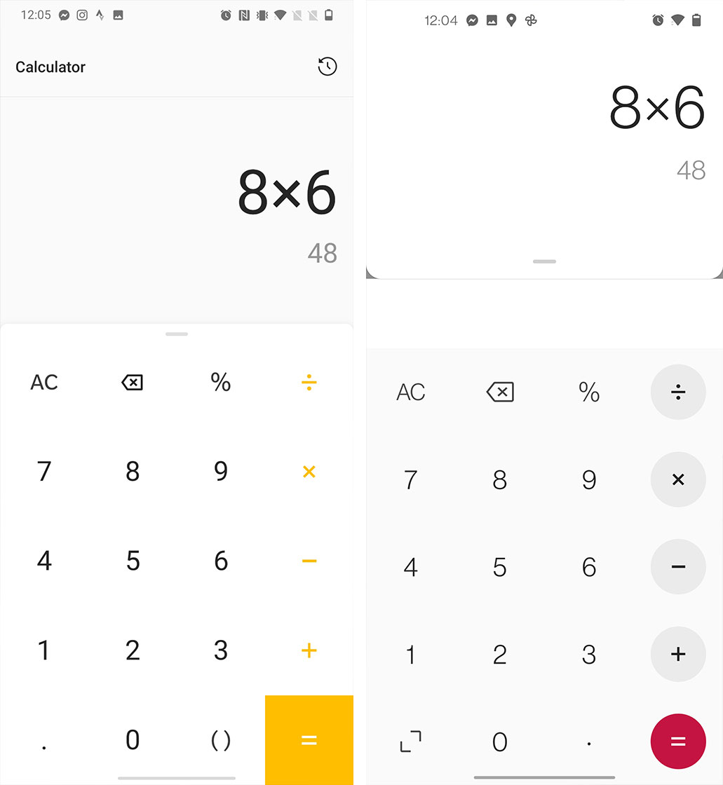
Contacts, Clock, Calculator, Game Space, Camera and the Phone app have all received mild refreshes, but nothing dramatic.
The updates bring these apps in line with OnePlus’ new design language, but no new features or major layout changes are applied.
Zen Mode has gotten a new feature that allows multiple OnePlus users to disable their phones simultaneously, but it’s more or less the same still.
Opening up the power menu also brings up Google’s new Android 11-specific smart home control panel, which is good to see.
Hopefully, more Android 11 controls like music playback in the quick toggle section make it to the final build of OxygenOS 11, but for now, I think the new design is enough.
Overall, this is an impressive update from OnePlus and one that I know I have been asking for since the launch of the OnePlus 8 series.
MobileSyrup may earn a commission from purchases made via our links, which helps fund the journalism we provide free on our website. These links do not influence our editorial content. Support us here.
