
I’m going to keep this short, since I honestly haven’t spent much time with the Surface Duo 2 yet (as of writing, I’ve had my hands on one for just a few hours).
The Duo 2 feels better than the original Duo — like, a lot better.
I’ll be honest with you; it’s far too early to tell if that statement will apply to the rest of the Duo 2. This is purely from the perspective of someone who opened a box with a Surface Duo 2 in it and held it for a few minutes. It just feels better, and I think that counts for something.
It’s not often readers get a chance to peek behind the curtain and see how things work here at MobileSyrup, but you’re going to get a chance to today. This week has been insane. Four back-to-back announcements from big tech companies plus a crazy tight review turn-around schedule — phew, it’s a lot. So, I was somewhat surprised (along with an odd mix of joyous, dismayed and completely overwhelmed) when the Surface Duo 2 showed up at my door amid one of my busiest weeks at MobileSyrup, and perhaps one of the most packed weeks ever at MobileSyrup.
None of this is to elicit any sympathy or attention or anything like that — I just want to be upfront about why the next 700 words (give or take) are not a Surface Duo 2 review (but one is coming!) and instead, a brief discussion about what it’s like to hold the Duo 2, since that’s really all I’ve had time for.
Nailing the feel
The Surface Duo 2 is insanely expensive. It costs $1,899.99 in Canada and isn’t available at any major carriers, which means customers will have to foot that bill on their own instead of financing or subsidizing it on a two-year plan. The original Surface Duo was also quite expensive at launch, but at least the Duo 2 actually feels like it’s worth the cost.
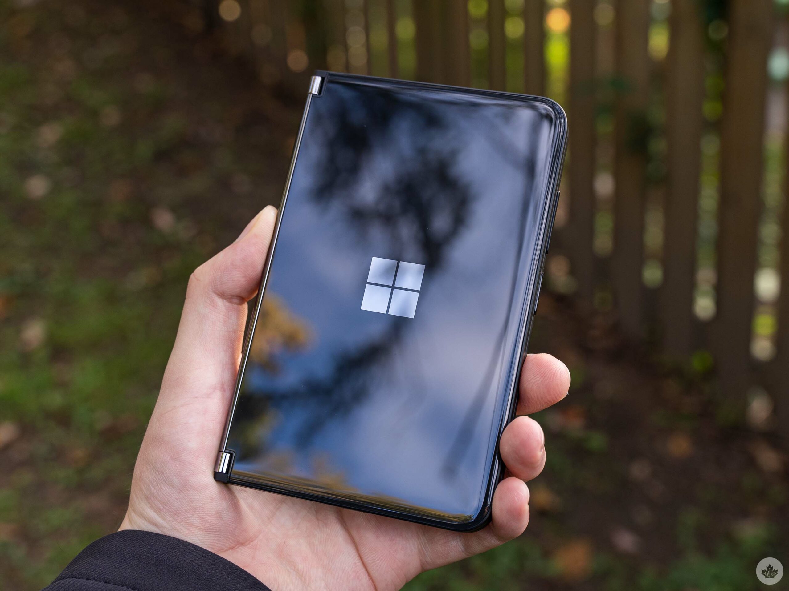
It’s clear to me that Microsoft focused on the details with the Duo 2. The outside glass curves subtly into the frame of the phone. The hinge feels smoother and it takes just a little more force to open the phone. The buttons feel tactile and don’t wiggle around like on the original Duo. Speaking of buttons, the power button is now also a fingerprint reader, unlike the original Duo that had a separate fingerprint sensor for unlocking the device (an added benefit here is that the Duo 2’s power button/fingerprint scanner combo is not crooked like the sensor on my original Duo).
Overall, the build quality seems significantly improved over the original Duo. If nothing else, it shows that Microsoft cares about the Duo line. I see clear signs of Microsoft trying to improve the product with the Duo 2, and that has me excited about testing the phone further.
The more things change, the more they stay the same
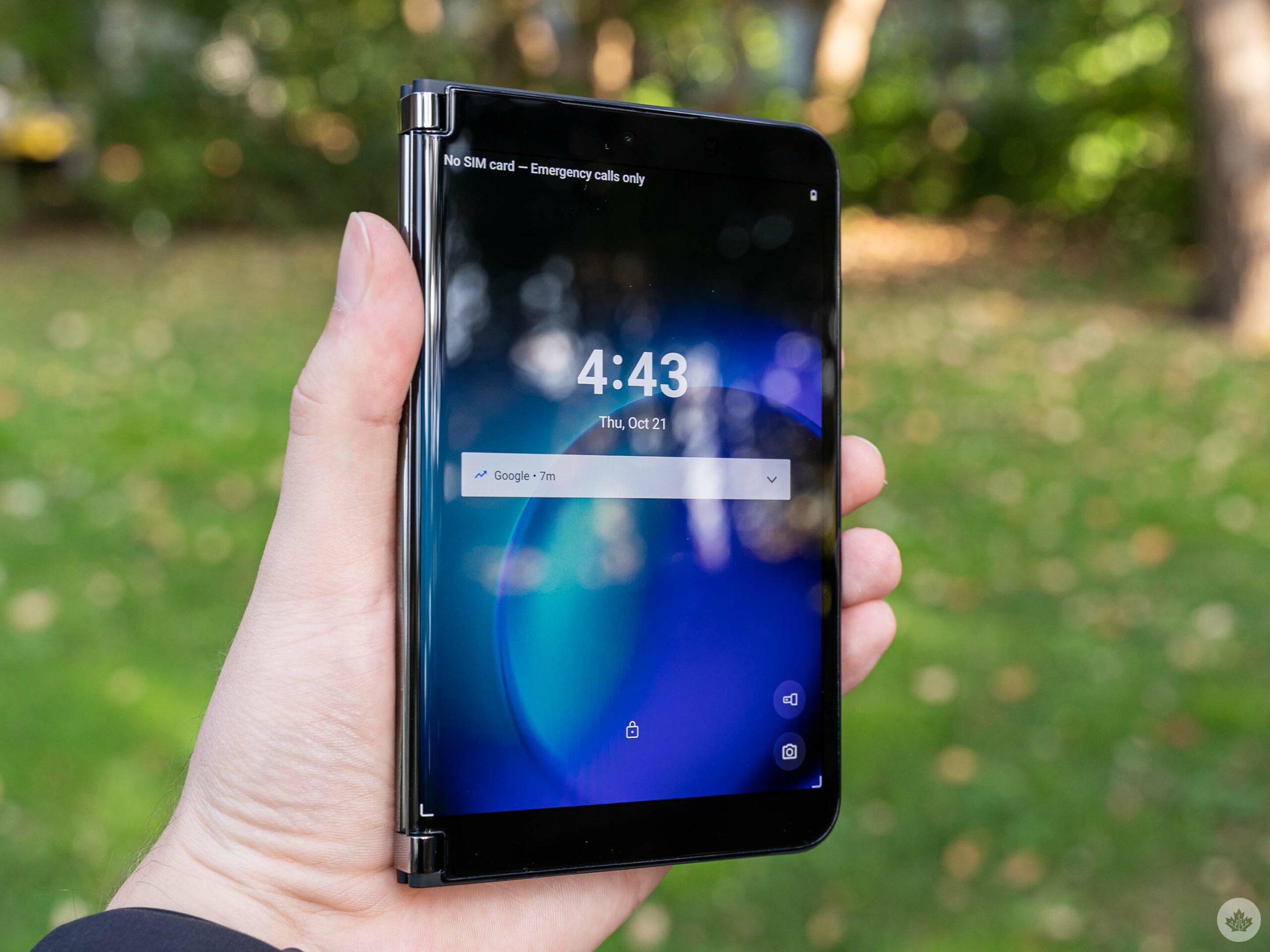
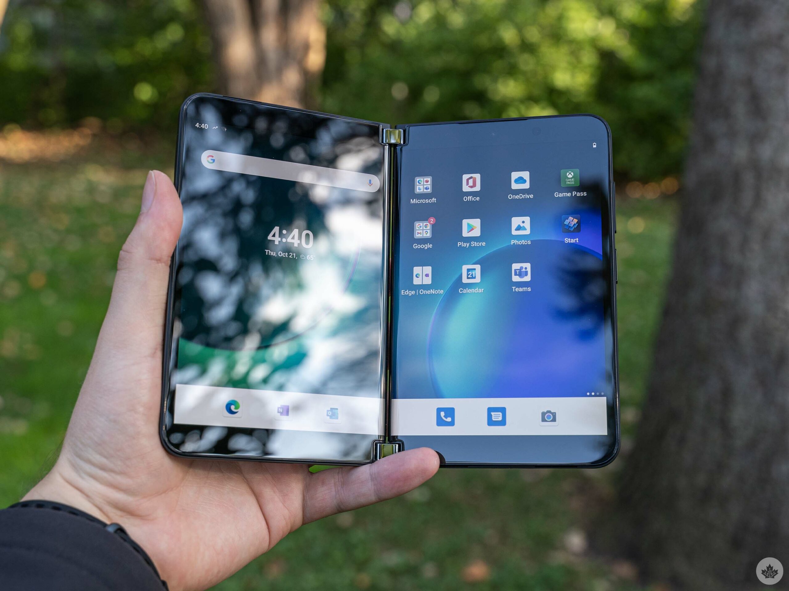
There are some other welcome improvements in the phone as well. For one, the new 90Hz screens looked and felt great while setting up the Duo 2. I, unfortunately, haven’t done much more than that, but scrolling through lists felt buttery smooth. Text was also crisp and clear and colours vibrant.
The new Glance Bar seems like a welcome improvement, although it was less-than-perfect in my initial use. It’s limited to just showing incoming calls, messages, battery level and volume. In other words, it didn’t show anything for incoming email or other notifications. There also doesn’t seem to be a way to “turn on” the Glance Bar when the device was closed — it would show information, then turn off and there seems to be no way to wake it back up. Moreover, it didn’t always display the volume indicator when I changed the volume with the screens closed. Perhaps there’s some bugginess here that still needs to be worked out.
In fact, in my brief time with the Duo 2, I encountered a few bugs, although nothing severe. Android’s Digital Wellbeing feature kicked on during set up and I was forced to finish the process in black and white. Another bug I encountered saw the home screens go blank, showing nothing but the wallpaper, for maybe 30 seconds while I was updating apps from the Play Store.
While not severe, these little things were definitely concerning, especially considering the cost of the phone. The original Duo was plagued with software bugs at launch, and I hope these were one-off issues and aren’t indicative of the rest of my time with the Duo 2.
That camera bump is something
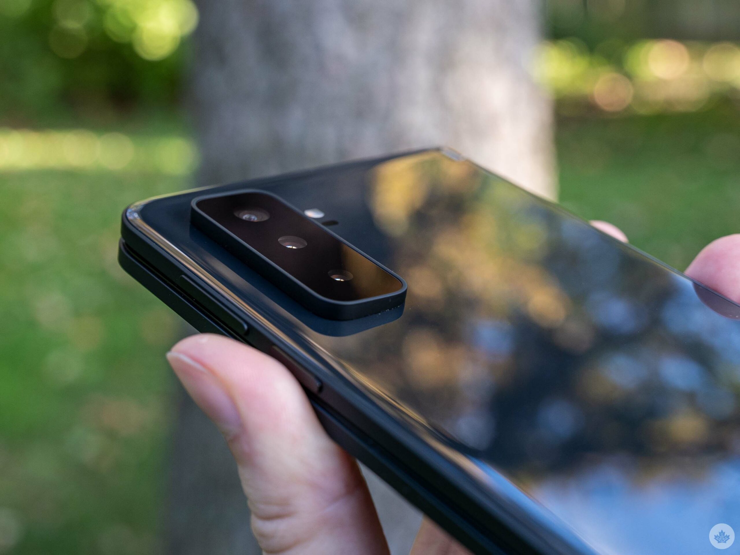
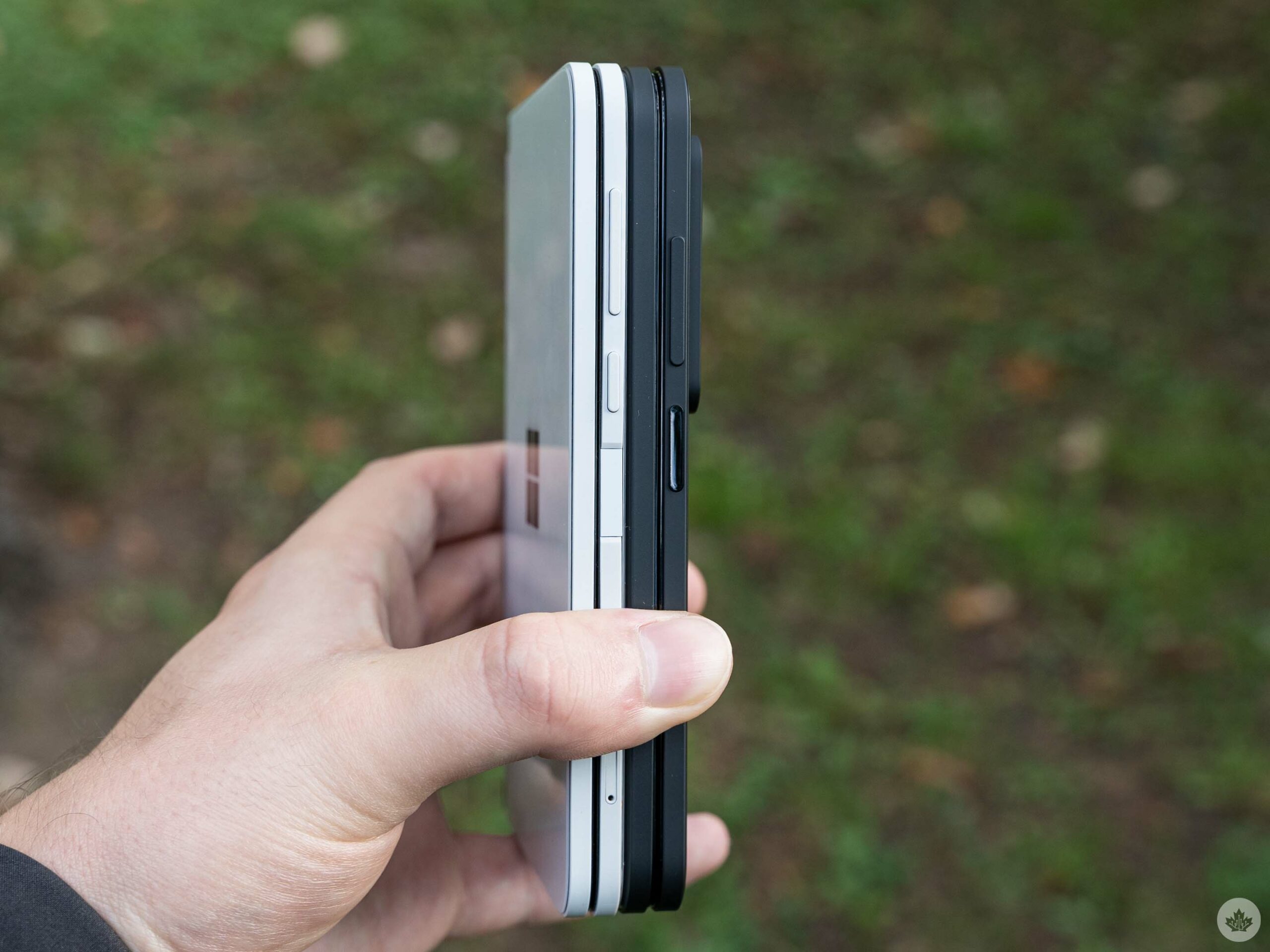
Finally, I want to take a moment to address the massive camera bump on the Duo 2. I don’t take issue with its size, necessarily. By nature of how cameras work, and how thin Microsoft made the Duo 2 (it’s not quite as thin as the original Duo, but it’s not much thicker either), the bump has to be big. Further, Microsoft was pretty smart with the design, adding a slight angle to the bump so that it acts as a sort of wedge when users fold the screen all the way around.
However, the camera bump sits right where I would hold the Duo 2. It gets in the way of my fingers and the camera glass is already covered in smudges (the new ‘Obsidian’ colour is also a smudge magnet, unfortunately). More annoying to me, however, is that the camera bump prevents the front and back panels from sitting flush when users fold it into single-screen mode.
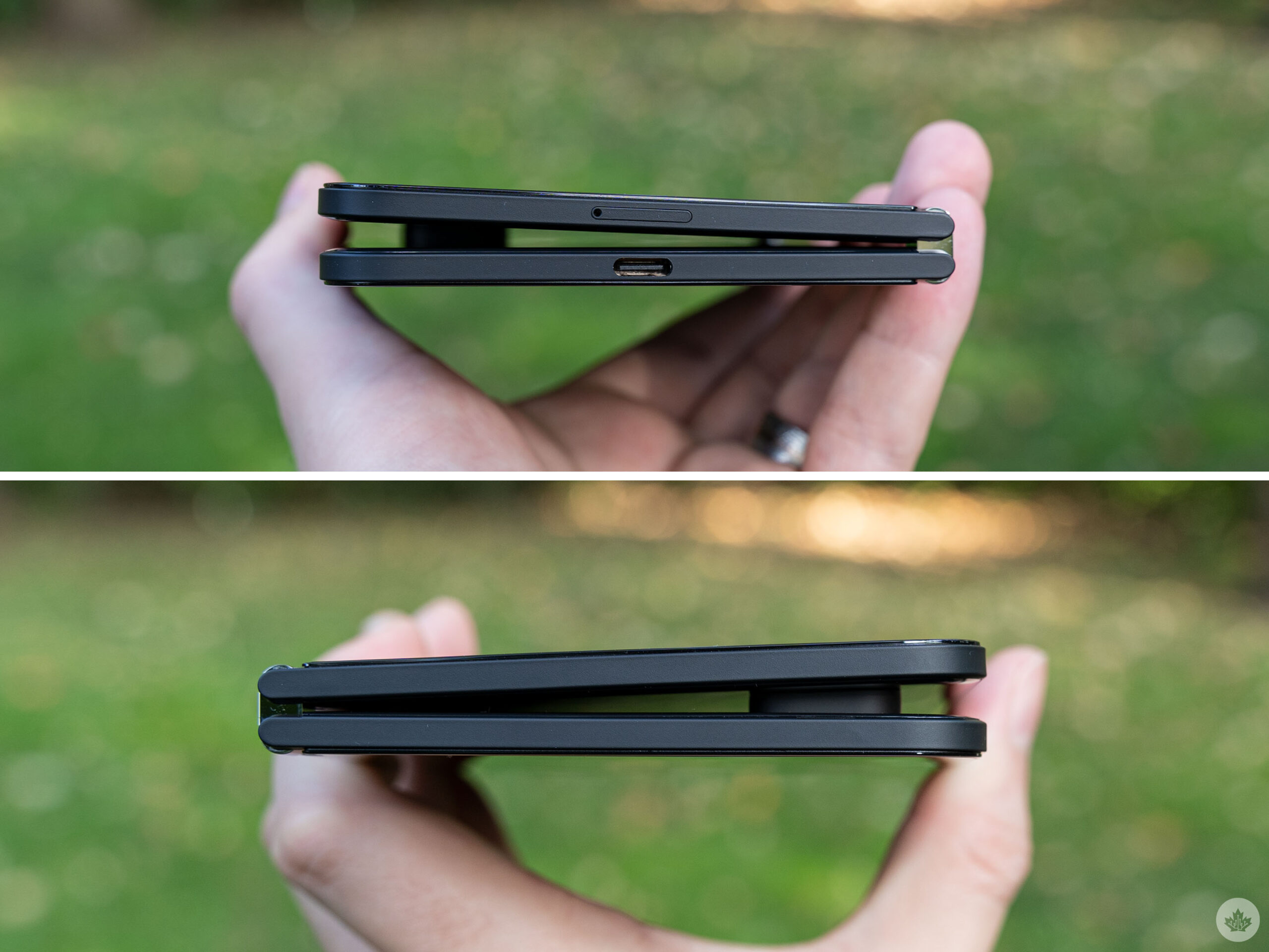
The top of the Duo 2, where the bump wedges between the two sides, feels sturdy. But without similar support on the bottom half, it feels like an unfortunate amount of pressure could cause some serious damage. In other words, don’t squeeze the Duo 2 too hard.
All in all, the Duo 2 feels like an improvement over the original Duo, but it’s hard to say yet if it’s worth the $1,899.99. My gut says probably not, but I’ll need to spend more time with the Duo 2 to be certain. There will be a full review coming soon with a deep dive into everything — the new camera system, performance with the Snapdragon 888 chipset, battery life and more.
MobileSyrup may earn a commission from purchases made via our links, which helps fund the journalism we provide free on our website. These links do not influence our editorial content. Support us here.
