
The three big Android players in Canada are Google, OnePlus and Samsung, so I decided to look at all three companies’ Android 13 implementations to see what they can learn from each other.
With the launch of ‘Material You’ in 2021, Google started to push Android towards personalization. Samsung and OnePlus have followed suit, and now we have three compelling Android options heading into 2023.
Not only do the looks set them apart, but the way each system handles default apps and the animations linking them all together play a significant part in what makes an excellent operating system. Overall, system stability and user-friendliness also play a role, along with how functional it is.
Colours based on your wallpaper are the new black
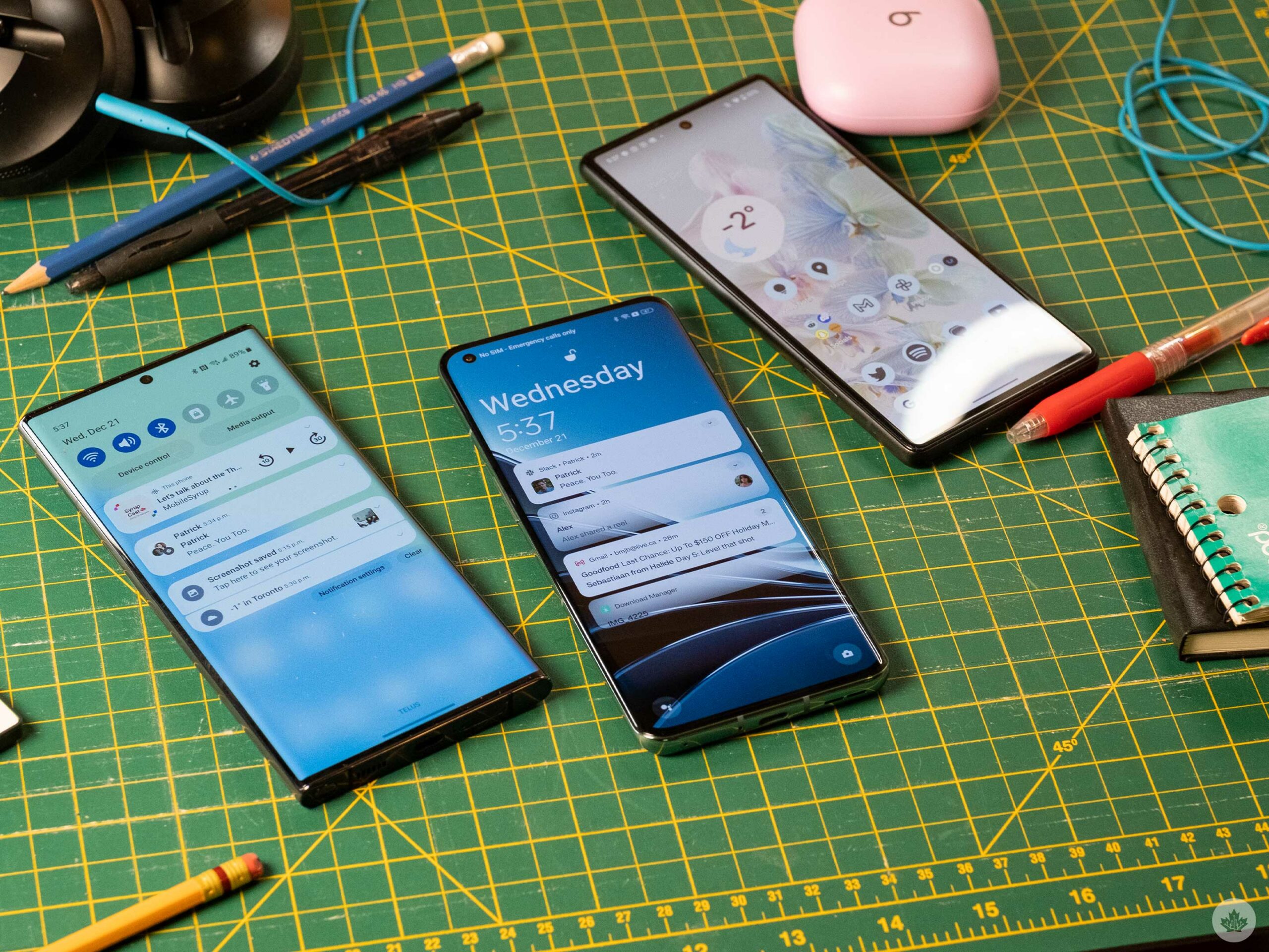
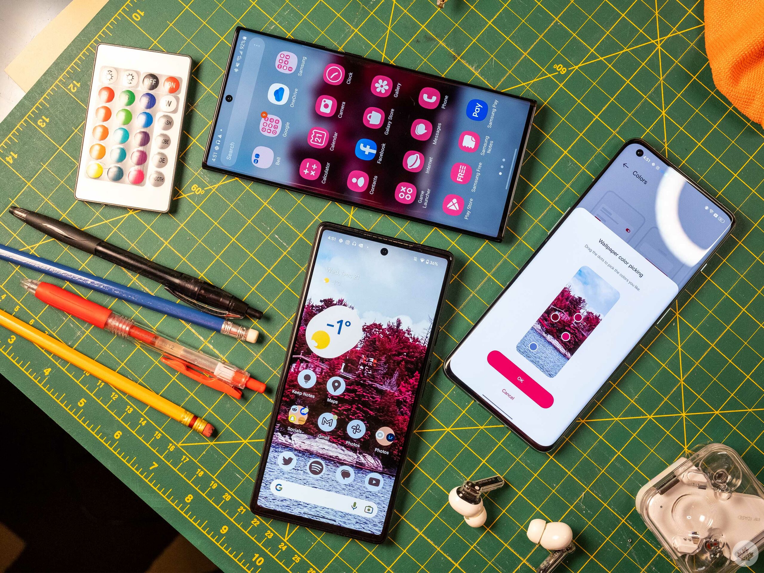 The most prominent theme linking all three builds of Android 13 I’ve played with, is that the system UI adapts to the user’s wallpaper in varying ways throughout the OS.
Samsung and Google push this the furthest with colour-adapting icons, and I like it a lot. Unfortunately, many devs don’t support the feature yet, and all the icons look alike, but when people mod their iPhones to look like this, I think we need to prioritize customization.


Samsung’s colours often seem bolder than the Pixel’s, but both phones retain a trendy pastel palette, so selecting what you find more appealing is up to you. Samsung and Google offer several colour palettes in Android 13, so picky people should be able to find something that suits them. However, it would be nice if users could select the theme colours themselves. OnePlus allows you to do this, but the company’s implementation doesn’t permeate as much throughout the operating system, and they’re often quite subtle, so it’s difficult to call this a real win.
Notifications and quick toggles never looked so good
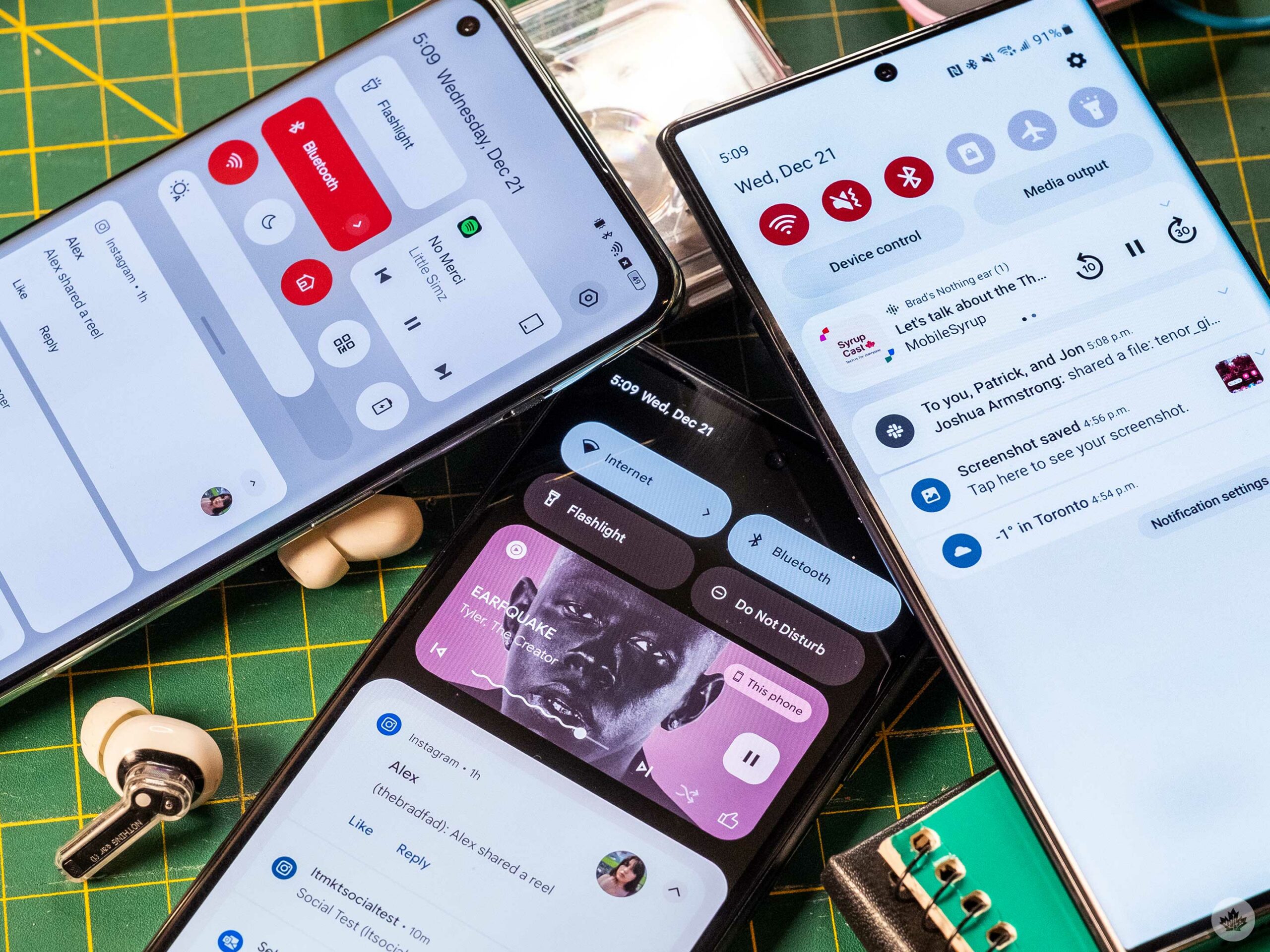 Where you’ll run into these adaptive colours the most are the notification shade and the Android Messages app. The default keyboard should adapt as well. All three companies do a good job of adding pops of colour to the notification shade, but OnePlus feels like it’s shoehorned it in. At the same time, both Google and Samsung have more deliberate theming, tying the notifications and quick toggles into the overall ecosystem. OxygenOS 13 does get some points for having more quick access to things at once, but Samsung makes its quick toggles very easy to use with one hand.
One area that can add a lot of personality to a phone is the ‘Now Playing’ quick toggle. In this regard, Google takes the cake with its large and colourful block that even includes the super fun squiggly line to show your listening progress. OnePlus’ implementation is smart since it takes up the least space, and Samsung feels like it’s barely even trying here. Its basic notification is unappealing, and the podcast controls are wonky, which throws off the design’s balance.


Samsung has very nice animations in One UI 5 that make it feel great and snappy. OnePlus has new animations too, but by comparison, they’re simple and slow. They don’t have the speed and bounce that make Samsung so satisfying. Google sits on the opposite side of the spectrum with bouncy animations that feel slightly slower than Samsung’s. The animations don’t make or break any system, and if you find them slow, you can always speed them up using developer settings on Android.
Another toggle that makes its way into this conversation is how each manufacturer handles volume controls. Samsung and Google take much better care to colour-match their volume controls, but OnePlus has the added flexibility of being simpler (on some phones) due to its physical mute switch.


Google solves this lack of an alert slider with a software version that appears when you hit the volume buttons. On the other hand, Samsung forces users to open the secondary volume pane to control notification volume. And even when you get to that second page, it’s confusing and unlabelled. Both Google and OnePlus keep things more straightforward.
What Samsung can teach the others
 Samsung has released one of the most compelling Android builds this year due to One UI five’s heavy emphasis on customization. Beyond colourful app icons and accents, the Korean tech giant now lets users set custom ringtones and wallpapers for contacts. The company also stresses that it’s made the lock screen easier to customize, but compared to iOS it feels somewhat limited, and the choices it presents are mostly dull or terrible.
Where Samsung could learn a thing or two is in how it deals with its multiple features, all operating systems need to handle this better, but Samsung really needs to simplify things. For instance, there are multiple ways to do everything from notifications to media control to adding wallpapers and more.


When you’re using the OS at a surface level, it feels and looks better than ever before, but once you get into the settings and start using the phone, it quickly becomes as complicated and convoluted as always.
Can OxygenOS 13 teach us anything?
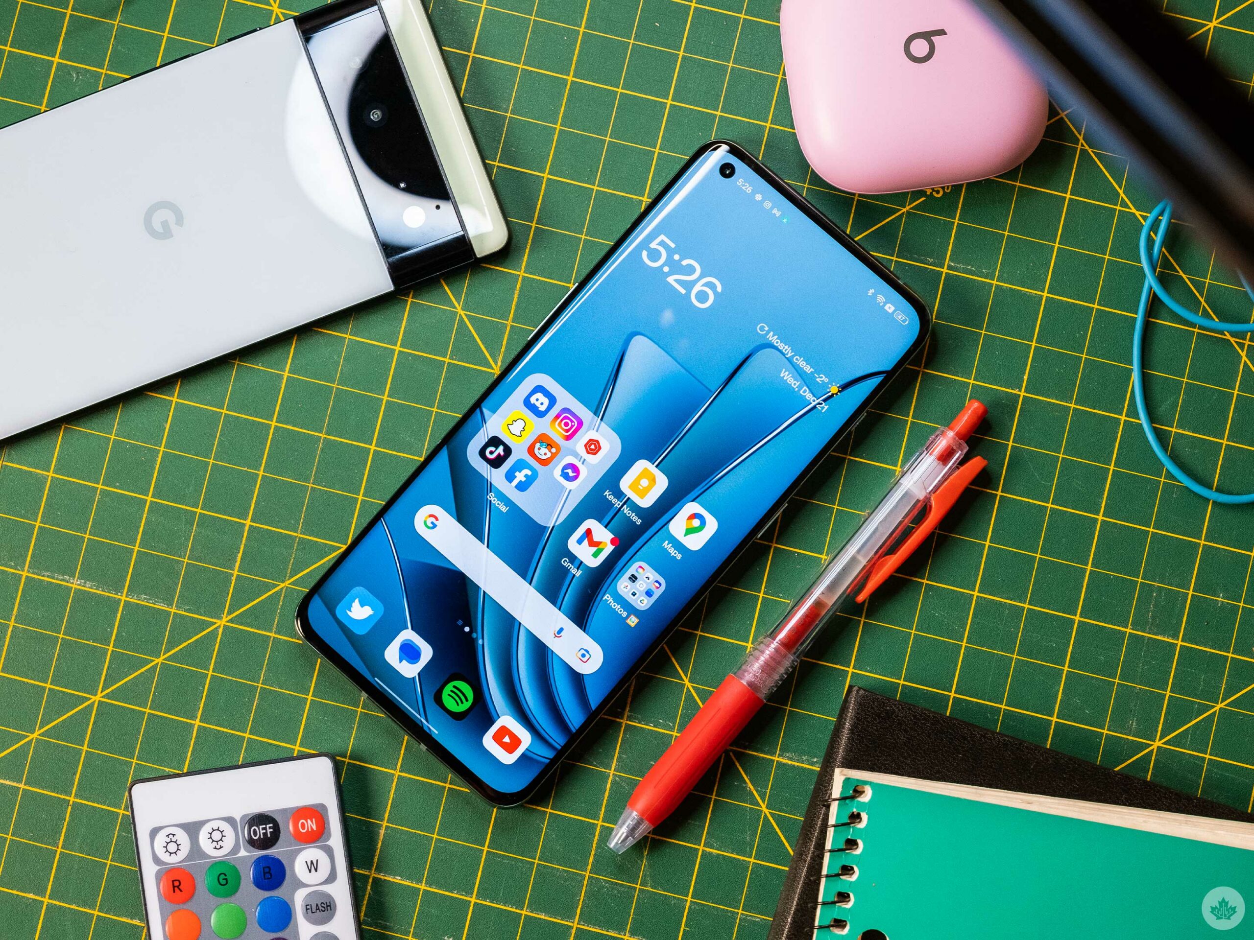
OxygenOS is still in a transitional phase between OnePlus and Oppo. This isn’t necessarily bad since there’s a lot of good packed inside, but it’s still rougher around the edges compared to One UI 5 and the Pixel launcher.
I like the giant 3×3 folder that lets you keep more apps on your home screen in an appealing way. However, it only works when you’re home screen is set to display apps in a 4×6 orientation. OnePlus also stubbornly believes that its default widget should have red 1s in it, which is especially annoying in this age of customization. For example, I want to show off the brand on the lock screen with a custom widget, but I don’t want it to clash with my wallpaper.


Beyond that, OnePlus is starting to emulate Samsung more, which may or may not be a good thing. For instance, the company is using more notifications for features throughout the OS, and it even has a quick access side panel that stores apps, offering a copy of Samsung’s Edge panels. The feature can be disabled, but I worry most users will find it annoying as they try to swipe from the side to go back.
One thing OnePlus does well is integrating screentime notifiers naturally into the operating system. For instance, the Always-on display shows users when and how many times they’ve used their phone throughout the day. To build on this, the company has an app called Wellpaper that does similar things to the wallpaper. However, the fact that this isn’t built into the phone properly makes it feel like an afterthought. There’s something smart about presenting users with an ambient way to gauge their screen time, and I wish other companies would adopt similar ideas.
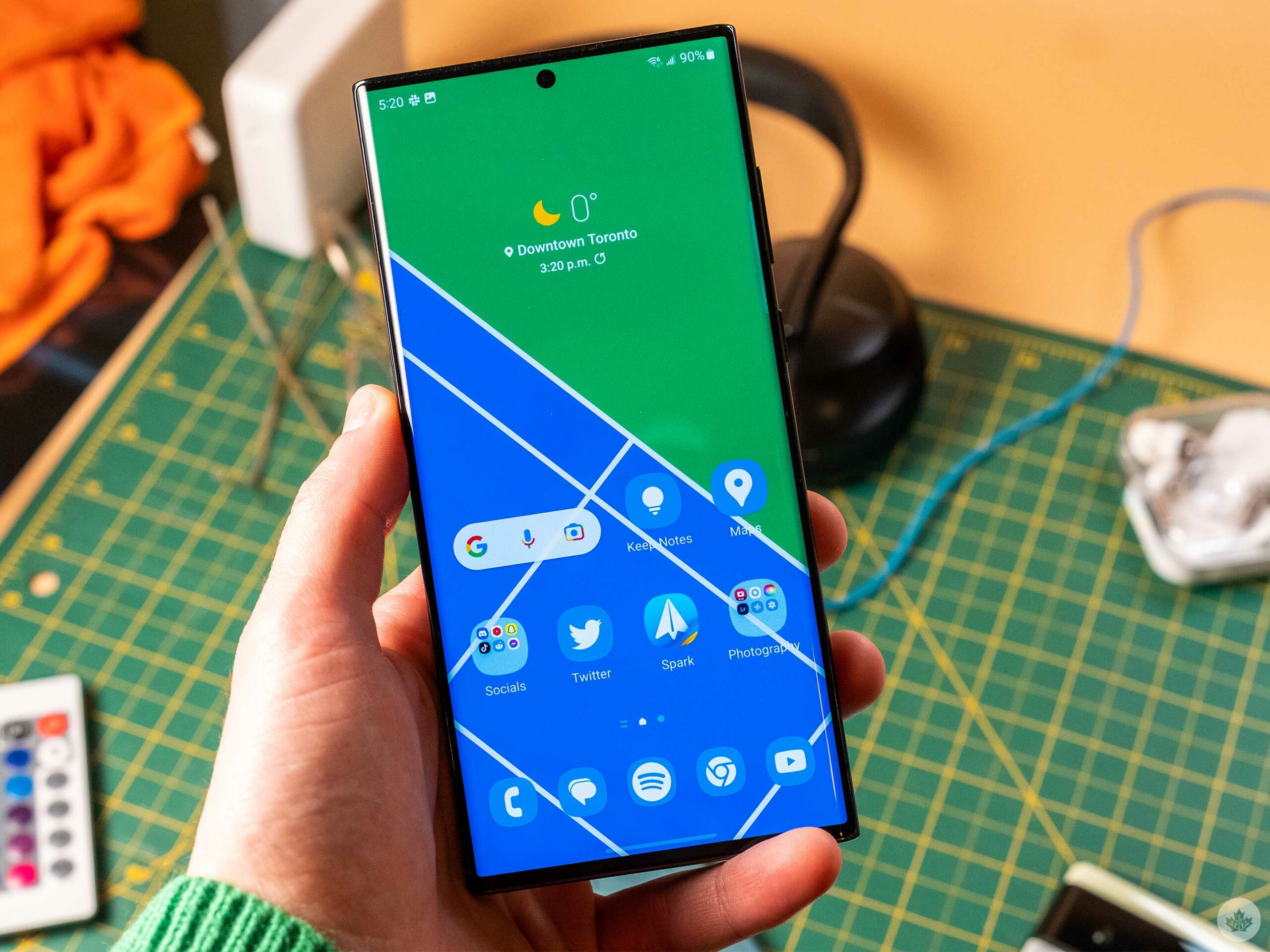
What does the Pixel Launcher bring to the table?
![]()
Two years into Material You’s life cycle and Google isn’t as far ahead in the colour adaptive world as it once was. That said, it’s still leading in a few categories, and its simplicity should not be taken as a lack of features.
While Samsung throws everything at the wall to see what sticks, Google is very targeted and doesn’t jam new features into every nook and cranny. It also doesn’t overload users with choices, making it feel like you’re more in control of your phone.
The other key feature the Pixel launcher has is a robust system search tool. It’s still not iOS level, but it feels like a more vital part of the operating system compared to Samsung and OnePlus. When you open the app drawer on the Pixel, you can even set it to have the keyboard open by default. It’s something everyone should do since it makes doing quick web, settings or app searches just a swipe away. The search feature can even pull items out of apps, such as surfacing chats when you type in a contact’s name.
Once again, this lends itself to simplicity which is the main thing the Pixel launcher does right. It’s not trying to give users every feature under the sun. Instead, it predicts what people will want to do the most and makes that easy. The software mute toggle is another excellent example of this.
Who has the best Android skin?
The best Android launcher is likely subjective, but I think the Pixel launcher takes the crown. I wish that it would offer a little more lock screen customization like Samsung and Apple, but at the end of the day, Google’s design language is so strong on the Pixel that it’s hard to hate on such a unified look.
Samsung’s array of features means that a lot of people are hooked on one. This works well for Samsung, and there’s no denying that things such as the S Pen, Edge Pannels, Dex and others are great for productivity. But most people use their phones as a social media browsers with a camera, and for that, the Pixel Launcher feels easier.
MobileSyrup may earn a commission from purchases made via our links, which helps fund the journalism we provide free on our website. These links do not influence our editorial content. Support us here.
